If you mostly read English or other Romance or Germanic languages, you’ve been spoiled for choice with digital fonts. The Latin alphabet has long been the subject of intense typographical exploration, with thousands of fonts available in more styles and weights than most non-designers would ever think necessary. Readers of non-Latin scripts like Chinese, Hindi, or Hebrew have never enjoyed such diversity.
Now the globalization of fonts is erasing this disparity. Type design and delivery might seem esoteric, but the flattening world of type actually speaks volumes about the economic and technological changes that are creating a truly global internet.
Delivering specialized content is easier than ever
Some kind of digital typeface has been available for the most widely used scripts for a long time. Microsoft Windows 2000, for instance, had pretty impressive support for its time, including Thai, Georgian, and Vietnamese. But until very recently, all the fonts—digital representations of typefaces—displayed on a computer or smartphone had to be installed on those devices’ operating systems. This Wikipedia page, for example, lists all of the fonts that come bundled with Windows. This is extremely limiting: A designer or developer cannot use anything other than those (usually fairly boring) fonts.
Now that limitation is being overcome, thanks to web fonts. These are essentially the typographic equivalent of music streaming services. Spotify removes the need for a hard drive full of mp3s by transferring audio directly over the internet. Web fonts do the same for a hard drive full of fonts. Quartz, for example, uses PT Serif for its body text. You probably don’t have PT Serif installed on your computer or phone, but you can see it anyway. That’s because your web browser downloads the font automatically.
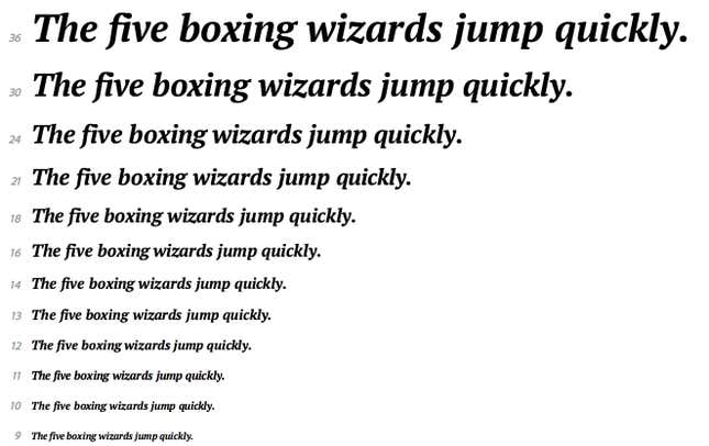
“[Web fonts] are a breath of fresh air,” says Gerry Leonidas, a professor at Reading University in the UK who specializes in Greek typeface design. They allow designers to add new fonts to their pages at any time, and even to make frequent and subtle changes to existing fonts, adds Leonidas. And they are being used on a tremendous scale. Google, the largest provider of free web fonts, has delivered over 2 trillion downloads.
This will no doubt improve the online reading experience in English, Spanish, or German. But it is almost revolutionary for non-Latin scripts, because system fonts for them are often either non-existent or badly designed. ”Web fonts are way more important for non-Latin scripts than they are for Latin,” says David Březina, the chief type officer at Rosetta Type, a firm that designs custom fonts to cover multiple scripts.
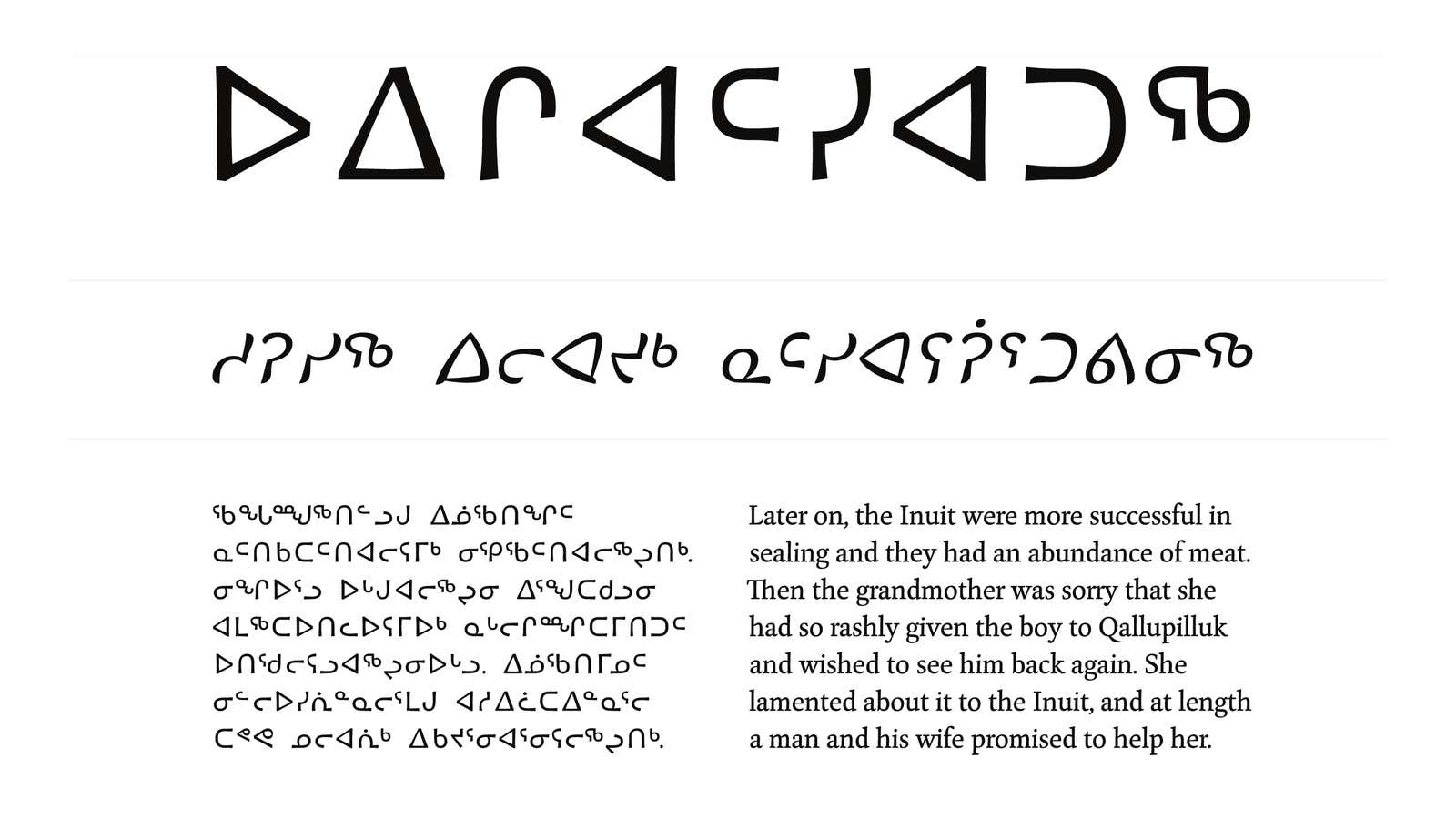
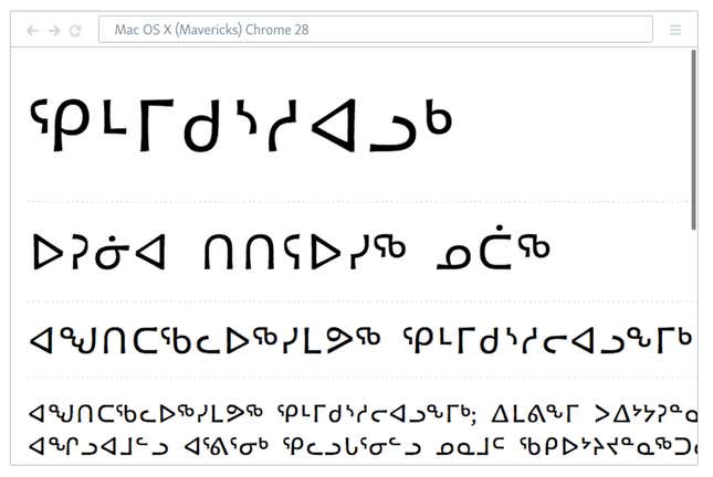
Rosetta has elegant web font offerings in such previously sidelined scripts as Armenian and Inuktitut, a language spoken and read by Canadian Inuits. A student of Leonidas’ developed the first font for the Native American language Lushootseed; converting this into a web font would be trivial.
A better internet for emerging markets
Web design has been improving steadily in Western countries, thanks to faster connections, better browsers, and more robust web development tools. Newer sites like Medium and Pinterest look shockingly better than their predecessors (compare them to Amazon, for example).
The state of web design in developing countries, on the other hand, has been mostly abysmal. Chinese websites are mostly walls of tiny, barely legible text. The site of Al-Ahram, Egypt’s largest daily newspaper, looks like it was designed in 1996. The same goes for the online home of the Indian state of Gujarat. But as the number of internet users in these countries grows alongside their economic prospects, they are demanding something better.
“Font design has not been highly regarded in China,” says Curt Huang, president of Chinese font agency Changzhou Sinotype, a frequent collaborator with Adobe. But, he says, “Chinese companies are increasingly concerned about fonts and design in general.” And it’s not just companies trying to improve their brand. Huang also cites growing interest in design from both individuals and even the government. Since 2005 the Central Academy of Fine Arts in Beijing has offered a PhD in typeface design, and Huang says the program is more popular than ever.
Global organizations and firms, no matter where they’re based, ignore this demand for quality at their own peril. Leonidas emphasizes the competitive advantage of having good typefaces for scripts like Devanagari, used by various Indian languages and read by between 400 million and 500 million people.
Multinational organizations are indeed responding. Voice of America adopted a Rosetta Type product for its Persian site. Google and Adobe have just released their own Pan-Asian font that covers Chinese, Japanese and Korean, which they spent two-and-a-half years developing. Adobe has rolled the font into its Source Sans family, while Google has incorporated it into its ambitious Noto project, whose aim is to construct a single, solid base font for every script on Earth.
“We’re trying to support all the languages and scripts encoded in the Unicode [character set] with as much harmony and consistency as possible, across scripts and as beautifully as possible,” said Jungshik Shin, a Google software engineer who works on Noto, in an email to Quartz. ”This is a problem that’s bigger than Google, but it’s one that we see often as we support more and more users in their native language around the world.”
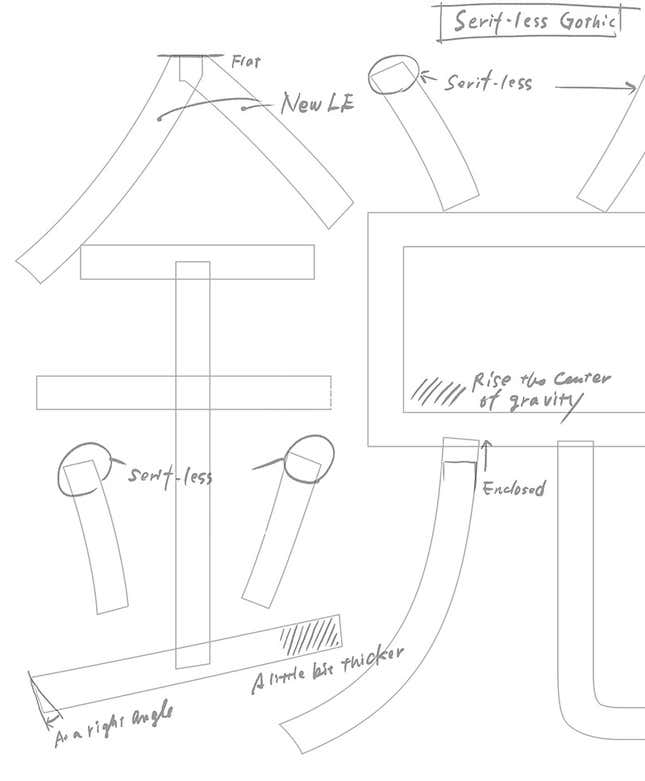
Both Leonidas and Březina are skeptical about whether such a universal font can be any good. “It is hardly ever the case that all the scripts in one family with more than three scripts are up to the same standard,” said Březina. Still, they say, raising the base standard for less common scripts is a good idea. At the very least, it shows that Google, Adobe and the like want to broadcast their messages more effectively to people across the globe.
The future language of the web is not just ”Globish”
There’s another good reason to combine different typefaces into a font, and you can see it if you go to any news website in a language that doesn’t use the Latin alphabet. Whether written in Chinese, Hindi, or Hebrew, nearly all of these sites use the same writing system as English sites for numbers, recognizable acronyms like NSA or IMF, and for words that have been adopted from Western languages. And typically they will use completely unrelated fonts.
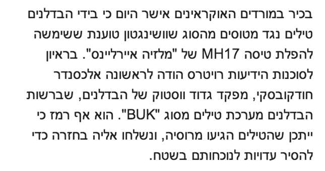
“One might look too formal, or too informal,” said Leonidas. “If I have a few words of Russian, do they disrupt the flow on the page?” The converse is true too. In this excerpt from a Haaretz article, the Latin letters are not only too big and wide; their curves and angles are also jarringly different from those of the Hebrew letters:
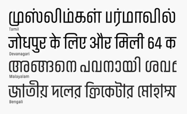
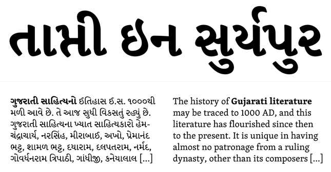
It’s popular to claim that English is the world’s de facto lingua franca. But learning English doesn’t mean native speakers of other languages will be speaking it to one another. In fact, Western languages, especially English, are creeping into other scripts. Rosetta Type’s Skolar, for example, was designed specifically as a multi-script font supporting Latin, Cyrillic, Greek, Devanagari, and Gujarati. The same is true for Indian Type Foundry’s Akhand font, which has a similarly compact style for four Indic scripts: Bengali, Devanagari, Malayalam and Tamil.
It is no longer enough for organizations like Google or VOA to speak a user’s first language, but also her second and third.
This isn’t actually about fonts
Fonts are just a good proxy for changes happening to the web. Giving people highly specialized content—whether it’s a font, software update, or search results—is now just a matter of changing a few settings. Emerging countries are hungry for a better web experience. Companies that deliver one will be rewarded.
But the globalization of fonts does tell us one thing: that a multilingual web is already 司空見慣.
