Atlas, the new home for charts and data
Today we are thrilled to launch Atlas, a new platform for discovering and sharing great charts. You can find it at atlas.qz.com.


Today we are thrilled to launch Atlas, a new platform for discovering and sharing great charts. You can find it at atlas.qz.com.
This is a big step forward for Quartz and, we hope, all of you. Atlas deepens our journalism by offering readers better access to the data and visualizations in so many of our stories. It also extends the reach of our journalism by letting you make use of our charts in new ways.
To start, all of the charts are made by Quartz staff and select contributors. In time, as we build out the platform, we are hoping to let anyone make charts in Atlas. If you’re interested in getting involved in any way, send us an email at [email protected], and we’ll keep in touch.
Go ahead and be one of the first people to follow @atlascharts on Twitter and like Atlas on Facebook.
What it does
Atlas gives each of our charts its own home, along with a set of tools for interacting with them: You can now download the data behind our charts, embed our charts elsewhere on the web, grab an image of our charts, and of course share our charts on social media. They will look great regardless of whether you’re using a big screen or mobile device.
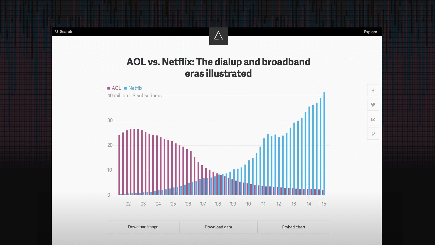
Click here to check out a typical chart page on Atlas. The same chart is embedded below; click on it to play around with the tools. Feel free to take the data or embed the chart yourself!
Some features of Atlas, like search and tag pages, will get much better as we amass a larger collection of charts. You can use them now, but don’t expect too many results :) But over time, we’re excited about the potential of this archive.
Why we built it
Charts have always played an integral role in our journalism; Quartz writers published nearly 4,000 charts last year. We also know that our readers love charts and love sharing them. Charts are our cat photos.
With Atlas, we wanted to make it easier for readers to share our charts by acknowledging that these simple data visualizations can easily stand on their own, with their own pages and ability to spread across the web. Atlas chart pages and embeds are also more useful than flat image files because they can offer context and, crucially, provide the data behind them for further analysis.
Often the best way to tell a story is visually. That’s all the more true for a news organization like us covering global business. We’re calling this Atlas because, while once atlases were used to figure out where everything was, the way we understand the world now is with data.
Chartbuilder 2.0
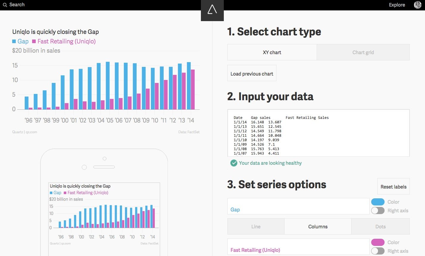
We make everything in Atlas using Chartbuilder, our in-house tool for quickly creating good-looking charts in a consistent style. It simplifies and speeds up some of the more maddening aspects of chart creation, empowering our entire newsroom to serve as its own graphics desk. Here’s what that chart above, comparing Gap and Uniqlo, looks like when it’s being edited in Chartbuilder:

Chartbuilder has improved a lot since we open-sourced the tool two years ago, thanks to the many people who have contributed to it and related projects. Lots of newsrooms, from NPR to FiveThirtyEight to the Australian Broadcasting Corporation, have also made use of Chartbuilder for their own needs, which gave us confidence that there is large demand for such a service.
So in tandem with launching Atlas, we’re also happy to be open-sourcing an all-new version of Charbuilder. It sports a range of new features and has been rewritten to be more extensible, which we hope will encourage more contributions by developers. (Think it could use some pie charts? Have at it!) Learn more about Chartbuilder and how to contribute at its GitHub repository.
Some additional notes
- The ads on Atlas are native, which is to say they are charts. Sponsor charts are clearly labeled as such and handled by our advertising team without any newsroom involvement. The first ones are rolling out today in some parts of the world.
- Atlas embeds follow the oEmbed standard, which means other platforms should easily be able to provide support for them. We are still testing this, so if you encounter any issues or would like assistance, please reach out.
- We love JavaScript, and this is probably our most ambitious JavaScript project yet. Atlas is a Node.js app, Chartbuilder is based on D3.js, and both are built using React.js—all of which, we should note, are only possible thanks to the generosity of the open-source community. Hooray, open source.
- Atlas only supports modern browsers. That means the latest versions of Chrome, Safari, Firefox, and Internet Explorer. Your results may vary with IE10 and below.
Amalia Viti and Yitz Jordan are the lead developers and Daniel Lee is the lead designer of Atlas. Nikhil Sonnad and David Yanofsky are the lead developers of Chartbuilder. Thanks, as well, to Micah Ernst, Dave Mouyal, Leslie Nguyen, and Josh Young. They are an amazing team of journalists, developers, and designers who defy all discrete labels.
If this all sounds like your idea of journalism, you should come work on the Quartz Things team. Email me.
We’re excited to see where Atlas will go and how it can improve from here. If you have ideas, get in touch with us at [email protected]. And if you encounter any issues using Atlas, email [email protected]. Thanks!