
Matias Duarte, head of design at Android, is holding a Nexus 7 tablet, and he’s clearly proud of it. With its custom, high resolution screen—one that was selected not just for its pixel density but also its brightness and color gamut, says Duarte—it’s the perfect vehicle for showing off the graphics and animations that his team is building at Google.
The design for Android, Google’s mobile operating system, has become progressively more refined since the product’s earliest days, and it’s apparent from the moment you pick up a Nexus 7, which runs the latest version of Android, that Duarte’s design team is working very hard to make it look and feel as polished as possible. Part of that work is resolving the debate raging among design geeks about whether mobile operating systems, and computer interfaces in general, should be “skeumorphic,” which means that all the elements on a flat screen should look as much like real objects as possible, or “flat,” a design convention that sheds all pretenses that a screen should resemble the real world, and aims instead for austere simplicity.
Apple’s iOS mobile operating system was, until the unveiling of a radically new, more flat direction, the exemplar of the skeuomorphic design ethos, with apps that included gaudy and seemingly unnecessary touches like fake leather, wood and glass. On the other end of the spectrum, at least in theory, is Windows Phone and Google’s Android operating system, which operate on the principle that most people already know how computers work and we don’t need to coddle them with flourishes that make interfaces resemble objects, like physical calendars, which most of us don’t even own any longer.
A mini master-class in designing for small screens
In our conversation, Duarte explained that Android is deliberately neither flat or skeuomorphic. And his reasoning is a mini master class on how to overcome the design constraints of small screens.
“We were thinking about this back when we launched Ice Cream Sandwich [the fourth major revision of Android, launched in 2011],” says Duarte. “We made a conscious decision to embrace modern typographic design and avoid the excesses of skeuomorphism. But like skeuomorphism, flat design also has excesses.”
Thus was born what might be called (with apologies to Duarte, who never used this term) “quasi-flat design,” which is now fairly well entrenched across all of Google’s products.
“Tactile cues are important in touch interfaces, giving users a sense of what they can expect that’s touchable, and how it’s going to behave,” he continued. “It’s not just good from a familiarity perspective; It also touches the fundamental reptile parts of our brain, which knows that is a thing and it has identity and mass and lives in relationship to other things.”
Using skeuomorphism to create smaller, more elegant design
The way Apple used skeuomorphism, you’d think it was all about eating up screen real estate with, for example, fake leather stitching. But it doesn’t have to be that way.
“One of the big risks in mobile with slavish adherence to flat design is, you leverage composition and white space to do what you might do with surface and texture in terms of visual hierarchy,” says Duarte. “On mobile where [you] don’t have a lot of space, you can end up with some cluttered layouts. It’s particularly dangerous when designing a whole platform [like Android.]”
The result, which is apparent in Android and elsewhere in Google, includes subtle nods to the real world, some of which people are likely to miss if they’re not paying attention.
“We’ve tried to create a minimal typographic design that uses a lot of white space and feels clean and modern, and despite that we still felt the need to create these tangible surfaces,” says Duarte. One place that philosophy shows up is in Google Now, where subtle hints indicate that individual “cards” should be thought of as just that—physical, and distinct, cards.
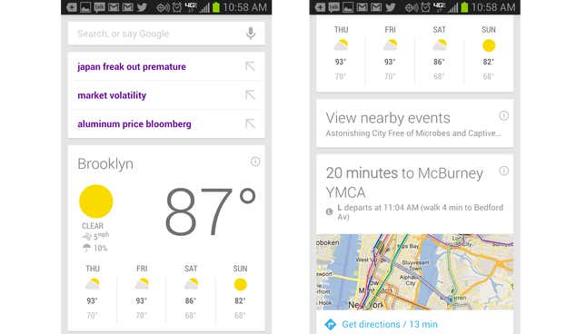
Without almost imperceptible outlines, drop shadows and other visual hints, Google Now cards would require much more real estate to look distinct from one another, says Duarte. “So the cards in Google Now have just the barest tangibility,” he notes. “They’re not skeuomorphic. We’re not trying to give them a linen texture or have letter pressed ink on them. There’s just enough cues that you see it has a thing it’s an entity.”
Like their verbal counterparts, design languages will continue to evolve as fashions come and go and the form factor in which we consume information changes. But in mobile design, for now at least, Google, Apple and Microsoft seem to be converging on the quasi-flat design standard.