So you probably have seen the headlines on this morning’s somewhat disappointing jobs report. Here’s a quick rundown of the key charts.
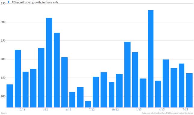
1. July saw 162,000 new jobs, less than the consensus expectation for 183,000.
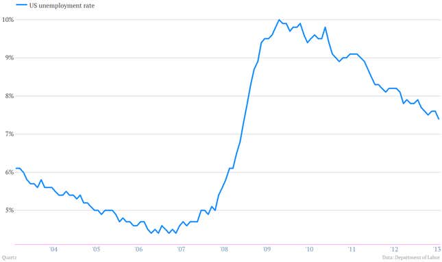
2. Unemployment fell to 7.4% from 7.6%.
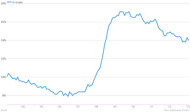
3. The broadest gauge of unemployment, the U-6, which includes part-timers looking for full-time jobs, declined slightly to 14% from 14.3% in June.
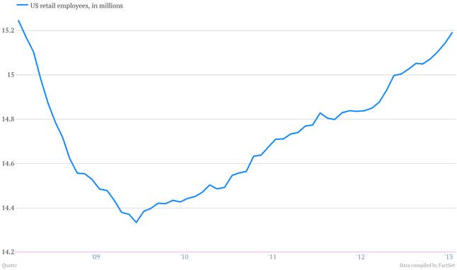
4. Some of the strongest gains in jobs were in the relatively low paid retail sector, which added 47,000 jobs in July. The sector has produced 352,000 jobs over the last 12 months.
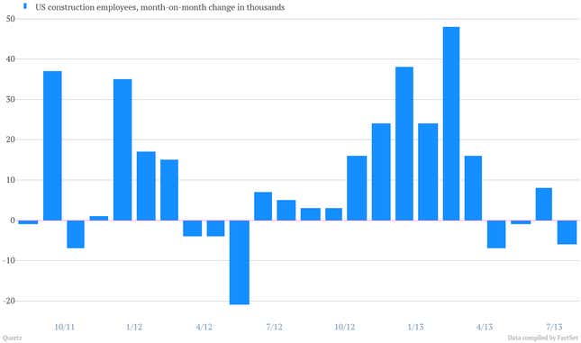
5. Construction employment actually declined by 6,000 during July, which is a disappointment to those hoping the US housing recovery would be a big contributor to an improving employment picture.
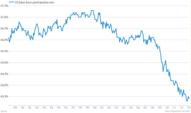
6. The US labor force participation rate continues to show little sign that people are being attracted back to the market by favorable job prospects. Although there remains an ongoing debate about how much of this is driven by demographics, including the aging of the baby boom generation.
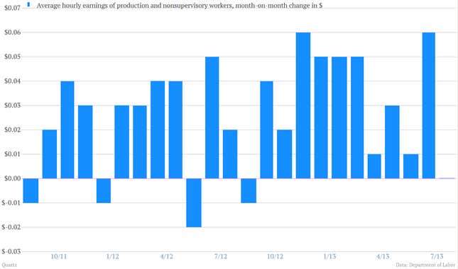
7. After a nice string of increases, monthly wage increases for production workers took a breather.
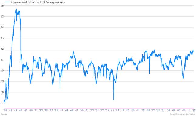
8. But the manufacturing economy seems to be holding up. Average hours for factory workers remain at some of their highest levels since World War II.
