


Bat for Lashes singer Nastasha Khan is making silly faces. A little later, she’s spinning in a circle and changing outfits. She pulls her hair.
But Khan, isn’t performing at an indie rock festival. Instead, her platform is a “Cover Story” on the Pitchfork Magazine website. Designed with parallax effect, which changes pictures like a flipbook as you scroll through the 3,000-word profile, the uncluttered cover story designs have been the most shared features on Facebook and Twitter that Pitchfork has ever had. Thanks to the success, said Creative Director Michael Renaud, editors now want to produce “more and more and more.”
Media outlets are finally investing in good design, and it’s not just an excuse to look pretty. Good web design has become good business. High-end designs are paying off with new users, more page stickiness (meaning how long people spend on the page), heightened traffic across the site and creative advertising opportunities.
In February, The Washington Post published “Cycling’s Road Forward,” a 5,000-word profile with video, photos and interactive graphics. Sarah Sampsel, the Director of Digital, Mobile and New Product Design at The Washington Post, said that the piece had more visits and was significantly stickier than a story presented in a more traditional news layout.
Most media outlets, including the Washington Post and Pitchfork, keep their exact web analytics numbers private. But a memo by New York Times Executive Editor Jill Abramson published last December cited 2.9 million visits in less than a week to Snow Fall, a trailblazer for this type of story layout. That means one single piece attracted just shy of 6% of the New York Times’s total monthly visitors.
Here are some examples of how media outlets have used multimedia and design to improve their standard article pages.
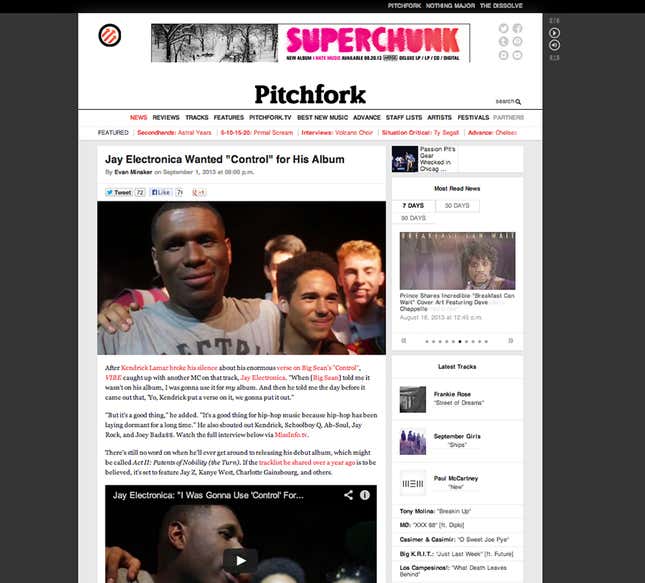
1. Icons galore, two levels of navigation, slideshows in the sidebar, ads—this standard Pitchfork news page is as busy as rush hour. That’s not to pick on Pitchfork, since how to fit lots of content onto a small screen is the central conundrum of media design. Many sites eschew hard editing choices and instead throw everything on the same page, clutter be damned. But outlets would be wise to streamline their designs.
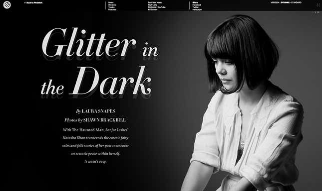
2. Streamline is just what Pitchfork did for their Bat for Lashes Cover Story, which features an inviting, magazine-style layout. With a single large picture, a hierarchical typography and ample open space, the viewer understands the mood of the piece and wants to read more. The menu bar only pops up when you roll over the top, preserving the design’s integrity.
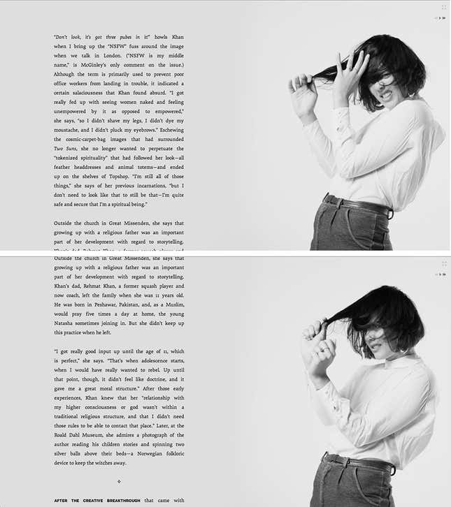
3. Here, the site employs a parallax effect: the background moves slower than the foreground. As you scroll down, one image appears to turn into the next. Notice, too, how easy it is to read the text, even on a smaller screen; this, thanks to responsive design enabled by HTML5.
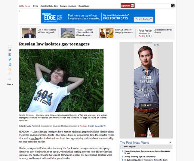
4. This is the standard news story template for the Washington Post. It’s cluttered and also the standard of many newspaper websites. You’ve got to pay the bills, and that explains the four display ads. But considering that only one out of 1000 visitors clicks through display ads, that’s not a very efficient use of prime real estate.
5. Within the much better design of The Washington Post’s “Cycling’s Road Forward,” multimedia presents advertising opportunities like video ads, which which generally make media companies more money. Sarah Sampsel, the Post’s Director of Digital, Mobile and New Product Design said: “Since we’ve launched the story we’ve actually integrated more advertising in.”
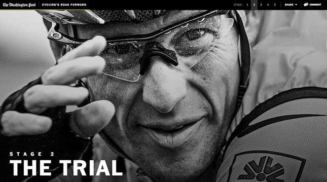
6. Cycling’s Road Forward uses big pictures and custom typography to visually usher readers through what’s most important. The design is calm, and and laid out to encourage continued reading and interaction with the page. “I think people really enjoy the quietness of it,” said Sampsel.
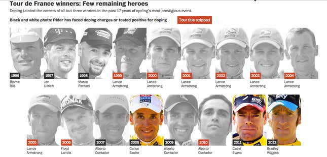
7. Interactive graphics woven into Cycling’s Road Forward break up the monotony of reading thousands of words on a screen. They also get the point across with pith: one visual shows how 14 of the last 17 Tour de France winners have tested positive for doping.
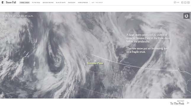
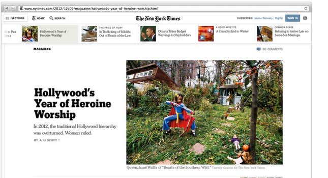
8. “Snow Fall,” a 2012 Times piece that used bold design and big video and graphics to create a dynamic and easy-to-use page, was so popular it has become a verb. This large image moves slowly like a weather map, and text placement allows for maximum readability.
9. Contrast that with the traditional – I would argue antique- vibe of a New York Times story page. In a noted screed against the Times’s layout, designer Andy Rutledge wrote: “What you’ve got here is not content, but noise.”
10. Thankfully, the Times is testing a prototype for a story page that is a lot more “snow fall” than “broadsheet.” It will be rolled out this fall.
The mistake that most non-designers make is thinking that design is just about looking pretty. In fact, good aesthetic design lets media outlets rethink how they tell stories, especially combined with HTML5 and other responsive web tools. Pitchfork’s cover stories, Cycling’s Road Forward and Snow Fall have proven their business mettle; now it’s time for the design ideas they embody to reshape day-to-day storytelling online.