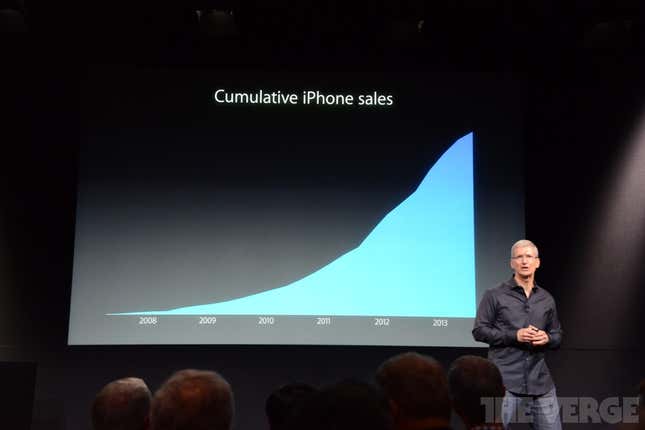
At Apple’s iPhone presentation today, Tim Cook presented the following chart:

At best the chart is misleading; at worst it’s disingenuous. The chart has no scale. It could be showing billions of iPhone sales or it could be showing hundreds of iPhone sales.
Furthermore, showing sales cumulatively tacitly overstates the number of iPhone users, since some iPhone purchases are replacing older or broken iPhones. Many of the phones Apple is claiming as praiseworthy in this chart found the junkyard years ago.
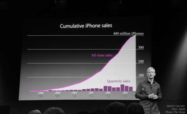
Using data from Apple’s own quarterly reports filed with the Securities and Exchange Commission, I made a better chart:

The overlay shows that, although Apple can boast more than 400 million iPhones sold for all time, its quarterly sales of the product have declined over the last three quarters.
Also worth noting is that the chart shown gives a preview of Apple’s sales ahead of its fourth-quarter earnings release on October 21. Judging by the change in slope on its chart, quarterly sales of iPhones continued to decline.
