At one time, the mansard roof was the very picture of architectural sophistication. French. Curved. Rarefied. But, nearly 300 years after architect François Mansart tacked his name, and his entire career, onto the elegant, slope-shingled eaves of the iconic roof he’d invented, well… along came McDonald’s.
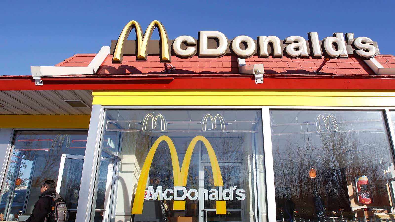
After some 50 years of McDonald’s relentlessly extending its reach through 118 countries, you’d be hard pressed to find an architectural novice who wouldn’t reflexively equate the iconic double-Mansard roof with the fast food giant.
But it didn’t have to be this way.
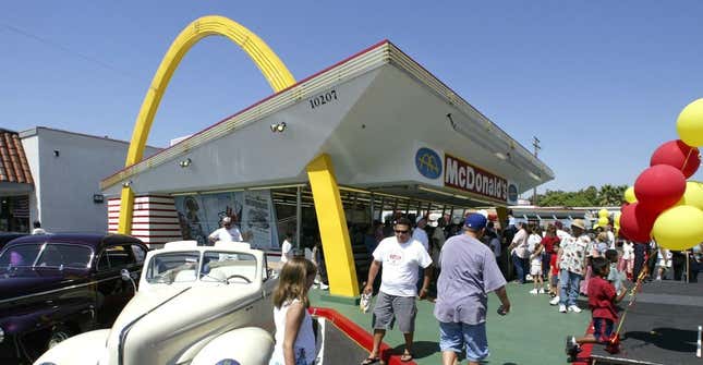
Mansart’s design aesthetic might have remained semi-obscure, retaining its Gilded Age cachet, instead of being strewn across the face of the planet in tens of thousands of locations. The design was adopted in the late 1960s after McDonald’s president Ray Kroc began searching for a wholesome, traditional architecture to replace the striking modernist design, by architect Stanley Clark Meston, which was in use through the 1950s.

Meston’s design was redolent of the futurism Kroc sought to project on his restaurants–fast new foods available all along the fast new interstate highways. But Kroc received repeated complaints. The arch was too big. The design was too strident. Kroc needed his restaurants to beckon, not shout—to draw customers in with a face as comforting as his burger prices were low.
Thus, the 1968 introduction of the double-Mansard roof. It struck just the right balance: homey, but with just a touch of the classical. Wholesome. Simple. Instantly recognizable. But after four decades, what had once made McDonald’s familiar and welcoming took on a down-market, numbingly identical seediness that diminished the brand.
Thus, in recent years, the company began a series of redesign efforts. The results have been compared to Starbucks and “prison for kids.”
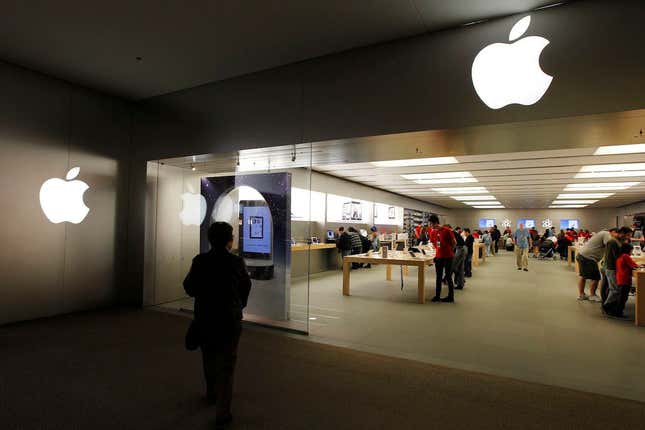
Fast forward to May 19th, 2001. Apple Inc. opens its first pair of retail locations, in malls in suburban Los Angeles and Washington D.C. Wholesome. Simple. Instantly recognizable… and yet, somehow refreshingly futuristic.

Today, the Apple Store is the backbone of iPhone sales in particular and profitability in general. The company plans to double its 400-odd locations in the next two years, and last month brought on former Burberry chief Angela Ahrendts, in part to keep up with demand in China.
As a luxury brand, Apple may not fear the downmarket-associations brought on by thousands of near-identical Mansard-roofed drive-thru restaurants. But Apple will have to deal with the fact that the novel recognizability will eventually wear off of the bright, sterile, glass boxes that define its retail aesthetic. From the beginning, some—notably New York Times architecture critic Herb Muschamp—have found Apple Store designs “bland.” Their architecture has drawn more criticism of late, spurring a redesign of the planned San Francisco Union Square store.
It now seems entirely possible that what was once deemed so striking and original about each Apple store’s glowing white silhouettes, polished metal and sharp angles—a style so distinctive Apple trademarked it—could soon strike shoppers as sterile and imposing. There is a pair of lessons for Apple in the story of McDonald’s architecture:
1) Everything gets old.
2) Change is inevitable.
Let’s hope the company is planning ahead with this next crop of stores. Otherwise, that glowing apple might soon be no more striking or unique than the Golden Arches.


