We care a lot about design here at Quartz, and as a digital-only publication, we especially appreciate good web design.
Daniel Lee, Quartz’s lead product designer, and Ritchie King, a reporter who designs data visualizations and infographics, together came up with a selection of their favorite examples of web design over the past year.
Victory Journal
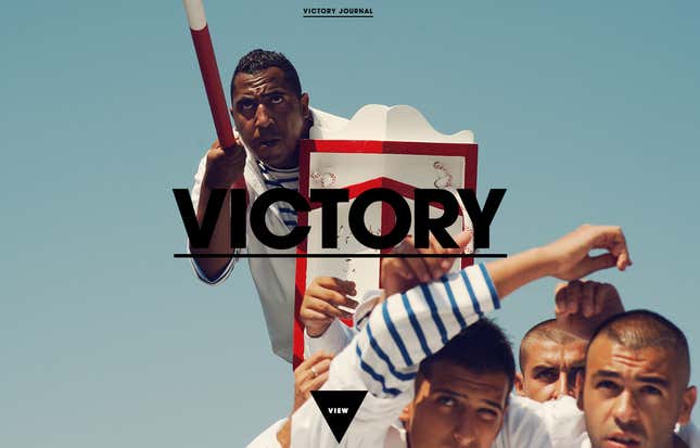
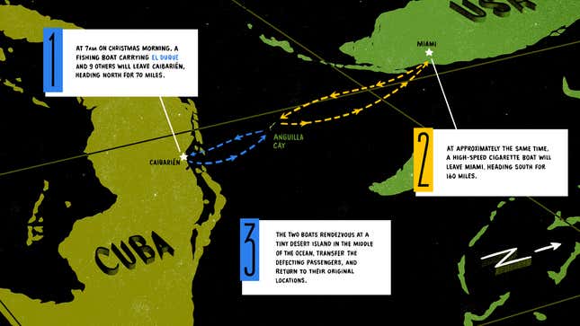
The key to the incredible design of Victory Journal—a sports publication that focuses on stories about athletes instead of tracking the outcomes of games—is great photography and illustrations. Its editors published a long feature about former MLB pitcher Orlando Hernandez’s escape from Cuba, with stunning drawings and some lovely scrolling features. Here’s a shot of that story:
Snowbird
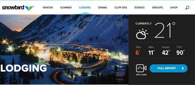
Snowbird, a world-class ski resort in Utah, redesigned its website this year, and it looks fantastic. The most prominent and most delightful feature (on desktop) is the weather report in the upper right-hand corner. When you hover over it, a full summary of which lifts and ski trails are open, in addition to an extended weather forecast, folds out to the left like a pamphlet.
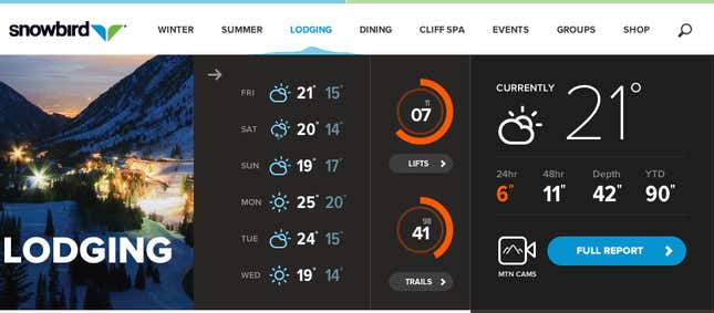
It’s the type of feature that could easily be clunky or annoying, but it’s so fast and sleek that it works beautifully. The site also looks great on mobile.
Dangers of Fracking
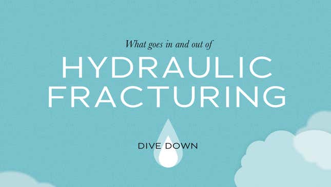
Bringing awareness to the dangers of fracking through web design probably sounds like it would make for a pretty dull site. But this explainer tells the story of how fracking works through a beautiful, continually moving illustration, peppered with key facts. The continuity is extremely engaging. It’s another example of how HTML5 is changing the way we think about how a website should look and function.
Forecast.io
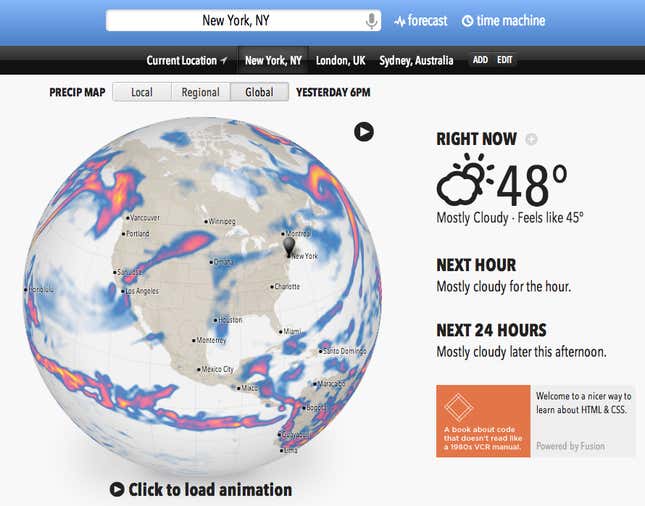
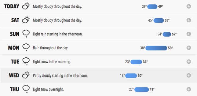
This is the most beautiful weather site out there. Simultaneously simple and feature rich, forecast.io wins major points for prominently displaying the most relevant information when it comes to weather—what the current temperature is, and whether or not it is going to rain or snow in the near future. It also shows storm systems in motion at different resolutions: global, regional, and local. The best part of the design is the graphical display of temperature highs and lows throughout the week. It shows you with a quick glance when it is going to be cold or warm and how much the temperature is going to vary throughout a given day.
Designers’ Friend
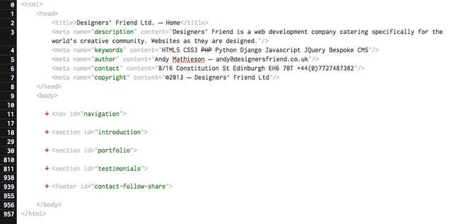
Designers’ Friend is the company of a UK web developer named Andy Mathieson, who teams up with designers to build websites for other companies. The site’s homepage is awesomely meta—it looks like the very HTML documents that underlie every web page on the internet. But it isn’t just static code. You can expand different sections to see Andy’s portfolio, and an introduction to the site. You can even change the text on the page if you want to. It’s incredibly playful and extremely distinctive. And all of that from somebody who claims a “3 year old with an eight-pack of crayola can produce better designs than me.” Oh, and there are hidden jokes, too, like this one, at the end of the paragraph:

Font Walk
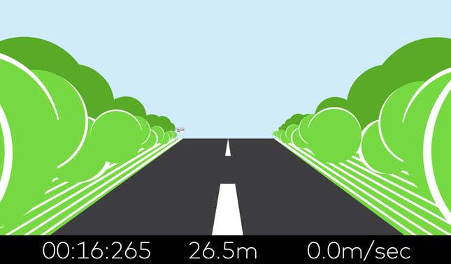
Font Shop recently released Font Walk, a fun site for designers to view samples of Font Shop’s custom typography in a new and creative way. As user scroll down the site, they see an amazing showcase of fonts transforming in interesting ways, or being displayed in the midst of a game. The best part is finding yourself racing down a highway as a timer and accelerometer (shown in a Font Shop font, of course) records how fast you can finish.
Cache Monet
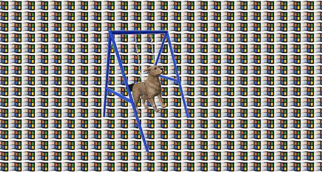
If you’ve never been to this site, just click on the link. It’s a whirlwind tour of the 1990s—AIM chat buddy icons, Microsoft Paint, the LimeWire logo, and Nacho Cheese Doritos—taken on a gif-fueled Willy Wonka boat ride through an acid trip tunnel. Click to change the combination of gifs. Click in rapid succession to put burn holes in your brain.
