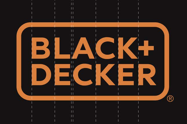
Black & Decker would now like to be known as BLACK+DECKER, part of a corporate refresh that aims to “modernize the brand.” The American toolmaker’s new logo is definitely sleeker. Here’s the before (left) and after (right):

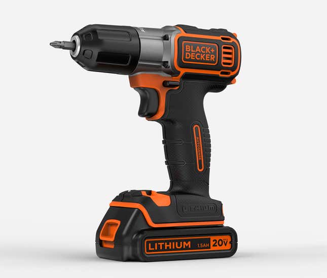
The redesign is most striking in the real-world context where most consumers will first encounter it. Doesn’t this power drill look a bit like it’s from the future?

As Quartz’s Christopher Mims noted (the rest of this piece is drawn from chats and tweets with my colleagues) the modernist aesthetic seems like an attempt to shore up Black and Decker’s market position in the face of lower-cost competitors like Ikea, which sells an electric screwdriver for $25. The list price of the tool pictured above is more like $89.
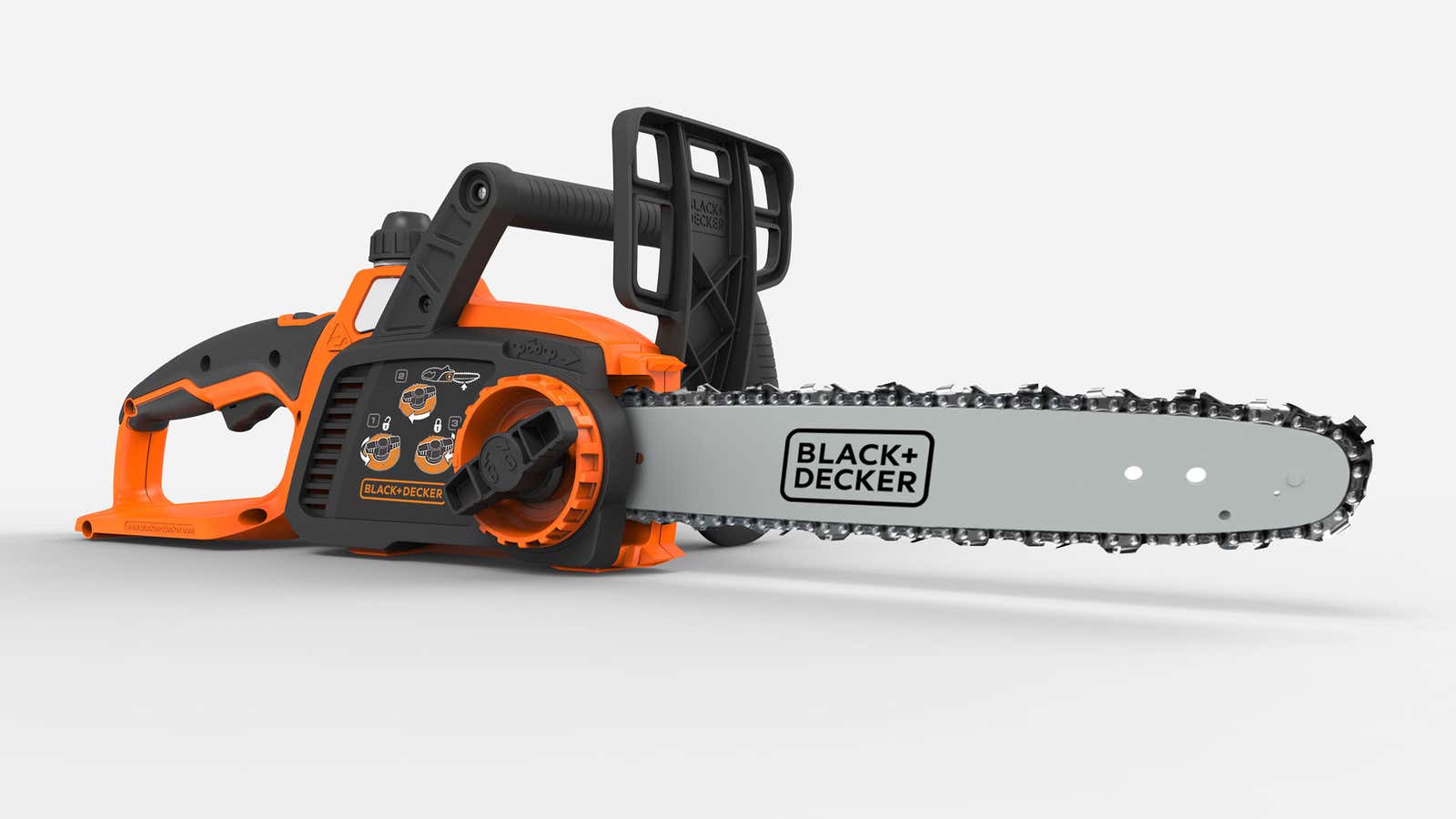
The new packaging almost looks… fake.

It’s reminiscent, actually, of Tropicana’s ill-fated redesign of its orange juice cartons in 2009. The new look wasn’t bad at all, but customers found it generic, a reminder that there’s a fine line between sleek and soulless.

Still, the Black and Decker redesign, by New York-based Lippincott, appears to be an improvement; it received a mostly favorable review from the influential brand design blog Brand New. The site also included a nice history of the company’s hexagonal nut logo, which didn’t survive the latest refresh. Heather Timmons said the original one, introduced in 1921, “says ‘farm to table,’ ‘I made it myself,’ and ‘quality handicrafts’ all in one.”

David Yanofsky thinks the plus sign in the new logo is a reference to a Phillips head screw. (I’m not so sure.) Jason Karaian said the switch from an ampersand makes Black and Decker resemble an architectural practice and adds,
Perhaps the most interesting choice Lippincott made was the logo’s kerning, or the spacing between letters. From the Quartz chat room:


Mims:
every single letter in that logo lines up with the one above or below it, along its left edge
and yet the kerning doesn’t look weird on either the top or bottom word
that is a kerning miracle
some designer accomplished that and was like “my existence is validated”
if you stop looking at the words, this is an extremely nice logo, in my opinion
like, I wonder if part of the reason for the rebrand was they’re trying to make the brand more international… in which case it’s more about the form of the letters, for non english speakers?
Yanofsky:
that kerning isn’t everything it’s made out to be
look at “BLACK” on its own
more like B LACK #amiriteMims:
the kerning only works in context
cutting it in half like that nicely illustrates the balance it only has when taken as a wholeYanofsky:
disagree the Cs are miskernedMims:
one C on the bottom is centered under the A above it
which they had to do so it wouldn’t look like DEC KER
so what this is all proving is that this logo is a master class in the kind of compromises designers make to create a harmonious logo
Yanofsky:
i’d frame it as logo’s aren’t perfectMims:
true
but this dissection has been fascinating
would make a great quartz piece
Sounds good.


