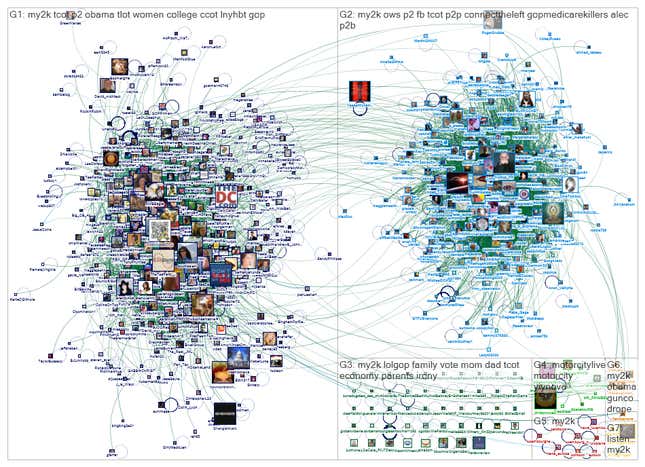
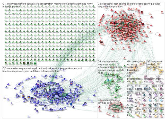
This is what Twitter looks like when two groups with different political views talk about the same thing:

As part of a new study on Twitter’s network structures, the Pew Research Center and the Social Media Research Foundation tracked a single hashtag related to America’s budget conflict over two days. What the researchers found are “large dense groups that have little inter-connection or bridge between them.”
In the map above, the cluster to the right is the “liberal group” and the one to the left the “conservative group.” Not only do they rarely talk to each other, they also use different hashtags and link to different websites within their tweets. Only the rare user, such as @YasserMohamed2 (now suspended) has links to both groups. Unsurprisingly, researchers call this a “polarized crowd.” It is one of six archetypical network structures they found to exist on Twitter.

The result confirms the worst fears of many. As Eli Pariser explained in his book, “The Filter Bubble,” the web tells you what you want to know and social network structures make it hard for outside voices to get in or for different groups to interact. (Pariser is now CEO of Upworthy, which is dedicated to making people read about things they wouldn’t normally read.)
Yet it is hard to prove this thesis without a network-level view of Twitter. “We often feel this polarization, but rarely have the tools to articulate it so vividly,” says Bernie Hogan, a social media researcher at the Oxford Internet Institute who was also an internal reviewer for this study. These network maps, he adds, “provide a clear basis for characterizing different forms of polarization on Twitter.”
Twitter, seen from the sky
The value of the study, released today, lies in the elevated view it provides of a social network that can be very hard to disentangle. Even the most active users will only ever see their own small networks of followers, and so just a slice of the social network. But how Twitter works and looks varies vastly from group to group. For example, 30% of tweets in Korean contain the @ sign, while only 11% do in German. And 30% of German tweets carry a URL, while only 11% of Korean ones do.
Marc Smith of the Social Media Research Foundation (SMRF) describes the study through multiple metaphors: Social media provide individuals only with a limited view of the dense forest of opinion and information they contain, rarely allowing users to see so much as a branch, let alone a whole tree or a forest. Or, to use a more urban metaphor, these are urban squares of which individuals can see only one small corner in a moment of time. Smith likens the research to a time-lapse video of the whole square. Zoom out and hover above the square, and you can see patterns emerge. In addition, adds Pew’s Lee Rainie, imagine that you could also listen to what all those people were saying.
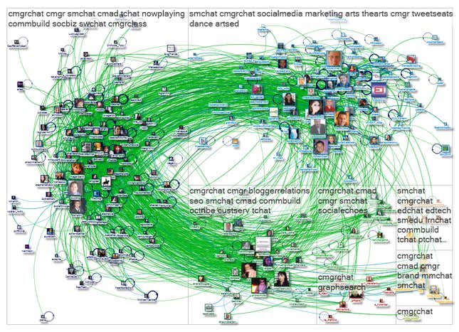
Political polarization is just one of many structures the researchers found. The others include “tight crowds” (seen below); “brand clusters,” in which brands or celebrities are discussed among disconnected users; medium-sized “community clusters” with moderate connections; “broadcast networks,” in which influential people wield tremendous broadcasting power; and “support networks,” for brand accounts that respond to customer queries.

The researchers gathered public data from Twitter and put it into Excel with NodeXL, an extension created by the Social Media Research Foundation. NodeXL visualizes linkages, which produces maps like the ones in this piece. The researchers looked for recurring structures that could not be reduced to each other, and arrived at six archetypes.
There are limitations to the study. Jim Slevin of the organizations and social media research group at Stenden University in the Netherlands points out that without information about physical locations, or indeed without an idea of which other networks individuals belong to, the maps study seems to “largely ignore the impact of the roots of participants and conversations in offline time-space.”
The researchers say they are acutely aware of the limited nature of their study. There could be many more archetypes waiting to be discovered, they say, as well as other languages to mine. They hope that others will extend and deepen their work. Ben Shneiderman, one of the researchers who worked on the report, says the methodology has already been picked up by other researchers both inside and outside the US. Marc Smith of the Social Media Research Foundation says he is also working to extend the NodeXL tool to work with data form Wikipedia, Facebook, YouTube and Flickr. ”We would like to create an atlas of cyberspace,” he says. Twitter is just the beginning.
“Mapping Twitter Topic Networks: From Polarized Crowds to Community Clusters” by Marc A. Smith (Social Media Research Foundation), Lee Rainie (Pew Research Internet Project), Itai Himelboim (University of Georgia) and Ben Shneiderman (University of Maryland). Read the full study here.