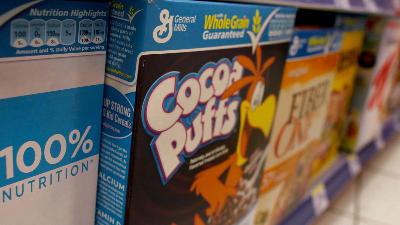
How do sugary cereals snag the attention of kids in the grocery store aisle? According to a new study, brand mascots like Captain Crunch and Tony the Tiger aren’t just there to make you smile. The people (and animals) on cereal boxes are designed to make eye contact with the brand’s target audience. And being fixed with Count Chocula’s unwavering gaze makes you want his cereal more.
The Cornell University Food and Brand Lab study first evaluated the placement of cereal boxes in a small number of grocery stores in New York and Connecticut. Unsurprisingly, children’s cereals were placed on the bottom two shelves, while adult cereals were higher. But the researchers also found that the stares of the cartoon characters on children’s cereal boxes were fixed down at an angle of nearly 10 degrees, on average. On adult cereals, the gazes were nearly straight ahead.
And in preliminary tests, the method seems somewhat effective. When shown one of two boxes of Trix—one with the rabbit looking straight ahead and one where he looks down—adults surveyed showed higher brand trust and loyalty for the one with the straight-ahead gaze. (There was no parallel study of whether kids react better to being looked down on.) The researchers suggest that healthier brands should take on some of these tactics—and that parents avoid taking their kids down cereal aisles all together.


