Wow. The US labor market shifted into a higher gear in April, as 288,000 new jobs were created.
The unemployment rate also tumbled from 6.7% in March to 6.3% in April. But that drop is likely overstating the improvement, because there was a large, unexplained decline in the overall size of the labor force.
In any case, here are a few of the key charts that we pulled from the depths of the report.
So close
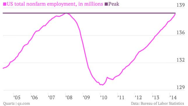
The US is just 120,000 jobs away from recovering all losses from the Great Recession.
Dropping out
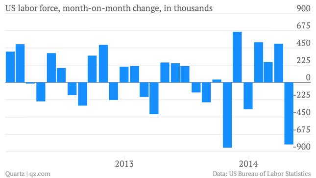
The US labor force shrank by 806,000 in April, and that sharp decline was responsible for the lion’s share of the improvement in the unemployment rate.
Participation
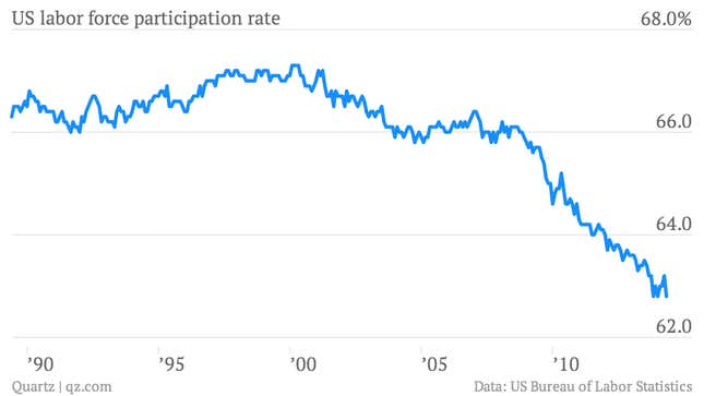
That drop in the size of the labor force sent participation back down to its recent low of 62.8%, after a bounce in recent months. In fact, labor force participation is at its lowest level since the late 1970s. The decline is a reflection of both the recent weakness of the job market and the aging of the US population.
In their prime
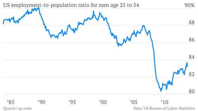
One way to try to strip out the impact of the aging US workforce is just to look at workers in their prime working years. You can see that the percentage of men between the ages of 25-54 who have jobs collapsed sharply during the Great Recession. It’s improved a bit in recent months, but faltered in April when the reading declinined to 83.3% from 83.7% in March.
U-6
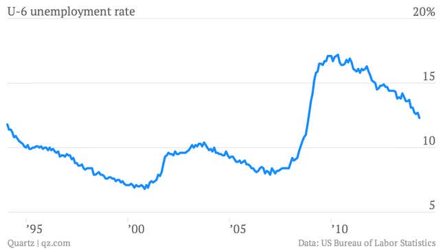
The broadest gauge of US unemployment, the U-6 measures the underemployed and those who aren’t looking for work because of economic reasons. It fell to 12.3% in April from 12.7% in March. That’s the lowest since October 2008. (Although you can see that this reading suggests that the US labor market remains quite weak.)
Skimpy raises
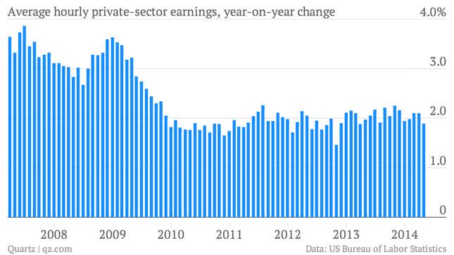
The average hourly wage of US private sector workers rose 1.9% in April, compared to the same month of the year before. You can see that wage growth is pretty stagnant in the aftermath of the recession. This is one of the reasons that the Fed feels free to keep interest rates very low, even as the unemployment rate falls. (Some economists say fast-growing wages can be a pre-cursor to inflation.)
Long-term
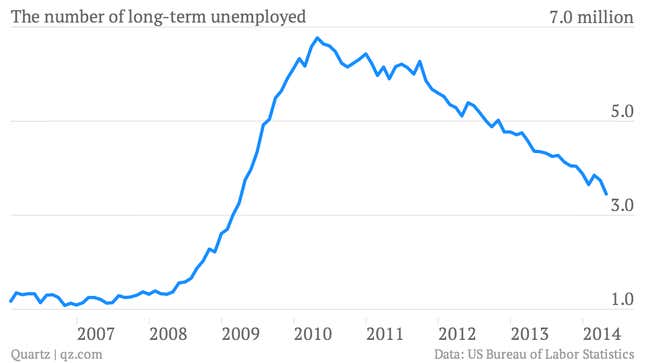
The number of people who have been unemployed for 27 weeks or more continues to fall, it dropped about by about 290,000 in April. This is a key gauge of the amount of “slack” in the US labor market.
…But with a bit more context
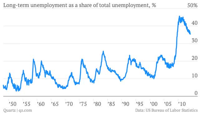
You can see that long-term unemployment still accounts for an outsized share of the total number of unemployed. In other words, there’s still a lot of weakness in the US labor market.


