Thomas Piketty’s Capital in the 21st Century has been at the center of the economic conversation this year, raising questions about inequality and what to do about it. While disagreements over his conclusions abounded, nearly everyone agreed that collecting the historic data underlying the work was an important accomplishment.
Now, the Financial Times’ Chris Giles reports errors and strange practices in Piketty’s spreadsheets, akin to the errors found in a similarly conversation-defining publication, Carmen Reinhardt and Ken Rogoff’s working paper “Growth in a Time of Debt”.
Piketty collected historical data from numerous wealthy countries to assemble his accounting of centuries worth of national wealth. But data can be spotty and imprecise, so he needed to adjust raw data for the book. Giles, examining his spreadsheets, finds transcription errors, adjustments that don’t add up, and unexplained assumptions about inequality data in years without much information.
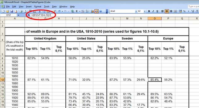
While you should read Giles’ whole article for all the details (it’s not behind the FT’s usual paywall), here’s an example to provide the flavor: When constructing an average measure of European wealth inequality, he does not control for population but uses a simple average across countries, which would distort the final product:
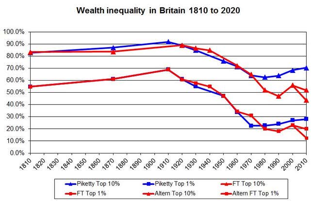
Ultimately, it appears to come down to a question of country-by-country analysis. When the FT compares other UK datasets to Piketty’s data, it finds a glaring discrepancy: Piketty sees British inequality rising again in the last four decades, where other sources show it falling, albeit with a blip in the middle:
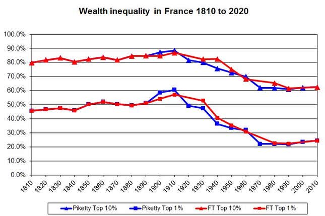
But when it comes to France, where Piketty’s own knowledge and the datasets are stronger, there is a better match:
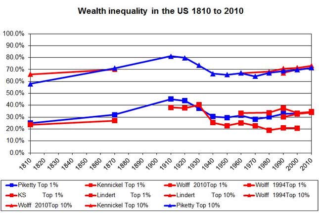
The US is harder than either the UK or France because it has comparatively little data on wealth. Giles didn’t try to make his own set for that reason, but there’s not as much divergence between Piketty’s data and other estimates as in the UK, and American wealth inequality does appear to rise after 1980 by almost every measure:
And that is the bulk of Piketty’s defense, too. In a letter responding to the FT’s analysis, Piketty did not address some of the very specific errors or suspect decisions Giles identified—we hope, in the future, he does—but says that he expects public access to this data will result in improvements to it that confirm his conclusions. While he notes that offshore wealth may lead to undercounting in some sources, his primary defense is that another data set (pdf), created by economists Emmanuel Saez (a frequent Piketty collaborator) and Gabriel Zucman, was built with different sources and methods after Piketty’s book was published but still shows rising inequality in the US:
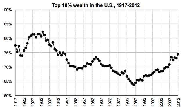
Giles charges that Piketty cherry-picked data to suit his thesis that inequality tends to increase over time in capitalist systems. But it’s not clear that Piketty’s analysis is entirely doomed.
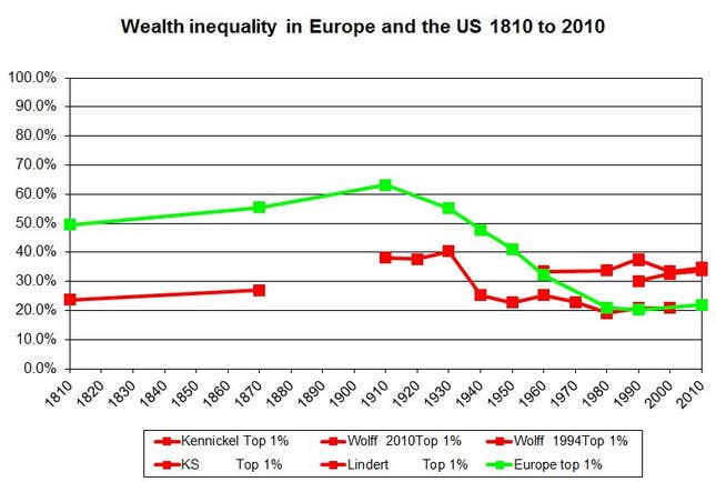
Giles says that he has refuted two of Piketty’s notions: That wealth inequality has begun to increase in the last 30 years, and that the US has a more unequal distribution than Europe. But Giles’ final chart, comparing US and European inequality, is ambiguous on this score. The chart is a mix of different datasets, some of which show wealth inequality appearing to increase—albeit so slightly that it might be a statistical error—after 1980. And some show that US inequality is higher than in Europe—even without including the Saez-Zucman data above, where the effect is more pronounced:
By that reading, Piketty’s ideas could still be plausible, even though problems need to be rectified and further work is needed. No doubt many eager economics grad students are licking their chops.
