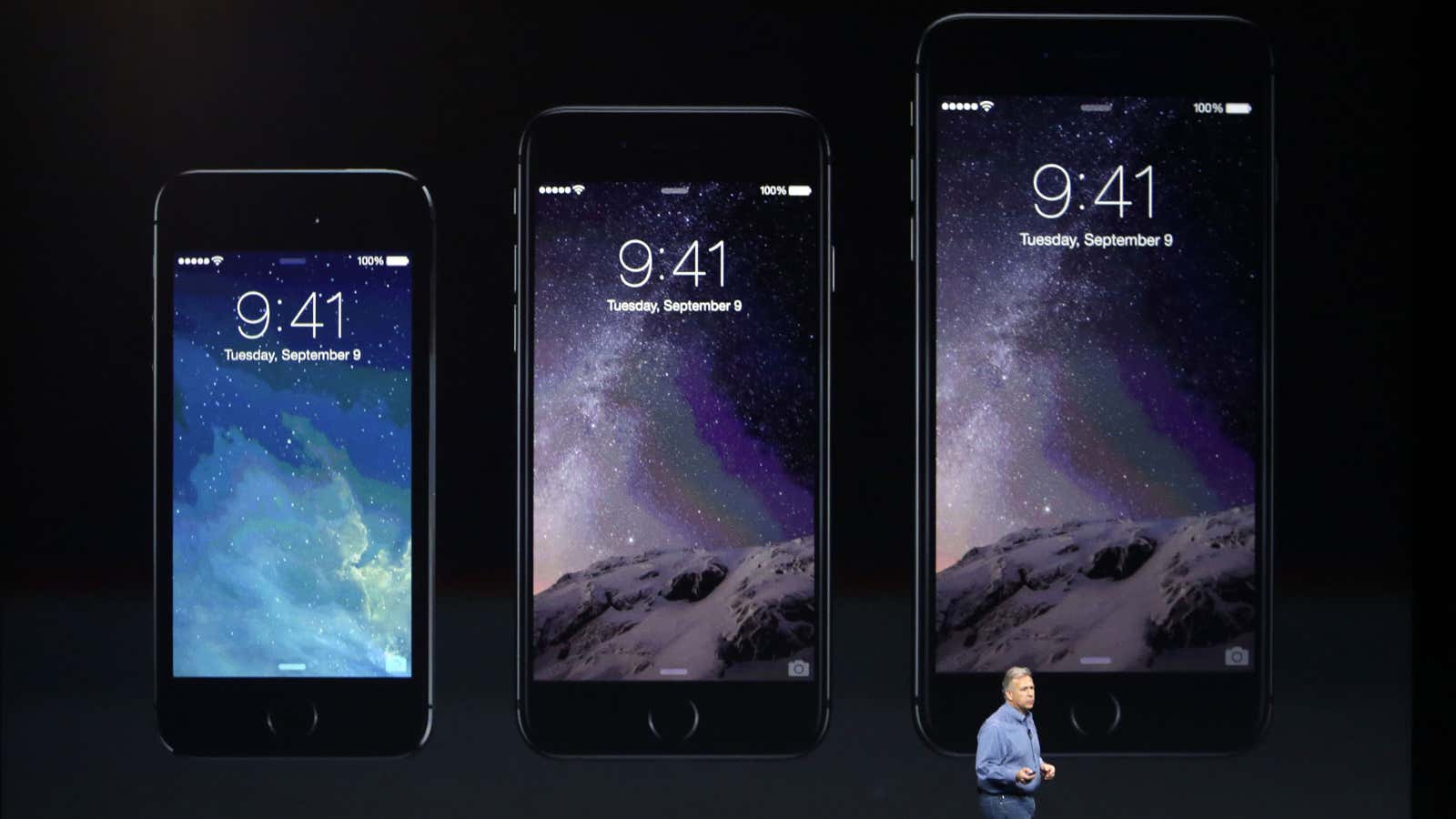
After years of resistance, Apple’s iPhone 6 announcement last week officially signaled the dawn of the Era of Huge Screens.
And it’s going to crash into existence in a big way. Just this Monday, Apple announced that they’d sold over four million pre-orders for the phones the opening night of pre-orders. In only one night, they sold almost half of what they sold the entire opening weekend last year for iPhone 5s and 5c.
So it’s looking like the 3.5” and 4” screens of yore will start their inevitable decline very quickly. That means that those of us who’ve gotten comfortable building apps, responsive sites and mobile-optimized web views with the old ways in mind have some learning to do (myself included).
The decline is already in motion. Adobe’s 2014 Mobile Benchmark Report claims that mobile browsing among phones with 4” screens or smaller is down by 11%.
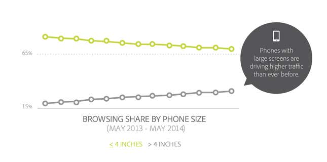
That means that learning how to design for thumbs is now more important than ever. Luckily, it helps that these phone display sizes are going to be practically universal. A cursory examination of the most popular Android screen sizes points to a range of 5.1” and 5.7”.
Apple’s changes will make our lives easier as smaller screen sizes die off. But only if we learn to adapt our designs.
If not, the future is going to be pretty painful for those thumbs.
This is especially important for those of us who’ve only been building iOS apps. All those design tradeoffs we thought we never had to worry about are suddenly right here in front of us — in an avalanche of pre-orders.
Designing for thumbs
What does it mean to design for thumbs? It means building interfaces that are the most comfortable to use within our thumb’s natural, sweeping arc.
But this gets complicated. We unconsciously adjust the way we hold our phones to reach certain controls in various areas of the screen. During any given day, I’ll wager that you stretch your grip, choke up on the phone, or angle it in ways that make reaching difficult areas easier.
But we have to start somewhere. Research suggests that most of us hold our phones in the following way—with the bottom of the thumb anchored on the lower-right-hand corner:
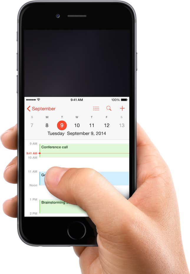
This assumption comes from a study that mobile expert Steve Hoober conducted with 1,333 people early last year. He discovered that people held their phones in the following ways:
- One handed: 49%;
- cradled: 36%;
- two handed: 15%.
Handedness figures were also instructive:
- Right thumb on the screen: 67%;
- left thumb on the screen: 33%.
Hoober notes that left-handedness figures in the population are around 10%. So the observed higher rate of left-handed use could be correlated with people doing other things at the same time—smoking, riding a bike, drinking coffee, eating currywurst and so on.
The Thumb Zone
The Thumb Zone is a heat map of sorts. It’s a best guess for how easy it is for our thumbs to tap areas on a phone’s screen.
Let’s use Hoober’s research to create a Thumb Zone map representing what seems to be the most common use case:
- one-handed use
- right thumb on the screen
- thumb anchored in the lower-right-hand corner
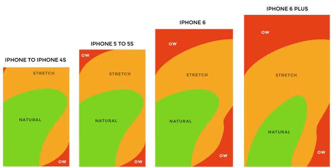
Here’s the Thumb Zone heat map applied to every iPhone display size since 2007:
Here’s a more direct comparison of the iPhone 6 and iPhone 6 Plus next to each other:
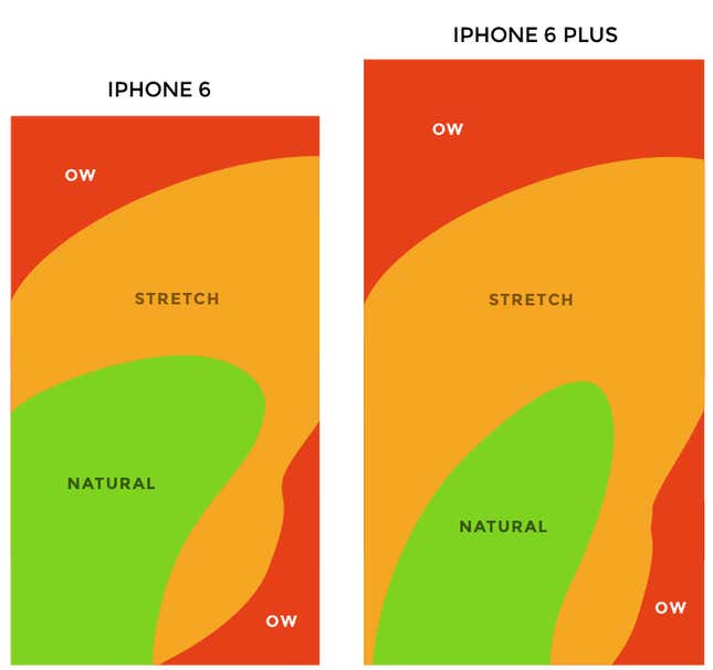
You’ll notice that the “safe” green zone stays roughly the same (more on why the iPhone 6 Plus is different in a second). That’s because our thumbs don’t magically scale with the screen size. And that’s also unfortunate, because I loved Dhalsim in Street Fighter as a kid.

But what changes is the sheer amount of “Ow” space, which becomes startlingly apparent with the iPhone 6 Plus.
Furthermore, you’ll notice how the shape of the “Natural” zone changes for the iPhone 6 Plus. That’s because it requires a different type of grip due to its size, using your pinkie finger as a stabilizer. It surprised me how different the experience was.
A note: my thumb doesn’t reach fully across the phone’s screen. Maybe you have bigger hands than I do. So terms and conditions certainly apply.
Choking up
Let’s analyze how the Thumb Zones change when you shift your grip. Sometimes you might be in a situation where it’s easier to tap the phone with your thumb’s anchor at the vertical midpoint.
Here’s an illustration of this in action for iPhone 6 and iPhone 6 Plus:
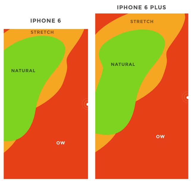
Notice how the iPhone 6 Plus actually gains natural thumb space because of its screen size. By comparison, the iPhone 6 just runs out of real estate.
Reachability
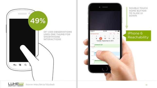
Choking up might not be necessary, though, with iOS 8’s “Reachability” feature. (That is if Apple takes the opportunity to teach people about its existence). By double-tapping the home button (not the same as “clicking” to display running apps), iOS will push the top of the screen down within one’s grasp.
Here’s a demo of Reachability:
And here’s how Reachability looks with the Thumb Zone overlaid on the iPhone 6 Plus. Notice anything?
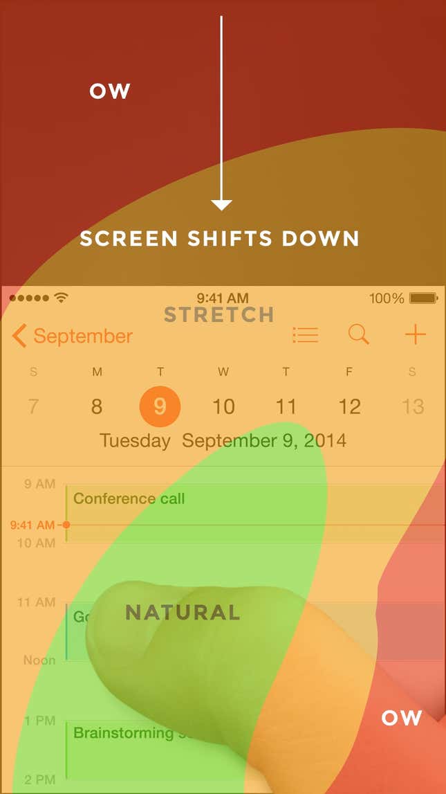
Yes, Apple’s demonstration images places the thumb in exactly the “Natural” zone.
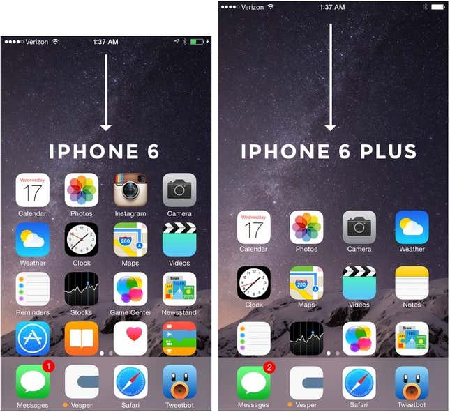
Another observation on Reachability, as pointed out by John Gruber: “Reachability on the 6 Plus moves things further down the display, percentage-wise, than it does on the 6—it’s all about moving the top of the display to a typical thumb’s length from the bottom of the device.”
Here’s that in action:
What does it all mean?
Mobile screen sizes on the whole are becoming more similar, and that’s a good thing. But it also means that we can’t just treat screens in the 5.5” range simply as a scaled-up version of a smaller phone. Grips completely change, and with that, your interface might need to do so, as well.
I think prototyping will become even more important. So if you haven’t jumped on that train, now’s the time.
