The precise location of the boundary between art and science has been in dispute for as long as there have been arts and sciences. With the rise of computer science as a mainstream vocation, the debate has taken on new life. In 2003, Paul Graham, a prominent Silicon Valley investor, argued that “of all the different types of people I’ve known, hackers and painters are among the most alike.” Earlier this year Vikram Chandra, a novelist and sometime programmer, investigated the issue at length in his book Geek Sublime, concluding that coding is not, in fact, akin to poetry.
Ben Shneiderman does not wade into the debate. He simply blurs the boundaries instead. Shneiderman invented the treemap as a means of data visualisation in 1990. It has since become one of the more popular techniques of making complex data easily understood through imagery. Treemaps are suited to a wide variety of data, from the complex, such as this one showing fragmentation in the Android universe, to the straightforward, like the Economist’s most popular stories of last year.
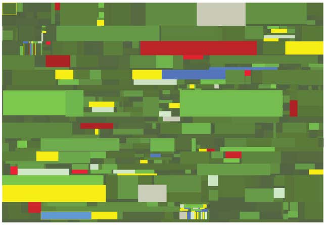
As the examples linked to above show, treemaps can, in addition to being useful, also be beautiful. Enough people had commented on the aesthetic qualities of treemaps over the past quarter century that Shneiderman decided to look back at his creation using his artistic rather than analytical side. The result is a set of 12 prints, which go on display at the National Academy of Sciences in Washington DC next week.
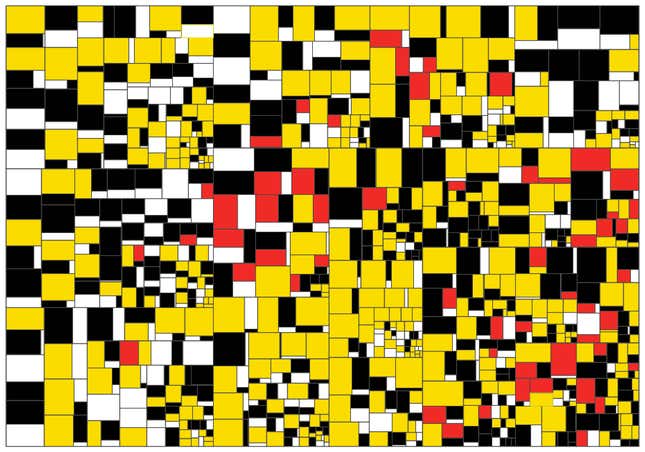
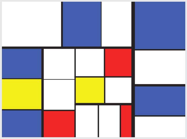
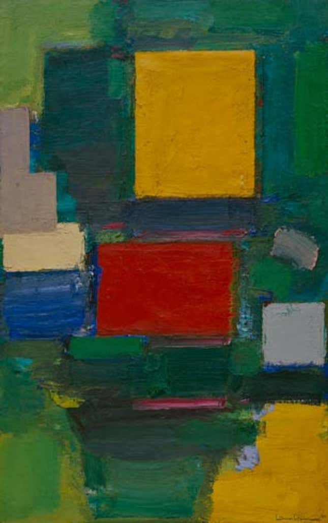
The treemaps for the exhibit, titled ”Everything AlgoRiThm has ART in it,” were created using public data sets from the World Bank, government agencies, and popular websites. Once the algorithm made the basic treemap, Shneiderman chose the color palette, often taking inspiration from artists famous for their colored rectangles, including Gene Davis and Piet Mondrian. Indeed these two pieces are direct homages:

Shneiderman had some initial pushback to his project, both from his scientist and artist friends. One scientist complained that it was difficult to see the treemaps as art. His analytical side insisted on knowing what the squares and colors represent. At the other end of the spectrum, an artist friend complained that his work did not qualify as art since it was algorithmically intermediated.
But that ignores the subjective decisions that are part of such a project: What size should the prints be? What texture? What colors work just right? How should the boxes be laid out?
Shneiderman says that despite intending to use very specific colours—sampling from Mondrian, Josef Albers, or the flag of Maryland, for example—the final result had to be tweaked in order to look just right.
“We intervened and made aesthetic choices. That was part of the creative process,” he says.
Still, it is important not to lose sight of the purpose of treemaps and other data visualisation, Shneiderman says: “Too many busy diagrams look beautiful but do not reveal the context. Too many visualisations are designed for visual appeal rather than intellectual insight. So to my designer colleagues, I would say, keep the aesthetics, but increase the intellectual clarity of what you are showing.”
“Every AlgoRiThm has ART in it: Treemap Art Project” is on at the National Academy of Sciences from Oct. 16, 2014, until Apr. 15, 2015.
