The time has come.
For the last few weeks we’ve been fielding reader submissions and scouring charts collected over the course of 2014. Our aim: to identify a chart worthy of earning the first-ever title of Quartz Chart of the Year™.
As we expected, some of the best suggestions came from readers, including the eventual winner. So without further ado, we give you the first-ever Quartz Chart of the Year™.
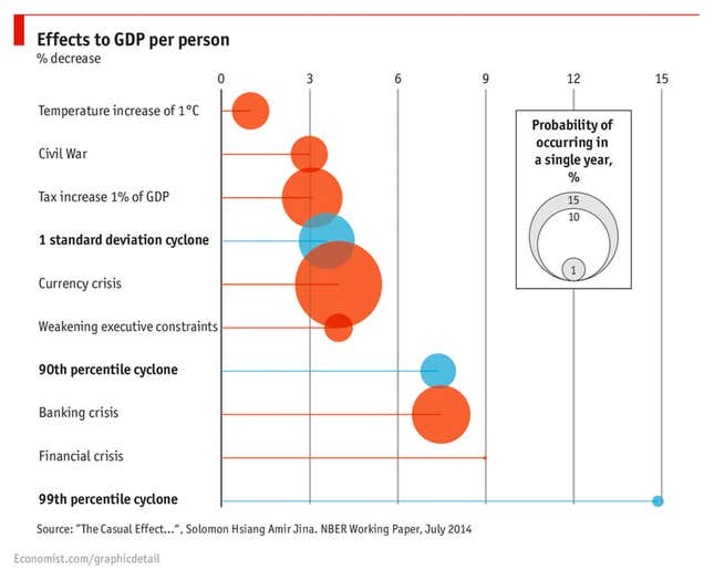
Catastrophic costs, natural and financial. (The Economist/Solomon M. Hsiang, Amir S. Jina)

So why did this chart, which was published on the Economist’s Free Exchange blog in September, earn this year’s honors? Well, it does quite a few things. First off, it’s offering us some new information, having been built on a novel data set compiled by Hsiang of the University of California, Berkeley and Jina, a postdoctoral scholar at the University of Chicago.
The pair effectively built a database of the physical impact on countries of every tropical cyclone—a storm category that includes hurricanes, typhoons, tropical storms, and cyclones—seen on the planet between 1950 and 2008. They then hooked that data up to other long-run indicators of economic growth to see whether large, destructive storms hampered long-run economic performance. The short version? “We first establish that tropical cyclones have a large and robust negative effect on long-run GDP per capita,” the authors wrote.
Then the authors go one step further. They compare the economic impact of severe storms to other man-made economic crises such as banking and currency crises, using the emerging literature on their impact on economic performance. The authors find:
The national income loss associated with a one standard deviation cyclone event is comparable in magnitude to loss associated with a tax increase equal to 1% of GDP, a currency crisis, or a political crises in which executive constraints are weakened. The income loss associated with a 90th-percentile cyclone event is comparable to losses from a banking crisis. The top percentile of cyclone events have losses that are larger and endure longer than any of these previously studied shocks.
The paper uses this data to build toward a specific point: these results should inform our thinking about the economic costs of climate change due to human activity. But the chart produced by the Economist focuses instead on putting the various costs of these crises into context.
It quickly and simply communicates all these really complicated variables, encompassing a vast, historical sweep of information about events that impact large swaths of humanity. It manages to link both the emerging-world economy—where cyclones and natural disasters are serious threats—with the developed-world economy, and the crises that tend to deal the deepest blows to people living there. It even somehow manages to be newsy, giving a sense of how the severe currency shocks now being seen in countries like Russia, Venezuela, and Argentina can cause deep damage to national well being over time. It also explains visually just how probable such events actually seem to be. For all those reasons, this was the one to take Chart of the Year honors.
“It was the perfect storm—forgive the pun—because it brings together several streams in a single chart,” said Kenneth Cukier, data editor at the Economist. Cukier said the paper made especially good fodder for a chart, as it was deeply empirical and avoided going down an overly theoretical path. He said that in crafting the chart, the Economist took care to keep in mind that while the economic consequences of natural and financial disasters might be comparable, the vastly different human consequences—the death and destruction of storms—aren’t.
“There’s a degree of tragedy underneath it, that doesn’t come out in the numbers,” said Cukier, who collaborated with Isaac Gross, an intern in the Economist’s economics section, and Graham Douglas, a visual data journalist—to produce the chart.
Thanks to everyone for their submissions this year—you can review the short list of candidates here.
And get ready to start gathering ideas, as the race for the Quartz Chart of the Year™ of 2015 begins imminently.
