Quartz is known for being a bit obsessed with charts, so we asked members of our editorial staff to submit their favorite charts produced in 2012. What “favorite” means was left to the beholder. Here are the results…
The world’s shifting center of gravity
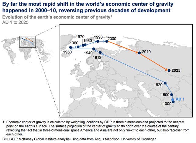
In a single visual, this McKinsey map shows the shift of the world’s economic center of gravity over the past 1,000 years—and forecasts an accelerating move farther east in the coming 15. It’s one of the starkest representations of the intense global change that we’re living in, capturing the quiet but steady shifts of economic power over time. —Kevin Delaney
The hottest year ever recorded
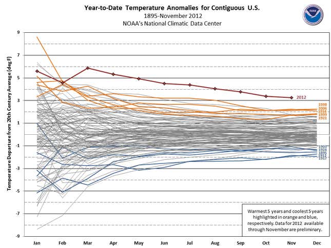
It’s not official yet, but 2012 was undoubtedly the warmest year ever recorded in the United States—and by a wide margin. The situation is similar across the globe. This chart, from the National Oceanic and Atmospheric Administration in the US, shows plainly how hot this year has been. Temperatures through November have been a startling 3.3°F above average. —Zach Seward
The economic impacts of natural disasters
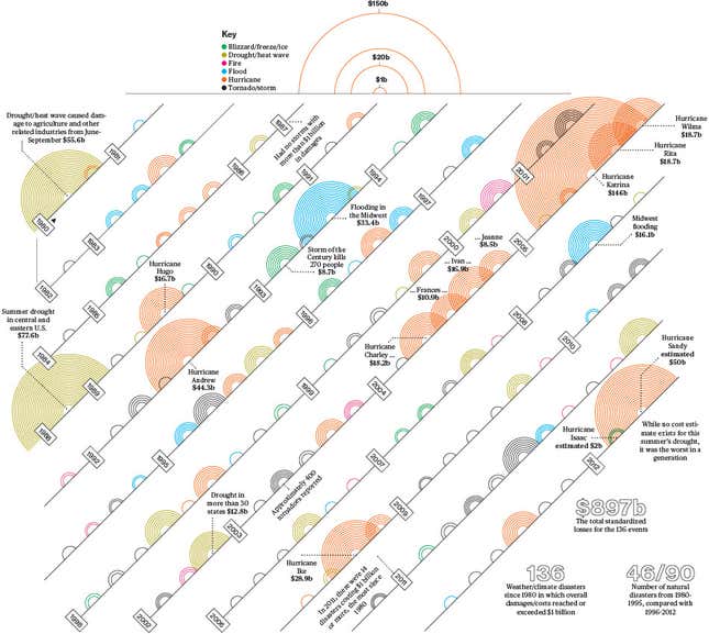
Talking about climate change in terms of rising sea levels and warmer temperatures still feels rather abstract. Casting it in terms of what it does to economies is another matter. This year saw increasingly solid data about that connection. And while climate scientists are usually cautious about linking any individual storm to global warming, they were able to point to various signs that superstorms like Hurricane Sandy are becoming more likely. The above graphic from Bloomberg Businessweek sums up the economic costs of natural disasters over the past three decades: The number of events costing $1 billion or more since 1996 was double that of the previous 15 years. —Gideon Lichfield
What the Chinese are worried about
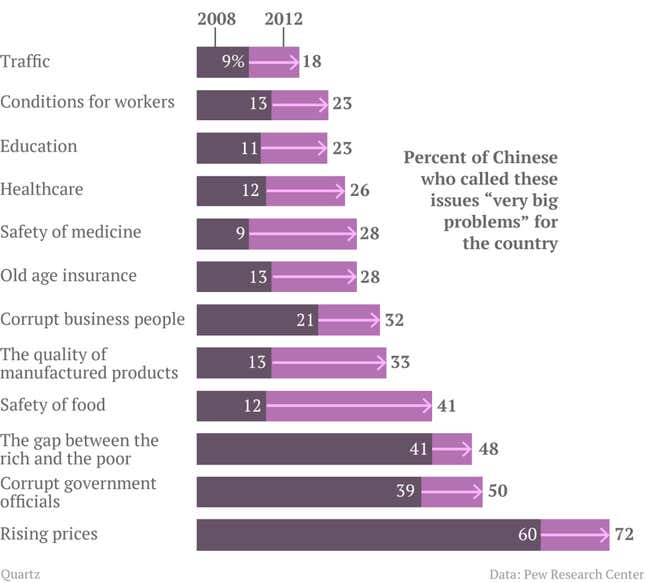
I like this chart, by Quartz reporter Ritchie King using data from the Pew Research Center, because it not only tells us the top 12 issues Chinese people are becoming more worried about, but what problems we’ve been missing in our reporting on China. Food safety—a topic that was in the news a lot in 2008 after the Sanlu milk formula scandal but not since—saw the highest increase in anxiety between 2008 and 2012. While over half of people surveyed think government corruption is a problem, that’s only about a 10% increase since 2008. This is a guess, but if anything is going to bring on mass protests and take down China’s dictatorial government, it’s more likely to be bad food than a massive graft scandal. —Lily Kuo
The rise and fall of the PC
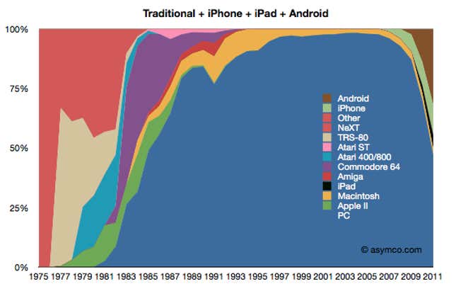
Here’s why I like this chart by Horace Dediu: When you recognize that all computing devices—be they phones, tablets, or traditional PCs—are now, somewhat interchangeably, carrying out the same functions, it makes sense to look at the total market share of all of these devices together. Which brings home the point that not only are we shifting computing to devices that some would hesitate to call “computers,” but also that this represents a unique moment in the past 15 or so years, when the redefinition of computing itself is allowing for a diversity in operating systems and hardware platforms. And it seems almost inevitable that, a decade hence, Android will be as dominant as Windows was from the late 1980s until 2009. —Christopher Mims
Italy’s diminishing enthusiasm for the euro
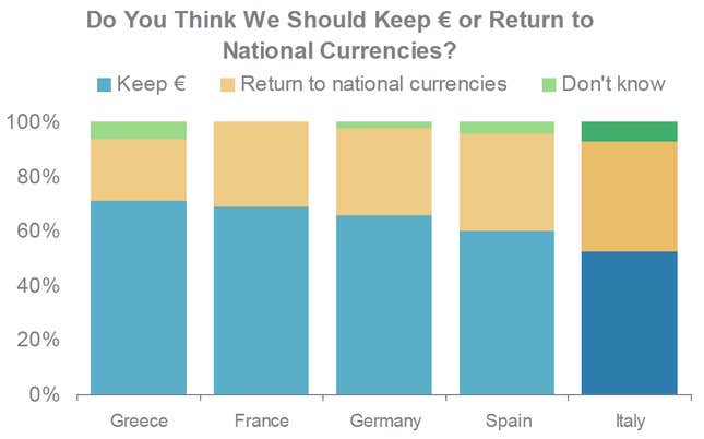
While Greece appears to be the problem child of Europe, a far higher percentage of French, Germans, Spaniards, and Italians would actually prefer to leave the euro and return to their national currencies, according to Morgan Stanley. Continued economic stagnation has generated angst, and the probability of a prolonged recession in the euro area is high.
With new elections next year and most likely without the leadership of Italian PM Mario Monti, the survival of the euro could once again come under fire from a new source: Italy. More troublesome still is that Italy is less dependent upon foreign aid than other peripheral countries; though its debt was equal to 120.1% of its GDP in 2011, Italy nearly balances its yearly budget. An Italian departure from the euro is probably unlikely, but an Italian shock to the euro area could be crippling. —Simone Foxman
Americans finally start to borrow again
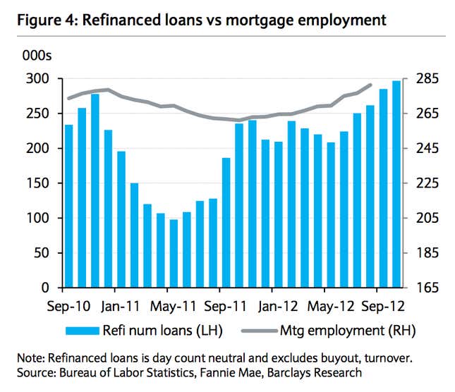
This Barclays chart might not be the most dramatic-looking, but it is precisely where the rubber meets the road for the US economy. Since the financial crisis, the US has been mired in what economists like to call a “liquidity trap.” It sounds complicated, but basically it means that people and companies are so freaked out about the state of the economy or their own finances—or both—that they have zero appetite for borrowing money. That means that the Fed’s main way of prodding the economy out of recession—lowering interest rates to induce borrowing—loses potency. Why? Again, because people don’t want to borrow.
An added wrinkle is that the Fed’s powers of prodding the economy forward were also weakened during this recession because despite record low interest rates, many people were unable to refinance their mortgages because they were underwater—owed more than the house was worth—making them ineligible. So what this chart shows is refinancing activity picking up, along with mortgage hiring. It suggests both demand for loans and capacity for lending are growing. And it could be the start of a very important turn for the US economy. —Matt Phillips
The history of US debt from 1790 to 2011
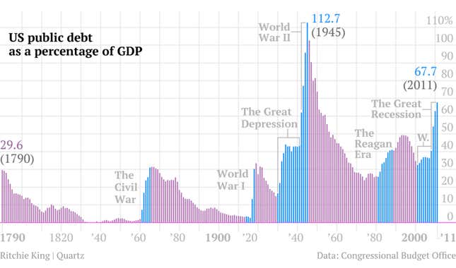
This chart, by Quartz reporter Ritchie King in a post by Matt Phillips, is my favorite because it contextualizes the US economy to show that we’re not quite in the financial apocalypse that seems to be upon us. The debt load during World War II was far worse—and it was followed by one of America’s periods of greatest prosperity. —Lauren Brown
The invisible bailout of the US economy
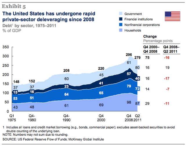
This graph, from a January McKinsey report, shows how the United States government has been taking on debt so that consumers and businesses may shed it. Government stimulus measures and transfer payments allow consumers to deleverage. In return, debt accumulates with the public sector, which borrows more cheaply and has a longer time horizon for managing debt than people do. That helps explain why the American economy has been expanding, thanks in part to more consumer demand, even as public debt has swollen to levels unsustainable in the long term. It’s an invisible bailout. —Tim Fernholz
The mission to kill Bin Laden, deconstructed
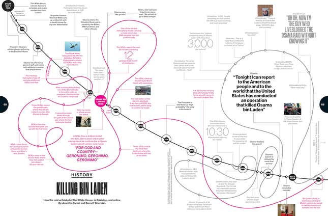
It ended with the world’s most wanted man buried at sea, but it started with a sandwich order to Costco. Bloomberg Businessweek compiled the events of May 1, 2011, into a comprehensive timeline of the actions, rumor, and decisions that surrounded the raid that killed Osama bin Laden. —David Yanofsky
Obama’s chances, deconstructed
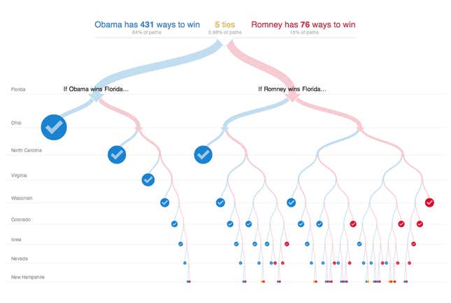
What an awesome utility. I spent all evening on the day of US election glued to this thing from The New York Times, answering my own what-if questions, watching different branches disappear as different states were projected. I love how the graphic takes a problem that’s way too crazy for mental math—the combinatorics of electoral outcomes in swing states—and makes it tractable, not by simplifying it, but by providing a way to explore the complexity. —Ritchie King
And finally…
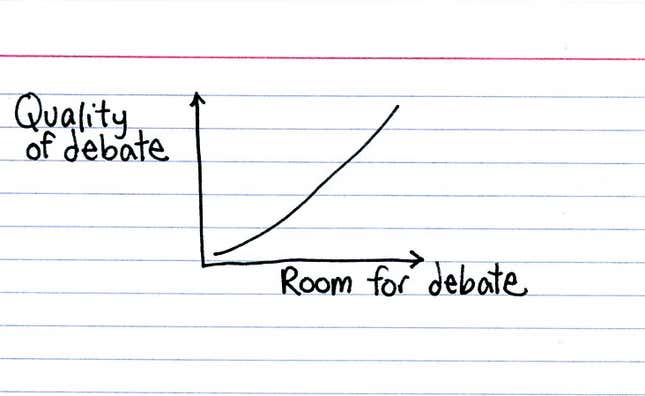
I love an irreverent chart. I love how a few lines can bring an obvious but overlooked observation into sharp focus. Jessica Hagy serves up simple graphs daily on her blog Indexed. This one is called, “Otherwise it’s just an argument.” Yes, her titles often contain more words than her charts. —Gloria Dawson