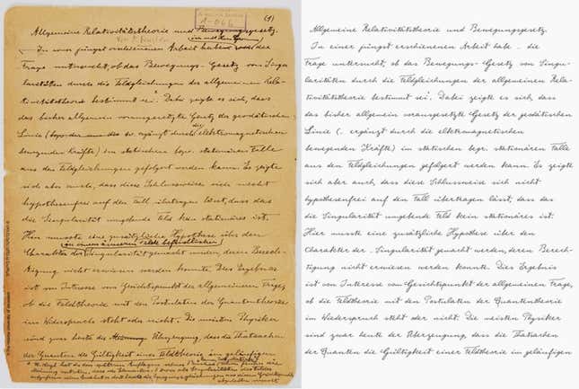
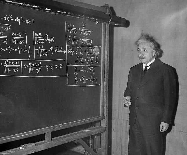
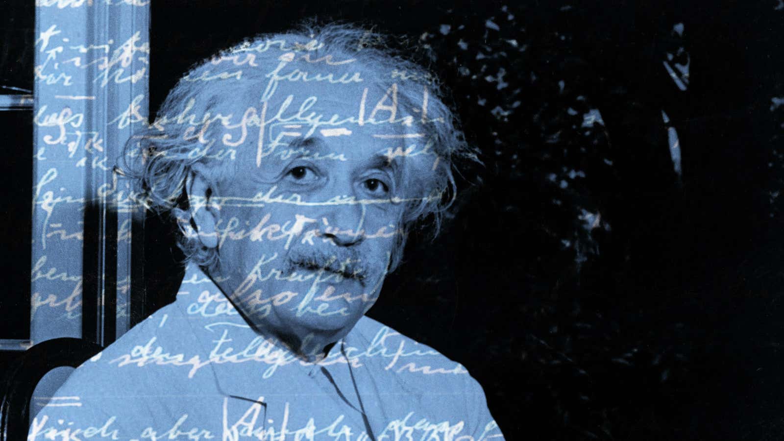
Soon your mundane emails can look like the scrawlings of a genius. A new font based on Albert Einstein’s handwriting is being developed in Germany, in time for the 100th year anniversary of the theory of relativity.
Aided by a thriving Kickstarter campaign, the German typographer Harald Geisler and the Harvard-trained physicist turned dancer Elizabeth Waterhouse are about to embark on the last laborious stages of production for the typeface, a project they started in 2009.
The research for the typeface involved poring over hundreds of pages of manuscripts in Einstein’s archives over the course of six months. With a pen stylus, Geisler traced samples of Einstein’s scrawl over and over again until he developed an intuition and intimacy with the Nobel Prize winner’s script, slant, rhythm and form. “This knowledge provides a foundation that I can improvise on,” Geisler tells Quartz. “This is necessary for the @ sign or the € sign—characters that were not common or had not been invented during the time of Einstein.”

While similar handwriting-based fonts are already commercially available—say of Cézanne, Picasso, Michelangelo, even Barack Obama to name a few—Geisler and Waterhouse are not satisfied with the cookie cutter approach to font-making.
“If you look closely at many handwriting fonts, the scripted letters are repeated without variation—nothing like the actual art of writing with a pen or pencil,” notes Waterhouse in the project’s manifesto. “[Handwriting] varies depending on mood, speed, and materials used.” The Albert Einstein font will have at least four variations on each letter, creating a lines of text that are more “life-like,” they say. An automatic script will adjust the letter’s style based on previously used characters, so the effect will be that no two successive letters will look alike.
The font is being designed to be compatible with PC, Linux and Mac operating systems and will work on mobile phones and tablets.
The irony of typing with handwritten script on digital devices is not lost on its creators. Paying tribute to science’s favorite poster boy is actually just one of their goals. Geisler and Waterhouse are really asking deeper questions about the diminishing (or evolving) role of our flawed, variable penmanship as a conduit of thought in today’s pixel-perfect landscape.
They ask, “Is thinking related to movement of your hand as you write?” And if the robust support for their Kickstarter campaign (they’ve raised more than $20,000 of the $15,000 goal with over a month to go) and the massive support for Geisler’s Sigmund Freud font in 2013 ($25,000 of the $1,500 goal) are indicators, it seems that their project has honed in on a collective concern too.
Lamenting the loss of penmanship instruction in school curricula, Waterhouse wrote,”this project aims to raise awareness of these changes and to support the value of penmanship as a fundamental quality of human intelligence and culture worthy of continued instruction.”

“My dream is that one day children in high school will learn to draw their own font which they will continuously develop over a lifetime as their own typeface,” muses Geisler. “If we think of a typeface being continually refined and designed over a lifetime, would this make up for the cultural value of handwriting?”
