New logos are easy targets. Mocked, manipulated, and abused, the online militia of Photoshop-savvy design commentators are quick to pull the trigger whenever a new logo is launched—and often miss its point.
The fate of the new IHOP logo was no different. For the first time in over 20 years, the popular American restaurant chain IHOP (International House of Pancakes), announced an update to their logo this week.
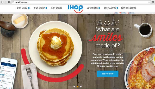
Designed by Studio Tilt, which is based in Kansas City, Missouri, the modernized emblem liberates the four letters from the traditional blue rectangle and flips the red arc beneath, repositioning it under letters “o” and “p” to form that all-too-familiar logo smile.
The internet wasted no time pointing out this tired graphic device.
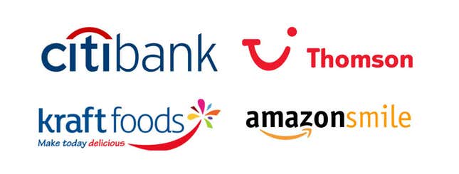
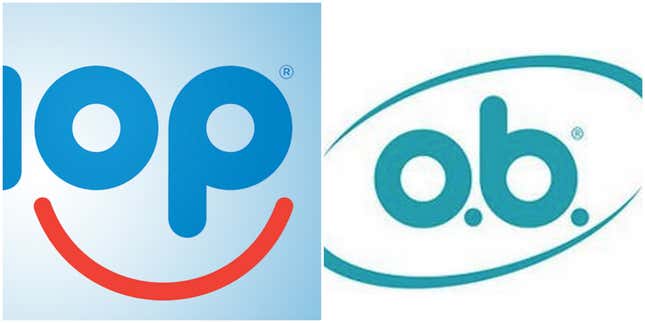
Some have even noted the new logo’s resemblance to a tampon brand.
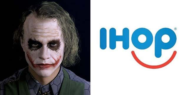
But the stickiest comparison may be the one from Fast Company, which likened the logo to the smile of “a deranged clown.”
This may have been what inspired others to describe IHOP’s new emblem with a generous pour of snark and self-indulgent fiction, in which the grin is recast as a grimace. This image was posted by a reader on the popular logo forum Brand New.
But IHOP, a division of Glendale, California-based DineEquity, seems to have been going for something less sinister. “Our guests have told us for many years that coming to IHOP, and in many cases just thinking about our world-famous pancakes, makes them smile,” Kirk Thompson, the pancake chain’s vice president of marketing, said in a news release about the logo update.
Branding expert Bill Gardner who publishes an annual logo trends report and has observed the IHOP logo in development since last year, offers a broader way to understanding the redesign.
The logo as a road sign
“It’s important to remember that the logo was redesigned along with the whole restaurant,” Gardner says. The implications for the chain’s signage would have been an important consideration. Many of IHOP’s 1,600-plus outlets across the US are roadside restaurants after all. In effect, the logo doubles as a road sign or a marquee—like a bat signal for pancakes on the horizon.
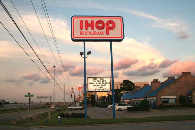
Gardner, who also owns a design practice, notes that the design team that worked on the IHOP update is part of 360 Architecture, owned by HOK, a global architecture and engineering firm tasked to re-envision the family restaurant, not just the logo. In other words, the graphic designers were thinking of its application in all types of spaces—both virtual and physical.


How bad design happens
IHOP tells Quartz that in the quest for a new logo design, “all breakfast-related concepts were considered.” But why default to the sappy logo smile in the end?
It might have something to do with the fact that some people, including at IHOP itself, saw the red, umbrella-shaped element on the old logo (the ribbon where the word “restaurant” rested under the IHOP name) as a sad-sack frown.
“If the frown had not been brought up, maybe the smile would not have been necessary,” Gardner explains. “The smile was a direct response to the frown,” he says.
Gardner’s observation is important because it surfaces the the oft-forgotten fact that final designs ultimately are shaped not only by designers but by a whole spectrum of decision makers and influencers—focus groups, neighbors, spouses, grandmothers, hairdressers, professional and amateur critics in all media channels.
Behind every brand mark is many hours of research, strategy meetings, prototyping, testing, and tweaking involving many teams. While the usual form of design appraisal may be good for a quick chuckle—even a belly laugh—it misses the opportunity to explain the place of powerful, well-designed logos in business operations. Perhaps if we stopped clowning around with logos so much and took the time to understand their strategic value, we might actually see even better designed ones.


