Twitter’s product and engineering departments will bear the brunt of the 300-plus job cuts the company has planned. Can the survivors accomplish what a larger team couldn’t?
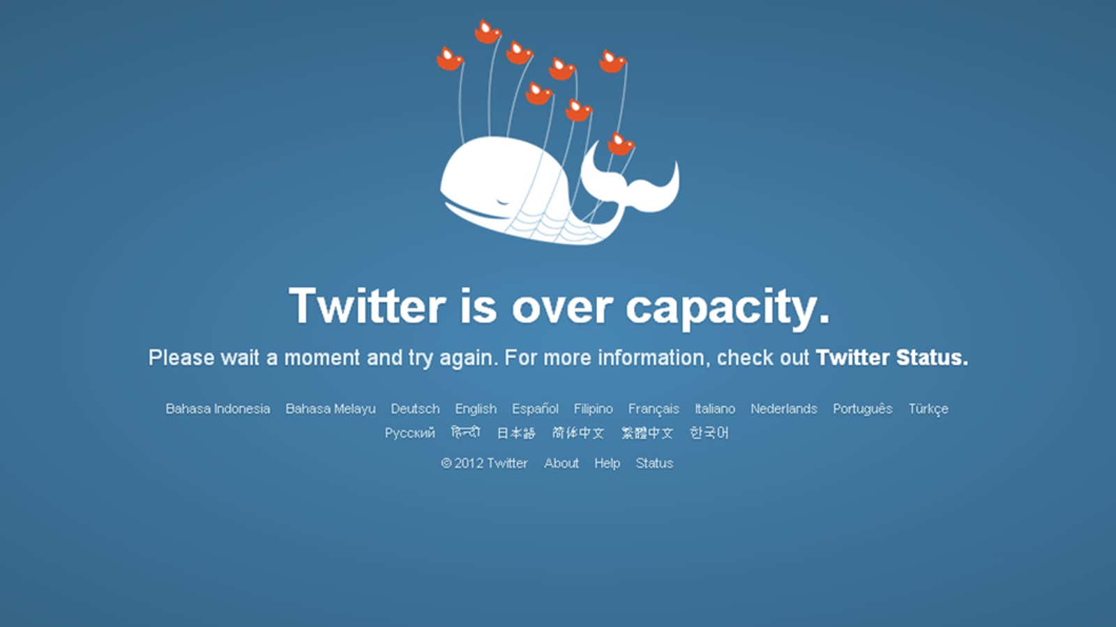
For years, Twitter has trailed the competition in terms of features. While Facebook managed to incorporate photographs, links, and long status updates into its billions of users’ feeds without skipping a beat, Twitter struggled just to serve up 140-character bursts of texts with consistent reliability.
In fact, many of the innovations we associate with Twitter didn’t even come from within the company. Hashtags began as a way to organize groups in IRC, and former Google designer Chris Messina was the first to suggest Twitter incorporate them:
But management at Twitter reportedly wasn’t into it. “[Twitter] told me flat out, ‘These things are for nerds. They’re never going to catch on,’” Messina told the Wall Street Journal back in 2013.
Twitter also didn’t come up with the bird icon, or even the word “tweet.”
When you consider the features still noticeably missing from Twitter, cutting hundreds of engineers from the company might seem like a strange move. Here are five things Twitter needs to do right away to become a better, more useful app:
1. More than 140 characters
Originally, Twitter limited tweets to 140 characters because that was the standard number of characters mobile phones at the time could handle over SMS text messaging. But times have changed. Now we have smartphones with data plans, and there’s no limit to the amount of text we can send.
Sure, the restriction on length keeps tweets concise, but Twitter could preserve this by only showing the first 140 characters in a tweet by default, and adding something like a “show more” button you could press to see the rest. They could still force users to keep their thoughts short, say 140 words, while also keeping your timeline moving.
2. Conversation threads you can actually follow
Ever try to follow a long back-and-forth conversation in tweets? It works fine if two people take turns tweeting at each other, but gets tedious if multiple people get in on the conversation and the thread begins branching out in several directions. A company like Twitter, which specializes in bursts of conversational text, should absolutely own this feature. Instead, it leaves you looking at a weird series of starting points, unsure where to click.
3. Consolidation of links and topics
Twitter sometimes tells you about popular links that many of your connections are sharing, but the notifications seem random and elusive, and that metadata has never been worked into feeds in a meaningful way. It may be important to Twitter to keep its feed in chronological order, but if a link is flying by that 20 other people I follow previously shared, why not let me know this is something I should pay attention to?
This is something Facebook has been doing for years, not only to keep your timeline clean, but also to signal something is happening that a lot of your friends are interested in.
4. Better search
This is another area where a company that specializes in pedaling text should excel. When you open a Twitter user’s feed, or your own feed for that matter, intuition tells you that you should be able to immediately search the feed for given keywords. But that is not the case.
Twitter’s search box, unless you’re on the advanced search page, is a universal search, with no checkbox to search only the page you’re currently on. The advanced search page offers most of the search options a typical user would probably want, but it’s cumbersome—it requires work, and feels like a relic from the last decade.
5. Consistent display of media across platforms
When you link to an image on Twitter, the ideal user experience would be for everyone to see that image right there in the tweet, without clicking the link. But as it stands, if you want your followers to see an image without clicking, you have to upload it directly to Twitter first.
And depending on your platform—whether it’s TweetDeck or twitter.com or a mobile device—you may or may not see the useless, space-consuming URL to the Twitter image. Similarly, links to articles display differently on desktop than on a smartphone or in TweetDeck. On desktop, you have to click into a tweet to see a preview; on TweetDeck, there is no preview. Consistency across platforms is another area Twitter’s competitors have mastered, and where Twitter continues to fall behind.
Perhaps Twitter’s software-engineering department has become too bloated and bureaucratic to get anything done; as CEO Jack Dorsey’s memo about the layoffs suggests, maybe a smaller team will be able to iterate through updates and improvements to the app more quickly. On the other hand, perhaps the remaining team, which is now likely demoralized, will produce work in volumes proportional to the number of cuts that have been made—in which case the upgrades could come slower still.


