This is the story of two big round things that loom large in our culture.
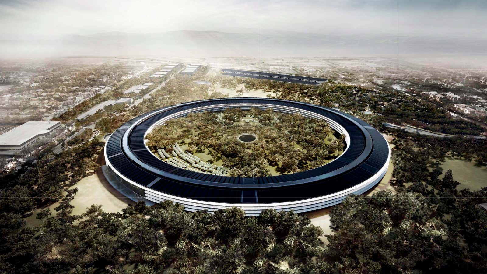
The first of these is Apple Computer—and its ideas and ethics, as embodied in its monumentally circular new headquarters, now finishing construction in Cupertino, California (above).
The other is the Death Star—the spherical, moon-sized battle station and colossal narrative device of the first and third original Star Wars films.
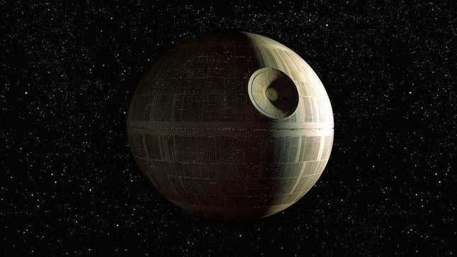
The comparison between the two was instantly drawn when images of Apple’s planned building first appeared in 2011. (“Apple to Build Death Star HQ,” announced—for example—Stuff magazine.) It may, at first glance, seem like the apotheosis of hipster-nerd; roundly and reflexively associating one empire’s icon with another’s.
But as the much-hyped seventh Star Wars film, The Force Awakens, approaches, and the enormous edifice in Cupertino nears completion, there’s a lot to be learned by looking at these things together, and not just because the careers of Apple’s Steve Jobs, Star Wars creator George Lucas, and several of their key lieutenants are unexpectedly intertwined in the Bay Area’s urbane technological ferment.
It’s also because the Apple building and the Death Star, with all their closed perfection, reveal a great deal about why today’s world looks and works the way it does. In particular, they point to the conflict and balance between order and openness, between power and the distribution of power, that must be constantly negotiated, and renegotiated, as we craft culture, city, and society at the beginning of the 21st century.
Just like in the breathless sci-fi serials and proto-mythic narratives that were combined into the original Star Wars scripts, there are no coincidences here.
Episode I: Under Construction
Jobs himself alluded to the Apple headquarters’ otherworldly aesthetic when—already gaunt with the illness that would end his life months later—he presented the design to the Cupertino city fathers in 2011. “It’s like a spaceship has landed,” he said.
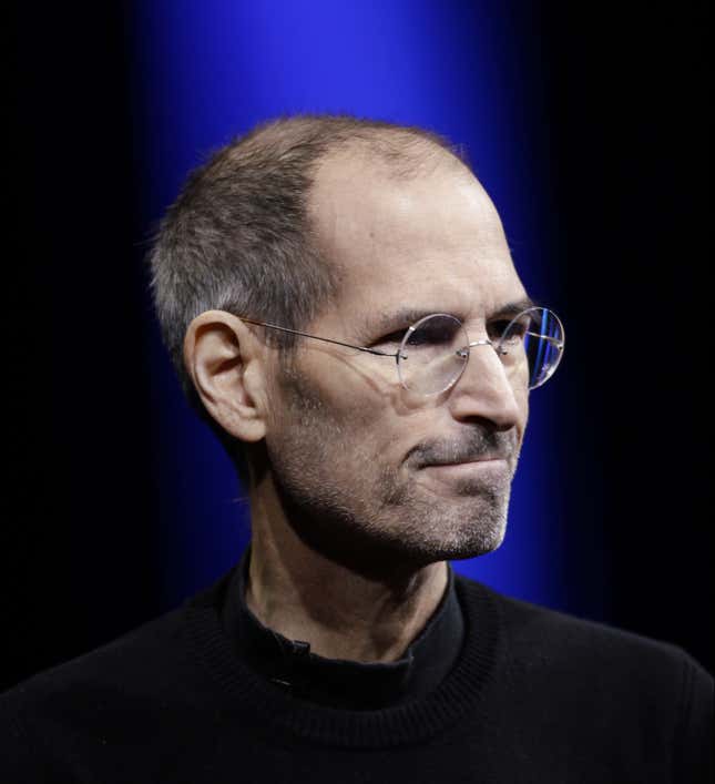
Jobs’ own remarkable life was inextricably linked in its dramatic first and third acts with the fate of Apple. But its messy second act was at least half-spent in the wilderness—or its Silicon-Valley equivalent, Emeryville, a former warehouse district outside of Oakland, across the Bay and a world away. There, he contributed to the rise of a very different kind of technology company, the digital moviemaking powerhouse Pixar—which, until Jobs took it over, had been a small, digital division of the Star Wars creator’s own empire, Lucasfilm.
Under Lucas, Pixar had started out as a project whose ideals might well have appealed to the Apple founder. It was intended not as a way to produce the Star Wars films themselves. Instead, the goal was to produce the techno-utopian vision of filmmaking that those blockbusters were supposed to fund.
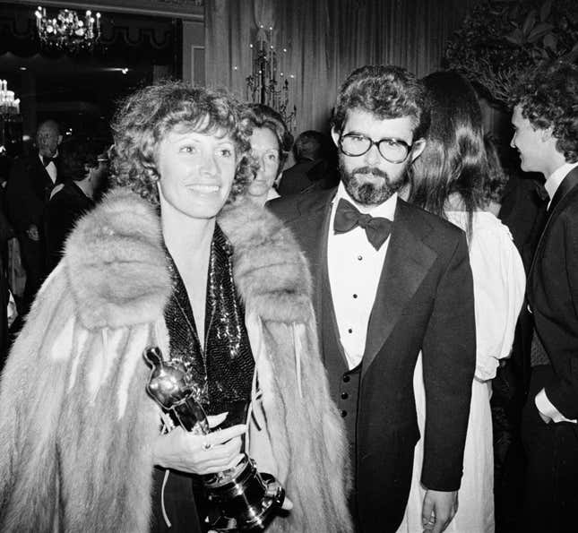
In production even more than in shooting, filmmaking was, and remains, an information problem. In the 1970s, assistants still rooted through laundry hampers of unrolled film to find sequences for editing. Once those sequences of printed-positive film and magnetic-tape sound had been cut together by an editor—such as Lucas’s collaborator and wife, Marcia Lucas—the film’s whole edifice had to be precisely reconstructed by white-gloved studio technicians, at enormous expense, from the corresponding strands of original negative.
Lucas’s dream, together with his early mentor and collaborator Francis Ford Coppola, was of an independent artist-filmmaker, liberated from the dictates and follies of the market by a high-technology production environment. This vision relied on the ability of new technologies—computerized editing systems chief among them—to allow the filmmaker the same creative control on complex, high-budget projects that Lucas and Coppola had enjoyed as film students at USC.
Pixar itself had begun as a small, eccentrically funded computer graphics lab at the New York Institute of Technology on Long Island, its founder’s seemingly far-off dream to make digitally animated movies. When Lucas recruited its key members to Marin county in 1979—the lab’s director, Ed Catmull, along with Alvy Ray Smith, Tom Cunningham and others—it was, however, more for their expertise in digitally organizing the filmmaking process than in digitally rendering it. Lucas sought to extend and amplify the power of the individual at filmmaking’s center, the director, with computing—much like the Force for a Jedi knight. Especially after an unwelcome studio re-cut of the remake of his film-school thesis THX 1188, it was a vision to which Lucas enthusiastically aspired.
It was not in fact the Pixar team that made the very first computerized rendering of the Death Star. That was one of their early colleagues and competitors in computer graphics—animator Larry Cuba, on borrowed computing equipment at the University of Chicago. It was, however, the very first use of 3D computer graphics in Hollywood film. Not the Death Star’s first sighting, mind you—as a massive, painted-and modeled orb encountered by Han, Luke, Leia and Obi-Wan amidst the asteroid field of the destroyed planet Alderaan, the first Death Star’s first victim. But rather, its much more ghostlike appearance towards the end of the film, as a three-dimensional display in the war-room of the Rebel Alliance, guiding the mismatched X-and Y-wings of the attacking fighters to their unexpected victory.
Episode II: Starkillers and Skywalkers
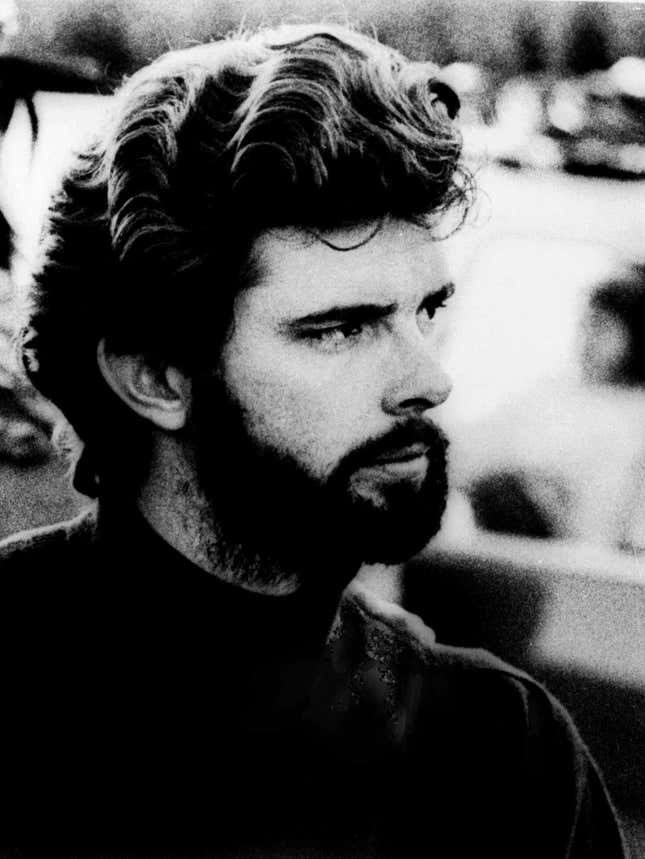
Lucas’s own relationship with technology, and its liberating potential, had started far earlier than film-school, in the hot-rod culture of far-suburban Modesto, an hour’s drive and a world away from the hills of San Francisco. (Only a near-fatal accident in 1962 led to his abandoning ambitions as a racecar driver.) Much like today’s smartphones, the endlessly customized hot-rods of Modesto were—as depicted lovingly in Lucas’ second outing as a director, American Graffiti—the technological means by which teenagers escaped the eye of their parents, encountered each other, and established and broadcast their own, nascent identity. It was a journey of self-actualization through technology that even makes it into Star Wars, with Luke’s landspeeder standing in for Lucas’s beloved Autobianchi Bianchina; both of them left behind as their drivers moved on to larger emotional and technological pursuits.
Lucas’s hope for Star Wars was ambitious but direct: to create a serial, in the tradition of the Flash Gordon films of his youth, whose proceeds would fund the independent production facility he dreamed of. But it was with the most essential part of his characters’ identities—their names—that Lucas began the project of writing Star Wars. He spent almost a year compiling lists of names—some used (Boba Fett, Darth Vader, Jabba the Hutt, Princess Leia Organa, Obi-Wan Kenobi, Han Solo), many not (Mace Windy, Ford Xerxes XII, Thorpe, Zena, Bail, Valourm)—before he began work on the script.
The name he would ultimately give to his compound in Marin County—Skywalker Ranch—would, however, come from a different source. In 1976, a month into filming Star Wars, the movie’s young hero still bore the name given him on the yellow-lined pages of Lucas’s original listing of names: Luke Starkiller. But that spring, a TV movie version of Vincent Bugliosi’s true-crime book Helter Skelter pushed the Manson Family Murders back into the news. “Starkiller” suddenly didn’t sound so good.
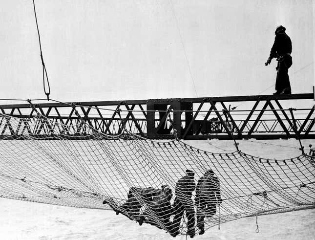
Unlike Fett, Hutt, or Kenobi, however, the substitute, “Skywalker,” was not entirely a Lucas original. Instead, it was, like Apple and Lucasfilm itself, rooted in the Bay Area’s ambitious and exuberant relationship to technology. “Skywalkers” was the name given in the 1930s to the high-altitude ironworkers of the Golden Gate bridge, as its steel cables were laced across the fog-shrouded opening to the enormous San Francisco Bay. The superstructure of the bridge often soars above the ubiquitous river of cloud that flows into the deep, rocky channel; those who trod its tracery during construction were, it appeared, truly walking on sky.
It was across this bridge, a quintessential example of technological ambition and the natural sublime, that Lucas decamped to Marin County in 1974 to realize his and Coppola’s vision of “a futuristic plant that would place filmmaking squarely in the technological era.” And he was not alone in the exodus. This was the Marin of the Whole Earth Catalog — lauded by Steve Jobs as “the Google of my own youth,” a newsprint compendium of geodesic domes and Volkswagen-camper-customization.
Lucas embraced everything this modernizing world had to offer—except, apparently, when it came to his taste in architecture. The central building of Skywalker Ranch, begun in 1978, involved thousands of square feet of stained glass, multiple cupolas, and gingerbread detailing. Only eight years later, Steve Jobs, for the moment showing a similar bent, would be memorably photographed by his friend Diane Walker in his wood-beamed Palo Alto apartment, the room empty save for a high-end stereo, Jobs, and a Louis Comfort Tiffany lamp.
But, beginning with the products whose proceeds funded their empires, Jobs and Lucas both would begin to craft their own, remarkable design visions.
Episode III: Screws and Segments
So much, then, for the un-evident touchpoints between the lives of Jobs and Lucas. But what of what lies on the surface —the visual language of their greatest creations, Apple and Star Wars?
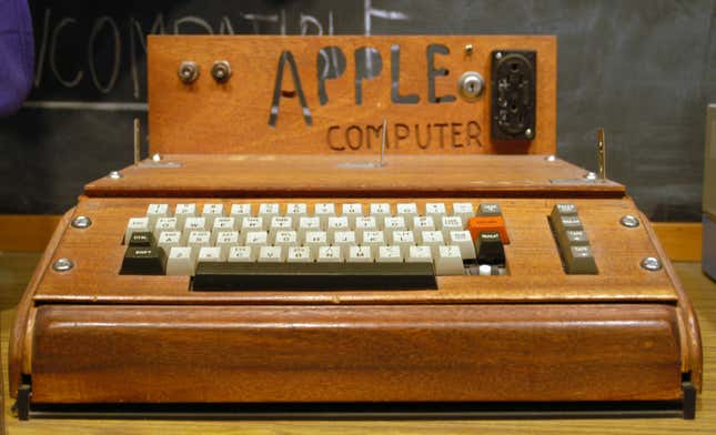
The very first Apple Computer had no obvious aesthetic at all. As conceived and assembled by “the other Steve,” Jobs’ co-founder Steve Wozniak, the Apple I was simply a green circuit board with an assortment of user-serviceable parts. With the Apple II, Jobs turned to a friend from the Homebrew Computer Club, Jerry Manock, whom he paid $1,800 to produce a case design. After much back-and-forth between Jobs and Manock, the computer remained user-serviceable—complete with a pop-off lid revealing the inner circuits—but all the screws attaching the metal case to the circuit board were tellingly hidden, at Jobs’ insistence, underneath the case.
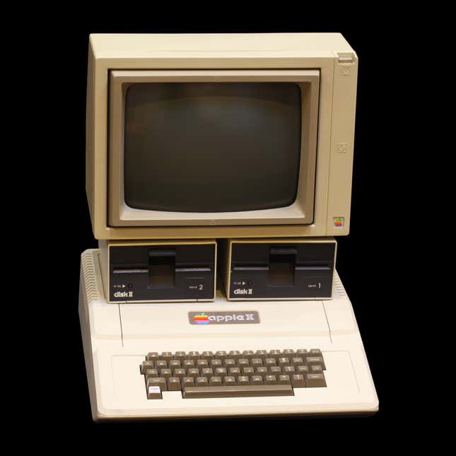
This tension—between, on the one hand, a uniform aesthetic, and on the other, the modularity and customizability that characterized personal computing’s hobbyist origins—defined the push-and-pull of Apple’s early designs. It was in service of these designs that, starting in 1982, Jobs began an intense and fruitful collaboration with the ambitious and visionary founder of a German firm, frogdesign, known then chiefly for the sleek, calm, and elegantly segmented shapes it produced for for Japanese electronics-maker Sony. The founder of the firm, Hartmut Essinger, assembled in the next year a design language—“Snow White”—that would govern most of Apple’s products until Jobs’ first departure in 1985.
By the time the first Macintosh came out in 1984, Jobs had its outside case emblazoned with a warning that was anathema to personal computing’s homespun origins: “No user serviceable parts inside.” (In Jobs’ defense, the capacitor of the built-in monitor had the potential to deliver hundreds of volts to any unwary tinkerer.) His corporate colleagues, however, began to propose projects—like the Macintosh II—that adopted a more “PC-like” architecture of open cases and user-swappable parts. Jobs’ perfectionism nonetheless ensured that the internal arrangement of these modular, white machines remained as resolved as their external shapes, even when closed from view.
This push-and pull—between modularity and clarity, between user-serviceable parts and a uniform aesthetic—was most elegantly resolved, perhaps, in an un-built design project, presented to Apple in June 1985, after Jobs’ departure (and shortly before frogdesign’s). Code-named “Jonathan,” it was an entirely modular computer, in which uniform black or white boxes holding disk drives, hard drives, processors, and memory were stacked and assembled in elegant, unique configurations by each purchaser, who could extend and upgrade each component in turn. (The unsuccessful proposal was even designed to run Microsoft’s DOS and the Mac OS side-by-side from different modules.)
And the contemporaneous aesthetics of the Star Wars Universe? Here, too, we find the tension between a smoothly uniform look and the under-the-hood jumble of user-serviceable technology.
Episode IV: Droids and Devices
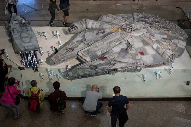
The user-serviceable devices we encounter in the first Star Wars film belong resolutely to the Rebel Alliance: first, the droids R2-D2 and C-3PO themselves, Anakin Skywalker’s hand-crafted lightsaber, and then the Millennium Falcon. These objects, and the business of tinkering with them—so similar to the patient efforts of Wozniak’s Homebrew Computer Club—anchor the first film’s first hour. They take us from the revealing of Leia’s message while Luke services R2-D2, to Luke’s first physical encounter with his father’s legacy as he grasps his lightsaber, and finally Han and Chewbacca’s fallible, resourceful shepherding of the Millennium Falcon. “What a piece of junk!” Luke remarks on first sighting the ship in Star Wars; it remains a “bucket of bolts” to Leia in The Empire Strikes Back. Yet it is also the fastest spaceship in the galaxy (“the ship that did the Kessel run in less than 12 parsecs,” although a parsec is actually a unit of distance…)
By contrast, the aesthetic of the Empire is not of people, systems, or technology open to view, but rather of complexity sleekly contained. From the deltoid sweep of the Imperial Star Destroyer sighted in A New Hope’s opening frame (its cannons blazing at a Rebel ship seemingly bodged together from a line of metal barrels) to the blank faces of stormtroopers and their leader, Darth Vader, glimpsed onscreen a few minutes later, the Empire’s control of the galaxy, ineffable and immense, is made clear by a mastery of architectural finish. Appropriately, the drama of the middle act of the first Star Wars revolves around the first pivotal confrontation between these two aesthetics: the elaborate effort by Obi-Wan Kenobi, aided by R2-D2’s interface with the Death Star computer, to hack into the smooth, closed, and desolate architecture of the Death Star’s deep interior.

For the look of the Empire, Lucas was inspired in part by the minimalism of Akira Kurosawa’s Samurai-saga costumes in Throne of Blood and the Hidden Fortress. (The latter film, made in 1958, famously also suggested to Lucas the plot device of a soaring imperial saga seen through the low-down eyes of two servants.) Here the corresponding consumer-electronic precedent would not be the hand-wired circuit board of the Apple I, nor the smooth yet generous modularity of later Apple products. Rather, it might harken back to Kurosawa’s Japan: the Radio Nurse, designed by modernist sculptor Isamu Noguchi in 1937, its Bakelite surfaces hiding all wires from prying, childish fingers. Today, the device is prized at auction for its resemblance to Darth Vader.
Episode
V: Pixels and Peugeots
Twelve years passed between Steve Jobs’ departure from Apple in 1985 and his triumphant return. But his career meanwhile would continue to be tied up in the intersection of design and technology. And the geometry he encountered in this wilderness helps us understand not only the development of his own aesthetics, but also the enormous transformations in design and computation that made it possible to mass-produce Apple’s current curves and contours.
Pixar was of course not Jobs’ only second-act pursuit. He also built another computer company: NeXT. Like the final Jonathan prototype produced for Apple in 1986, the NeXT computers were also designed by frogdesign’s Hartmut Essinger, and were also black—but not modular. Apart from the keyboard, mouse, and monitor, they were a single magnesium cube, containing only a single, square circuit board, to which all the computer’s components were elaborately affixed.
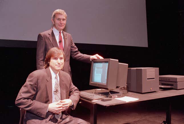
The exterior of the NeXT recalled another science-fiction icon: the black, cuboid (1:4:9 ratio) monoliths of Stanley Kubrick’s 2001: A Space Odyssey; but it also prefigured the sleek, “unibody” devices that Jobs would produce in his second act at Apple, milled from a single block of aluminum.
While the NeXT cube was not modular in its hardware, it was very much so in its software. Unlike the first Macintosh, it could be networked and connected to other computers. Its operating system was built on a version of AT&T’s Unix, refined at Berkeley in the 1970s to better allow robust, “object-oriented” programming. (Most usefully, this allowed parts of the software to fail while others went on running.) It was on a NeXT workstation that Tim Berners-Lee wrote the first version of HTML and the modern web browser, at the European Physics Laboratory CERN, in 1989.
Yet the physical perfection and processing power of the NeXT came at a high price. Marketed to universities and laboratories only, it cost $6,800 in 1986 dollars (nearly $15,000 today). Jobs expended an enormous amount on an elaborately designed stage-set of a robotized factory, but—though the core of the NeXTSTEP operating system became the kernel of Mac OS upon Jobs’ return to Apple—the company was, on its own, a commercial failure.
Pixar, on the other hand, had a very different trajectory, one tied up in several successful geometries of its own. The first were the new techniques of fractal geometry exploited by a new Lucasfilm digital-team hire, Loren Carpenter. After only managing to get a reprise of Star Wars’ Death-Star infographic onscreen in Return of the Jedi, the group used the fractal techniques to manage its first onscreen coup, a two-minute digital sequence in Star Trek II: The Wrath of Khan, for which ILM was acting as special-effects subcontractor. The sequence—a digital animation of the “Genesis Effect” weapon beamed to captain Kirk by Starfleet, complete with fractally generated craters, fire, and mountains—finally brought the digital division to Lucas’s attention as a possible tool in the visual language of film, not just the logistics and technology of its production.
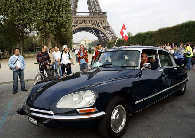
The other essential part of Pixar’s geometry came from a quite different industry (one which Apple today seems poised to enter.) A decade before even the first Star Trek phaser hit the screen in 1966, mathematicians employed by French carmakers Renault and Citroën (later part of Peugeot) were seeking to better formalize the design and industrial production of car bodies. The sinuous curves that characterized typically French saloons like the famed Citröen DS had their origins in hand-shaped models and hand-beaten panels, which were hard to render in a computer model. Mathematicians for the carmakers developed tools—Non-Uniform Rational Bézier Splines, or NURBS, named for their Renault inventor—which allowed these complex, pillow-like surfaces to be described with all the precise economy of more traditionally Cartesian stuff like squares and rectangles. They compressed the complex shapes as efficiently as the NURBS acronym compressed the name.
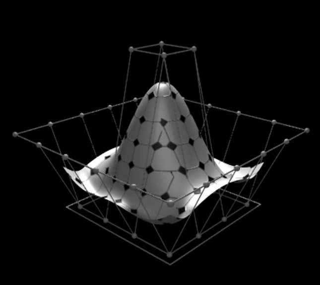
Lucasfilm’s Ed Catmull had always been interested in NURBS and their mathematical kin. Unlike the gridded geometry used by the first CAD systems, they could easily describe the kind of curvy characters and environments traditionally depicted by animation. The next step was to produce such an picture—as had been the dream since the Long Island days. The team’s first such effort, 1985’s The Adventures of Andre and Wally B, which debuted at the SIGGraph computer graphics conference as a demo of the Lucasfilm digital team’s new software, was an awkward, adventurous leap into this new world.
It was at this point, however—just as the vast, Victorian Skywalker ranch buildings were finished, and ILM and Lucasfilm were preparing to leave a suite of anonymous buildings in San Rafael—that Lucas’s marriage, and so his larger empire as well, began to fall apart. When Marcia Lucas left George for the architect of the Skywalker Ranch’s stained-glass dome, she took with her a large portion of his fortune, earned in her role as a professional, as well as personal, collaborator.
For Catmull’s group this crisis turned out to be an opportunity. Their work had recently crystallized into a new, stand-alone product—a high-end computer workstation. Chafing at their second-tier, technical status at Lucasfilm, the team began an effort to spin themselves off, under the name Pixar. Their initial efforts to find a buyer fell through (the firm almost sold to Ross Perot). But Smith and Catmull had met Steve Jobs at SIGGraph in 1985, and he had told them to “call me if the price drops.” Now they did so. Ultimately, Jobs would purchase Pixar from Lucas in January of 1986 for $5 million, plus a $5 million investment in the company.
Pixar’s demo reel at the next SIGGraph meeting, in 1986, began to reveal the full storytelling potential of the inanimate objects which were at the time the most straightforward candidates for computer animation. The film, “Luxo Jr.,” is still referenced in Pixar’s movie-opening logo.
Surprising even Jobs, the film’s demo reels were its most engaging products, ultimately protected and expanded by Jobs even as the company’s other efforts (in particular that workstation, the Pixar Image Computer) proved unprofitable. The 1988 demo, Tin Toy, caught the eye of Disney, which had just contracted its first externally produced animated film, Tim Burton’s Nightmare before Christmas. Tin Toy was expanded into Toy Story.
A symphony of easy-to-NURB toybox characters, the 1995 film recast and rendered the geometry of French carmakers at the scale of the nursery floor—and revolutionized storytelling on the big screen. In the decade leading up to Toy Story, Jobs would ultimately pour more than half of his $100 million Apple severance into Pixar. The gamble paid off: Pixar’s IPO, scheduled (in another gamble) for the week after Toy Story’s opening, valued Jobs’ 80% share of the company at more than $1.2 billion, or 20 times his investment.
It was from this position of financial independence that Jobs negotiated his own role—first as adviser to the CEO, then just adviser, then interim CEO, then CEO—when Apple took over NeXT’s software business in 1996.
Episode VI: Closed Curves
The story of the larger corporate turnaround that followed has been told many times elsewhere. But the turnaround was visual as much as financial. It depended a great deal on the aesthetics Jobs had encountered outside Apple before his return, as well as a parallel revolution in computer modeling and technology manufacturing. And let’s just say it: Apple’s resulting shift was not back to the aesthetic of the Rebel Alliance at all—stylish, informal modularity. Rather, it would steadily tend to the reverse: the sleek, sharp and shiny shapes of Star Wars’ sinister Empire.
This shift did not happen at once. In a young and heretofore frustrated Apple designer, Jony Ive, Jobs famously found a kindred spirit in an attempt to combine technology and art. Their initial outing together, 1998’s iMac, featured tight, polycarbonate curves and bright paint-box palettes, departing dramatically from the bleakly beige aesthetic of mid-1990s Apple. This tinted translucency, while it dated from a few efforts by Ive before Jobs’ return, became for a while Apple’s signature aesthetic. (The previously ergonomically-correct Apple mouse was ditched, if temporarily, for a perfect, plastic circle.)
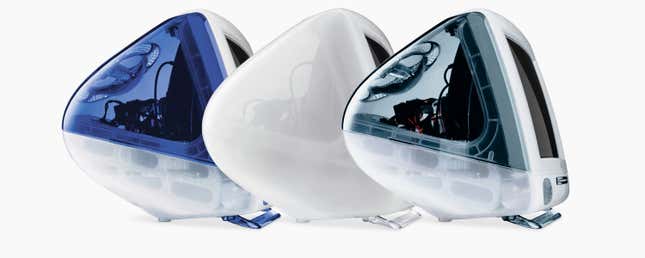
Not by coincidence, this was the aesthetic of 1990s Pixar as well—the NURBS geometry of Woody, Buzz, and the delightfully uniform Pizza Planet Aliens. By then, this same curve-friendly mathematics was baked into industrial design software like McNeel’s Rhinoceros and Dassault Systems’ Solidworks; the iMac’s shape as a result recalled an airplane’s nose as well as a clown’s. The iMacs shared not just their curves with Buzz and Woody, but also a common complexion—light greens, blues, pinks and oranges. And the same, complex effects of translucency and distortion, so essential to the rendered reality of the frames in Toy Story, were also a large part of what made the real iMacs engaging. While not user-serviceable, the internal workings of the first iMacs were nevertheless shown through their translucent cases, and celebrated in all their well-ordered complexity.
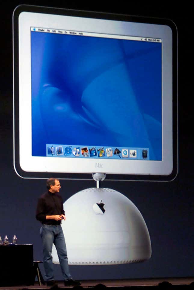
This approachable, see-through aesthetic of the iMac era lasted until the revised iMac of 2002. This, with its LCD display and half-sphere base, started a trend—reaching a knife-edge today—of slipping computer and monitor into ever-thinner enclosures. Ads for the first iMac’s hemispherical base and articulated arm explicitly echoed the anthropomorphic movements of Luxo Jr.—but by 2004, the design was settling into an ever-thinner slab of plastic, then aluminum, on a single, smoothly curved base.
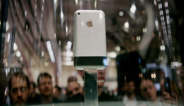
So too with Apple’s laptops: While the first model to come out under Jobs’ new reign, the iBook, hewed to the translucent, curved-and-colored aesthetic of the iMac, subsequent designs eschewed extraneous detail and color in favor of ever-thinner, seemingly-solid slabs of aluminum. The iPod and iPhone sleekly followed suit; thinner, flatter, with nary a crease or joint visible, and ever-fewer accessible openings to within.

In Gary Hustwit’s 2009 paean to industrial design in the millennial age, Objectified, Ive appears onscreen to discuss a crucial watershed in this developing design aesthetic. It was the “unibody” approach, introduced in 2008, in which the main body of the Macbook is made from a single block of aluminum, with keyboard, battery, boards and ports all adhered to it, and an increasingly confounding set of screws designed to prevent users accessing the ever-tinier interior. Today’s razor-thin iMac—not to mention the computer this is being written on now, the perfectly circular, black aluminum cylinder of a 2015 Mac Pro—extends this singular aesthetic to the desktop.
In Hustwit’s film, Ive is introduced just after an extended monologue from the modern Apple style’s most obvious real-world influence: German design legend Dieter Rams. In the 1960s, Rams, as a Braun Electronics employee, had been asked to collaborate with several faculty of the Hochschule für Gestaltung Ulm (itself a re-founding of the famed German Bauhaus) on a cohesive design language for all of Braun’s products. From shavers to coffee-makers to coffee-table-sized radios, the clean, white-and-black lines of the Braun devices hewed to Rams’ re-take on Bauhaus director Mies Van der Rohe’s famous “less is more,” namely: “Good design is as little design as possible.”
Yet “as little design as possible” is precisely not that. It is, rather, the exhaustive application of design until every detail, every offending element, is brought under strict, harmonious arrangement. We notice nothing because everything is under control. And this is where we get to the essence of the resonance between the artifacts of Apple and that of the Empire of Star Wars: the exertion of control, and power, over the complex, messy reality of systems and objects.
In technological and aesthetic terms, it makes sense for the objects of the insurgent Rebel Alliance to be well, ragtag; Less Mercedes, more MacGyver. As a result, there is a ready, family resemblance between the Millennium Falcon and the first, painfully awkward Android phones, or even the lovably lumpy Motorola StarTAC. But the only reaction one can imagine Han Solo having towards the sleek, touchscreen iPhone is the attitude he takes towards the sleek, all-too-functional internal comm-links of the Death Star —blasting it to bits.
Episode VII: Model Metropolis
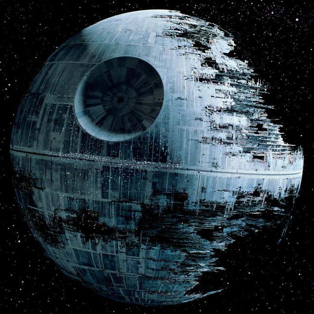
Which brings us back in turn to the Death Star, and its exemplary architecture. The great reveal of the Star Wars battle-station’s introduction is not just its singular form, but the way in which the seemingly sleek sphere slowly resolves—first in the Millennium Falcon’s tractor-beam approach, and then, even more so, in the film’s dramatic, dogfight-laden conclusion—into a complex universe of bits, pieces, and well-defined components. As echoed again in Return of the Jedi, where we see the scaffolded innards of a new Death Star in mid-construction, the Empire’s might is expressed not just in the singular shape, but in all the enormous complexity compressed into and controlled beneath its surface.
This idea—of all of human complexity brought into the order of a tabletop—is, of course, a very longstanding architectural dream, particularly in the 20th century at the hands of the influential French architect Le Corbusier, as well as German emigrés and ex-Bauhaus directors Mies Van Der Rohe and Walter Gropius. (The three had in fact worked together for one of the first architects to design a company’s—AEG’s—products from poster to factory, Berlin’s Peter Behrens.) So it is perhaps worth identifying, here, the Death Star’s own, very urban origins.
The great architect of the model-based film sequences at the heart of the original Star Wars’ Death Star denouement was originally trained as an industrial designer. After a brief stint working with special effects-giant Douglas Trumbull (of 2001 fame), a young John Dykstra found work on a research project in the urban simulation laboratory of the Institute for Urban and Regional Development (IURD) at UC Berkeley’s College of Environmental Design (not forty feet, as it happens, from where these words are being written.) Part of a move towards better simulation and quantification of the grand urban proposals that, by the late 1960s, were already drawing critics such as Jane Jacobs, IURD’s simulation lab made movies of cities. Not real cities, though, but model ones.
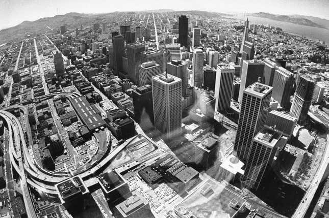
From building miniature buildings, streets and facades—the IURD lab would ultimately build a 40-foot-wide (12-meter) model of all San Francisco—Dykstra came to work on the novel camera system developed for the model-urban films. Instead of filming at 30 frames per second through the tiny streetscapes, the camera was set to record one frame, be moved one step ahead by a motor, then loose another frame. Enabled by an early “minicomputer,” the 250-pound Digital PDP-11, the ability to replicate the camera’s slow trajectory was particularly useful in the simulation lab for overlaying multiple proposals for a similar site, re-filming each one along precisely the same, miniature urban route.
When the simulation project at Berkeley ran out of funding in 1975, Dykstra returned to Los Angeles. From friends at Trumbull’s studio, he learned of Lucas’s special-effects needs for Star Wars. At a fateful meeting with Lucas and producer Gary Kurtz, Dykstra proposed the Berkeley-developed system as a way to film the complex spacecraft dogfights Lucas envisioned.
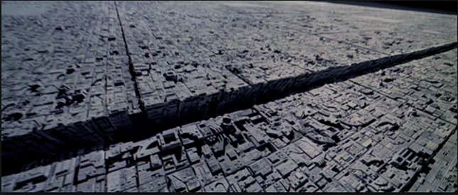
The “Dykstravision” cameras that resulted were as essential to Star Wars as any other, more obvious part of the production design. As well as his filmmaking colleagues from Berkeley’s IURD, however, Dykstra (the first head of the team that Lucas named Industrial Light and Magic) hired literal makers as well, who pioneered such techniques as “kitbashing”—using and misusing parts from model railroad and vehicle kits to collage together a proper image of urban complexity. At 40 feet long, the model of the Death Star’s trench produced for Star Wars’ final sequence was not only the same size as IURD’s model of San Francisco; it was of equal seeming complexity. And just as San Francisco’s streets and buildings abandon all topography in favor of a grid-like march across the landscape (even as they sinuously drape across it), so the Death Star’s surface shows a cityscape of diverse elements, all brought into alignment, and order, by the hand of man, or Emperor. Indeed, the Empire’s galactic scale—never really grasped in the first films especially—is symbolized in synecdoche by the scale of the single edifice.
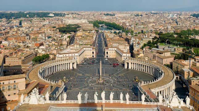
A big building standing in for an enormous empire is hardly a new idea, of course. Rome’s empire stretched from Scotland to Persia, but found fullest form in the (far smaller, but still-enormous) spans of the Pantheon and ur-colossal Colosseum. Likewise, by the time of the opening of St. Peter’s Basilica in 1626, the Catholic Church’s dominion stretched from Poland to Patagonia, but was more palpably signified by the enormous new cathedral.
According to his biographer, Walter Isaacson, Steve Jobs was fond of sharing a drawing by the Apple headquarters’ architect-of-record, Norman Foster & Partners, of the circle’s vast interior dwarfing not only St. Peter’s, but also its enormous, circular forecourt (completed by Gian Lorenzo Bernini in 1667 and holding up to 400,000 pilgrims to the present day). Isaacson presents this as one of the last scenes of the book’s penultimate chapter, immediately before a concluding discussion of Jobs’ final illness and death.
The implication, of course, being another job often given to architecture; a job taking place not in space, but in time; the job of securing immortality. One of the most masterful shots in the Force Awakens previews hints at this as well. In it, the camera pans across a desert planet, coming to rest on the hulk of a great star-destroyer, the sleek, city-sized dreadnought, ruined and half-buried in the sand.
Yet in real life, and in particular in the life of buildings, the immortality of scale, organization, and geometry can come at the cost of a city’s own life.
Episode VIII: Orchards and Oddballs
One of the most effective critiques of the totalizing approach to urban design—the Darth-design of cities, if you will—was architecture critic, activist, and theorist Jane Jacobs. Towards the end of her bestselling 1962 critique of mid-century urban design, The Death and Life of Great American Cities, Jacobs recounts the number and diversity of the neighbors in the building where she worked. She reports:
“The floor of the building in which this book is being written is occupied also by a health club with a gym, a firm of ecclesiastical decorators, an insurgent Democratic party reform club, a Liberal party political club, a music society, an accordionists’ association, a retired importer who sells maté by mail, a man who sells paper and who also takes care of shipping the maté, a dental laboratory, a studio for watercolor lessons, and a maker of costume jewelry. Among the tenants who were here and gone shortly before I came in, were a man who rented out tuxedos, a union local and a Haitian dance troupe. There is no place for the likes of us in new construction. And the last thing we need is new construction.”
And added, in a forceful footnote: “No, the last thing we need is some paternalist weighing whether we are sufficiently noncontroversial to be admitted to subsidized quarters in a Utopian dream city.”
That there is little room for controversy or discord in the Death Star—amongst its legion of same-suited stormtroopers, say—may go without saying. But what of Apple?
It is clear, first of all, that the company’s success—for all the apparent imperiousness of Jobs—relied, and likely relies still, on discussion, disagreement, and diversity. Jobs himself was famously a stickler for regular “no-holds-barred” meetings in which, while his own leadership had to remain unchallenged, no other presumptions or suppositions were sacred. (Pixar’s irrepressible Alvy Ray Smith would be one of the only employees to challenge Jobs’ control of a whiteboard, part of a duel with Jobs in which dry-erase markers, presumably, stood in for sabers.)
Like the products themselves, however, Apple’s core identity relies on keeping disagreement and discord behind a tightly controlled façade. And sometimes even a tightly controlled interior; one of Jobs’ least successful management interventions on his return to Apple was a short-lived attempt to have all his many thousand employees wear the same, black, custom Issey Miyake clothing. To Jobs’ credit, he quickly withdrew the proposal—but it lived on in the many hundred black turtlenecks Miyake crafted for Jobs’ own, resulting use.
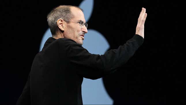
No, if there is something disturbing in the design of Apple’s own apparent Death Star, it is not so much in the company’s clearly successful internal operations, nor in its beautifully singular product range. Rather, it lies in the runaway result of this success; the way in which so many of our interactions with the world, and with each other, are now filtered through the efforts of a single, well-designed and Apple-authored interface.
And beyond well-intentioned, we might even say essential. Particularly given the disorder and predictable unpredictability of complex technological systems, we all crave, and need order. The first Star Wars shoot was so plagued with technical difficulties (and the related derision of the unionized British workforce on the Pinewood Studio lot) that more than one cast member observed that George Lucas appeared far more sympathetic to the authority and order of the Empire than the ragtag Rebel Alliance. Apple has thrived above all in the last two decades by offering the particular beauty that lies in order, organization, and simplicity, and in the predictable delight that results when something technical, unexpectedly, just works.
Episode IX: It Doesn’t Work
This core truth of technology—that it often doesn’t work like it’s supposed to—is key to Apple’s success. The clean lines on an iPhone’s surface, or the obsessive typography of its software interface, are but welcome indications of a much deeper order: a relentless synthesis of software, hardware and supporting infrastructure that turns out to be the best, if not the only way to make the most ambitious modern technologies work.
Cities, however, work differently. Where technology is often unexpectedly brittle, cities are often unexpectedly resilient. And their resilience comes from something first noted by Jane Jacobs in 1958 (in a letter seeking funding for Death and Life), namely that:
“within the seeming chaos and jumble of the city is a remarkable degree of order, in the form of relationships of all kinds that people have evolved…Where it works at all well, this network of relationships is astonishingly intricate. It requires a staggering diversity of activities and people, very intimately interlocked (although often casually so), and able to make constant adjustments to needs and circumstances.”
Apple’s success has been, quintessentially, in taming the awkward and unpredictable complexity of technology. Yet today, its own scale and ambition are reaching towards a different kind of scale and complexity—that of the city itself. And here a singular order is not so successful.
This is nowhere more visible than in the perimeter of the new, circular headquarters itself. In the elaborately produced initial renderings of the buildings, it rests, like the spaceship Jobs dubbed it, amidst seemingly infinite orchard-woodland, harking back to Silicon Valley’s rural history. Like the Golden Gate Bridge against the hills of Marin, it is a vision of a massive, technological achievement set against its only presumed-equal foil, wilderness.
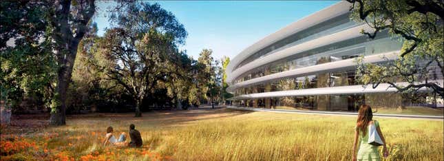
A close-up aerial view of the building under construction today reveals little—other than dirt in the place of eventual greenery—to disturb such a vision. But zoom out a bit, and a very different picture comes into view. Instead of an Arcadian farmland, the building is revealed instead to be set, behind its own eventual moat of trees, in one of the densest parts of Silicon Valley.
Cupertino is regularly, but inaccurately, described as “suburban.” At 5,200 people per square mile, its population density ranks not far behind Seattle’s—and its daytime density, is of course, much higher, fueled by the many buses-worth of Apple and other tech-company employees carried from San Francisco and elsewhere. This is what makes Silicon Valley work—not its order and cleanliness, but rather, as in any city, its dense balance between structure and chaos, in which unexpected institutions and encounters—like that between Steve Jobs and Steve Wozniak some 40 years ago—give rise, far more than any single idea, to the ferment of innovation.
One big problem with Apple’s big new headquarters is that it shows no heed or deference to its context and neighbors, and certainly no desire to engage them. By contrast, all of Lucasfilm’s work on The Empire Strikes Back and Return of the Jedi was secretly accomplished in a series of buildings in downtown San Rafael. (Their signs read “Kerner Optical.”) Pixar—despite its own, continuing Jobs-like secrecy—thrives today in a series of expensive and urbane warehouse buildings in the densest part of Emeryville. Pixar employees are well provisioned within the complex, but they can also walk to the same diners and restaurants that serve the gentrifying area’s mixture of startups and design studios (including my own). Apple’s staff, by the looks of it, will not be doing any such thing.
Friction is what provides the spark of the city, and fuels the creativity at its core, even if it is sometimes, in the moment, inconvenient. Anyone living in the dense fabric of the Bay Area knows what it is to have to tolerate eccentric behavior and accommodate crazy neighbors (take this from a former resident of Berkeley.) It’s a pain, but we do it; for who knows who the eccentric will turn out to be, or might unexpectedly teach you? Yoda himself first appears as ridiculous and embarrassing as the other memorable characters voiced by his puppeteer, Frank Oz (Miss Piggy, Grover, Animal), rooting for food in Luke’s backpack, and using addled, backwards grammar crafted by Oz as well. All this before being revealed as the universe’s most powerful Jedi master.
Apple’s headquarters respects its founder’s singular vision, and is offered by Isaacson and others as Steve Jobs’ most fitting legacy. But what it respects least of all is the fabric of Silicon Valley that gave rise to such a vision. New York’s historic zoning code, immortalized by illustrator Hugh Ferris, dictated that the iconic headquarters of the last century, while ascending to spires at their height, had to respect the street at their base. Apple’s headquarters offers no such compromise, affording the prospect of a building as complete, enclosed, and seemingly portable as one of its famed electronic products.
Beyond the manners of the street-edge, though why is this a problem?
Episode X? A further sequel—or a fiery ending
We might start inside. A recent profile of Sir Jony Ive in the New Yorker by Ian Parker, “The Shape of Things to Come,” shifts seamlessly from the discussion of consumer objects to that of architecture. Ive, it is suggested, sees himself as an architect too. He finds it, he says, “a curious thing” that in design “we tend to compartmentalize, based on physical scale.” He is reported to assert that he has (in Parker’s words) “taught Foster’s architects something about the geometry of corners,” introducing a seamless, curved detail between wall and floor that now runs throughout the building’s interior.
Yet this detail, and its future life, points to what is in fact one of the main differences between design at the scale of consumer electronics, and that at the scale of architecture and the city.
Apple’s great success as a consumer-focused company is rooted in the one power a consumer has above all: choice. Apple’s products are ubiquitous, above all, because they are far better than what they compete with, a quality that comes precisely from the tight control that Apple exerts on them and their design. But, at the point we don’t like our device, we can—and will—buy a different and better one—from Apple, or from some as-yet-unimaginable competitor.
Yet it is in the nature of architecture that it offers no such choice—the more so the bigger it gets. We can, if we are lucky, sell a house we don’t like. But we can’t sell or dispose of the terrible building across the road. And architecture involves many more people than those who design it, or even pay for it. Myself, I keep thinking of the cleaning staff of the new Apple headquarters; it is for these people, above all, that the usual, clunky detail of wall-meeting-floor exists, with a skirting board to hide the edge of the floor-wax, and catch and disguise the dirt that escapes the polishers. One hopes a special, super-functional polishing device has been designed for them, that will seamlessly clean and feather the floor-wax as it slowly curves into the wall—but one fears that it has not. One thinks as well of Apple’s desk-bound employees, who, so as to preserve the clean lines of the building’s exterior, will not be able to open windows in their offices—despite the Bay Area’s preposterously perfect climate. (“That would just allow people to screw things up,” Jobs apparently declared.)
But here is where the design of products and buildings is most different. The particular conundrum solved by the best teams of architects and city-builders (including all of us as citizens) is how to balance a whole set of competing demands, physical, environmental, and social, against each other—including the demands of the powerful against the needs, and rights, of the powerless.
As we attempt to design 21st-century cities for an increasing landscape of uncertainty, this is an important lesson to remember. Instead of single, grand projects, the staying-power of a city depends on a million connections between its inhabitants, and the natural and technological systems that sustain them. Cities designed tabula rasa, as Jane Jacobs cogently characterized it a generation ago, lack this robust resilience. Instead, their monumental visions of order turn out to hide brittleness, fragility, and frequent catastrophe. Even the most seemingly ordered long-lived city-grid—Manhattan, Barcelona, even San Francisco—simply allows us to better negotiate what is, in reality, a riot of real-world diversity.
It is in this light, perhaps, that one might also examine Apple’s greatest points of corporate difficulty: the interface between the company’s tightly designed and integrated products, and the public software ecosystems it has developed in service of them, the App Store and the Mac App Store. To this architect, these places read a bit like a modernist cityscape; beautiful, elegant, even nice to visit—but very difficult to live in. Like such cities they are also—at least in the case of the Mac App Store—increasingly abandoned, as is usual, by those who can afford to leave.
And yet it is not really Apple that is entirely to blame. The revolution in architecture today—one where the world of screens and devices and the common infrastructure of our cities merge, overlap and combine—is much larger than even the enormous, careful company.
In an awkwardly received, hauntingly prescient diatribe while presenting the Oscar for Best Director in 1979, Francis Ford Coppola declared, “We’re on the eve of something that’s going to make the Industrial Revolution look like a small out-of-town tryout.” What Coppola saw was our world today: “a communications revolution that’s about movies and art and music and digital electronics and satellites, but above all, human talent.”
Steve Jobs’ Apple set out to help create this world—and has succeeded beyond our wildest dreams of the future. George Lucas hired Pixar’s founders, originally, to use technology to make the production of culture easier for himself and a cadre of directors. But Lucas’s digital editing system was quickly eclipsed by Apple’s own, far cheaper, Final Cut Pro—and then, of course, by the iPhones that put high-quality filmmaking and editing into all of our hands. In this, and much else, Apple has helped author a world much like that of Lucas’s far-off galaxy; where all of us are connected, and can tap into vast reserves of invisible power through the device we hold in our hands.
But as Apple’s reach extends into the city and world, into the public sphere as well as the private screen, we should do well to remember these hard-learned lessons of control and openness, hardness and softness, brittleness and resilience. After all, the only thing one can say for certain about a Death Star is that it unexpectedly explodes right before the ending.


