
After 12 years of deliberation, the US government finally took action on a controversial subject: Fonts.
In the Jan. 25 issue of government publication Federal Register, the Federal Highway Administration (FHWA) announced that it will deauthorize the use of Clearview as a typeface for signage. The edict applies across all 50,000 miles of freeway and four million miles of road in America. Every state in the union must now use an older, officially sanctioned font, known colloquially as ”Highway Gothic.”
Clearview was warmly received when it was introduced back in 2004. Over 25 US states currently use the font on road signs. But the FHWA’s spokesperson Doug Hecox explains its popularity to Quartz as likely “attributable to the fact that older, worn signs were replaced with new, clean ones using brighter materials.” The agency has been working with sociologists, chemists, photospectrometrists, and various experts to develop road sign solutions, especially for older drivers. FHWA believes that sign’s surface (or retroreflective sheeting material) has the biggest impact on legibility, not the typeface.
Citing a 2006 evaluation, FHWA says that using Clearview actually compromised legibility on signs with black letters on white or yellow fields (like speed limit or roadside warning signs). ”For these and other reasons, the FHWA believes there is no practical benefit to the public in continuing to pursue this alternative font,” Hecox says.
The decision will take effect on Feb. 23. However, the states who have already adopted Clearview will not be required to take down their existing signs.
Deathblow to design activism?
The announcement is a blow to one of the most famous examples of design activism in the US. Clearview was the first digital typeface to be “acquired” and feted by the Cooper Hewitt, Smithsonian Design Museum, calling it a ”beautiful example of design as a form of social activism.”
Design activism refers to designers using their tools, thinking, and techniques to address burgeoning civic problems. Often initiated without a formal commission or client, this kind of activism includes proposing new layouts to improve paper voting ballots or prototyping better medicine prescription bottles.
If it sounds trivial, remember that picking a font for a road sign is very different from picking a font for a brochure.
A road sign must be legible from a distance, must be read within a fraction of a second, and must also work in all kinds of weather and light conditions. Designing for the aging eye is also a particular concern for FHWA: New data published by the agency in Dec. 2015 shows a record spike in the number of drivers over the age of 50, including many over the age of 80.
A mandate from FHWA requires optimizing public signs for these 214 million licensed older drivers—the fastest growing demographic today. To this end, FHWA recommended larger print road signs in 2003. This would have increased the size of Highway Gothic letters by 20% and result in significantly larger road signs.
But by that time, graphic designer Donald Meeker had already been puzzling over how to improve highway signs in his home state of Oregon. His attention first turned to the typographic quirks of Hightway Gothic while working on a highway signage project there in 1989.
Prior to designing Clearview, Meeker ran a thriving practice designing wayfinding systems for national parks, schools, and public projects. He was inspired to take action by the discombobulating array of route numbers, exist signs, and town names that clutter US highways, Meeker explained at the Society for Experiential Graphic Design conference last year. “There’s nothing more assaulting and daunting…than highway signs,” he said, calling the US official signage system “dysfunctional, frenetic, wild and uncontrolled.”
In 2004, Meeker together with graphic designer Chris O’Hara and type designer James Montalbano, proposed Clearview as a solution.
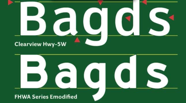
Meeker, O’Hara and Montalbano redrew the letterforms in Clearview specifically to counter bad road conditions. They eliminated “light traps” or tiny notches in joints of the letterforms and cleaned up the letters’ shapes to mitigate the halo effect at night, due to the sign’s reflective surface. They also increased the negative space in the letters “a” and “e,” which tend to close in from a distance. These small typographic refinements were posited to improve legibility of the letters without increasing font sizes.
In a statement to Quartz, Meeker expressed sadness over the decision to abandon Clearview, but says he will continue to work on improving US public signage. “This is disappointing because we are quite sure we are saving lives with longer reaction times by older and all drivers,” Meeker writes. “But it is out of our hands.”
It is fair to say that this has never been approached as a systematic design effort and designers are not part of the equation—as it was when Jock Kinneir and Margaret Calvert redesigned the road signs in 1964 in the UK.
Highway signs are the one thing that has not changed in any fundamental way since the early 1960s when there was a upgrade to accommodate the “new” Eisenhower Interstate Defense Highway System. This system is a tiny fraction of all the nations’ roads but it drives the system. Highway signs are also the single greatest manifestation of government that most all citizens interact with on a daily basis and this ubiquitous assault need not be so daunting.
It’s not just about the font
Unlike in-house designed Highway Gothic (officially called “FHWA Standard Alphabets”) that is free to use, Meeker licenses out Clearview to state agencies and individual clients. According to FHWA, having to pay to use the font—even for fairly reasonable sums—was an issue for many states. “The federal government promotes items that are in the public domain as much as possible,” says Hecox, who confirms that the agency has never attempted to buy out the universal license from Meeker.
Although the FHWA’s announcement notes ”the FHWA does not intend to pursue further consideration, development, or support of an alternative letter style,” Hecox tells Quartz that the agency will still welcome new proposals regarding fonts or any kind of design-led solutions to keep roads safer.