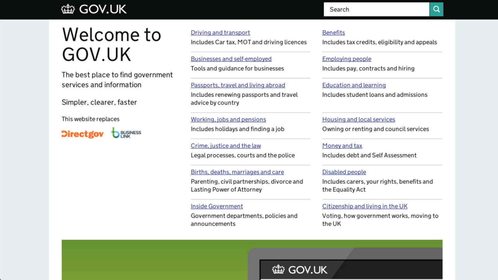
The London Design Museum’s annual awards took place last night and for the first time, the winner of the best design of the year was a website. What’s more, it was a government website: Britain’s gov.uk.
Visiting gov.uk with the knowledge that it is an award-winner is a distinctly underwhelming experience. That’s because it’s meant to be that way—unobtrusive and quietly efficient. Launched in October as a single stop for all major government services, gov.uk is, with the addition of the Department of Work and Pensions this morning, home to to 21 of the 24 departments it will eventually host. Its minimal design loads fast even for people on slow internet connections.
The award, then, recognizes that design—like government—exists not as an end in itself, but to facilitate other things.
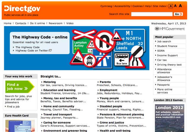
Before gov.uk, going to anyone of Britain’s several government websites, such as direct.gov.uk, was a lot like dealing with the state in real life, which is to say, pretty frustrating. Cluttered homepages, a multitude of directions but little guidance, hundreds of superficially different but essentially similar options, and general ugliness. It was like landing at JFK.

All the while, the websites of commercial companies, news organizations and even NGOs grew ever slicker. As with so many other things, the state was in danger of being left behind. Britain, at least, recognised this. In 2010, it commissioned a report from Martha Lane Fox, founder of lastminute.com and prime minister David Cameron’s designated “UK Digital Champion”.
Her report (pdf) was revolutionary: she advocated tearing down the existing model of how government worked on the web to replace it with a new, open and modern system that emphasised speed and efficiency. Fox also suggested developing an application programming interface, or API, which would let third parties build websites or apps that use the government’s data. And by establishing a central digital team, the report said, the government could reduce web expenditure from £560 million ($855 million) to £200 million a year, perhaps going down over time to £100 million. At a time of deep cuts to state spending, that proved irresistible.
The Cabinet Office established the Government Digital Service, or GDS (whose website, like Quartz, runs on the popular blogging tool Wordpress). Ben Terrett, head of design and formerly at the hip advertising agency Wieden+Kennedy, explained the thinking behind gov.uk to the Guardian. “Users are coming to find out what the VAT rate is, or what the minimum wage is—it’s not about browsing, so the idea is to get people in and out as quickly as possible,” he said. One way to do that is to “start with needs (user needs not government needs)”, the first of GDS’s ten design principles.
The aim, he said, was to make not just the best government website, but one on a par with those of “the giants of the web.” Other projects, which include helping people who aren’t online and doing more with the API, should be more fascinating still.


