While Facebook works with third-parties to warn users about fake news on the site, others are still trying to figure out where it comes from, and who’s giving it such massive visibility on social media.
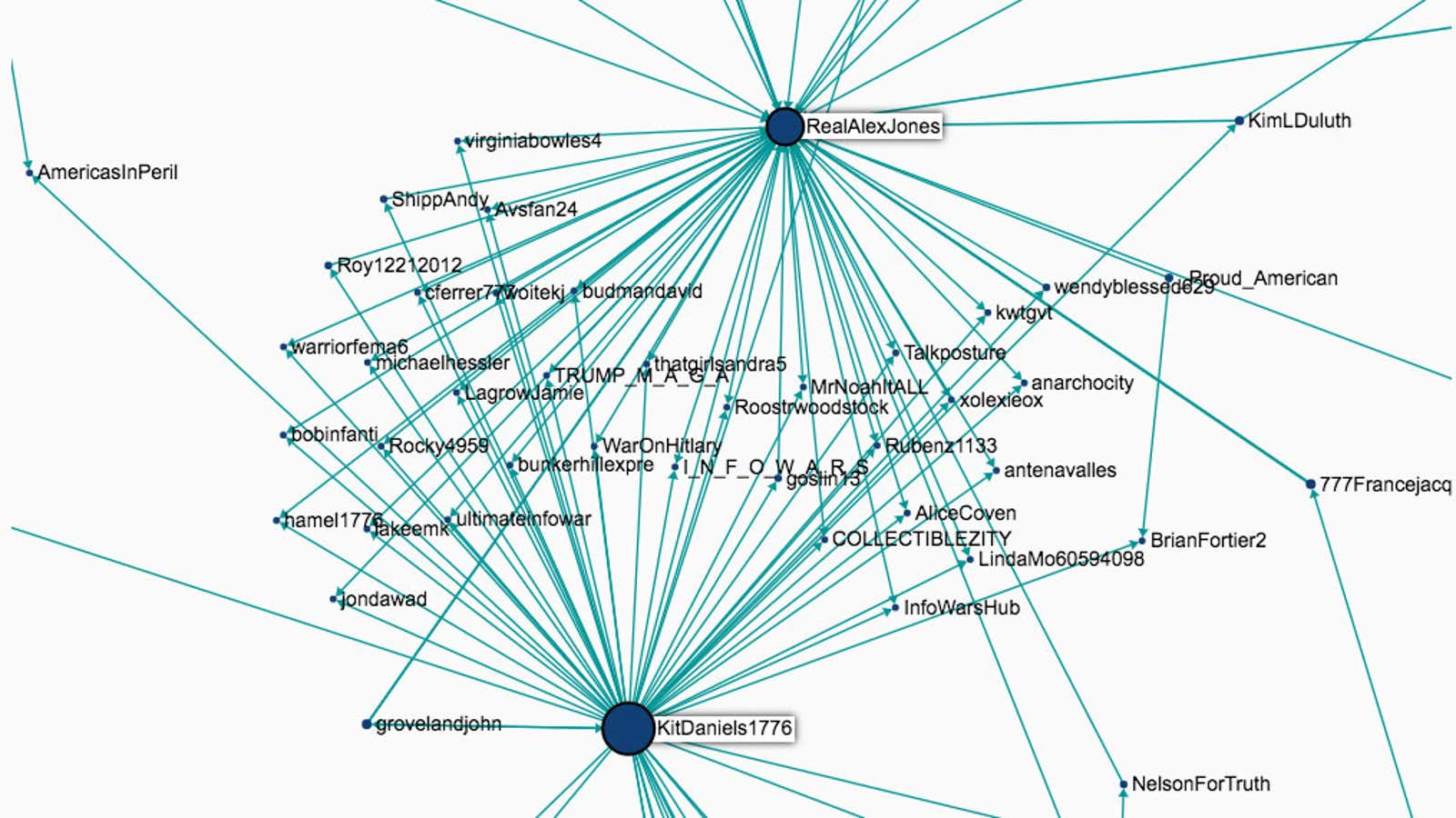
A new tool, called Hoaxy, attempts to do exactly that: it finds the most popular fake claims, and then charts when they went viral on Twitter and who was sharing them. The tool also can make similar comparisons against fact-checking sites likes Snopes, Politifact and Factcheck.org to show the effectiveness of truth against these claims.
When you search for a term, Hoaxy goes through a public list of sources known for fake news (like Infowars and NationalReport) and finds matches in the headlines and text of stories. It then combs through public tweets for links to those stories, and makes a map of who shared and retweeted the links.
The tool comes with a warning, though. Filippo Menczer, an Indiana University professor who co-lead the project, said in a release that Hoaxy only relies on the claims of falsehood or truth that other people have made.
“Not all claims you can visualize on Hoaxy are false, nor are we saying that the fact-checkers are 100 percent correct all of the time,” he said. “It’s up to users to evaluate the evidence about a claim and its rebuttal.”
And like any automatic curation tool, it’s possible there are biases in the lists. Looking through two popular fake claims, that President Barak Obama is a Muslim and Hillary Clinton is the devil, Infowar’s Alex Jones is the epicenter of both. Is Jones really the catalyst for these hoaxes hitting the mainstream, or is he just the largest data point in this tiny sliver of the internet?
The makers of Hoaxy, Indiana University and the Center for Complex Networks and Systems Research, previously worked on another tool that could tell if a user was a bot on Twitter.


