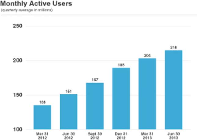
Twitter included in its IPO filing a chart of monthly active users—MAUs as it calls them. These numbers are significant for investors trying to assess how fast Twitter will grow in the future—and it’s clearly in the company’s interest to make the growth rate look as impressive as possible. Twitter’s chart looks like this:

If you were just looking at the bars you might make the assumption that from March 2012 to June 2013 monthly active users tripled—the June 2013 bar is three times the size of the March 2012 bar. But if you look carefully you’ll see that the chart’s y-axis starts at 100 million, and if you look at the numbers on top of the bars you’ll see that over this time period user growth was only 58%.
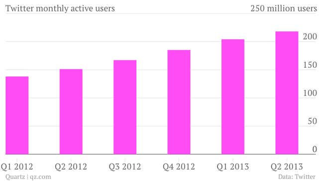
Here’s a more accurate chart of the same data, with the y-axis set at zero:

The flawed Twitter chart appears at the beginning of the filing. But in fairness, Twitter does provide bar charts of its user growth with y-axes that start at zero later in the document. See page 61.


