


Another Apple event, another Apple charting failure.
Just like when the new iPhones were announced last month, Apple CEO Tim Cook showed his audience a dubious chart of the history of the soon-to-be-released new product—in today’s case, the iPad. Though this chart had a y-axis labeling the number of units sold (which the iPhone version did not), this chart was still more misleading.
Here’s the chart as shown by Apple in its presentation:
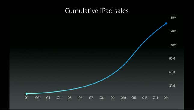
While that is a nice smooth curve, it has little resemblance to the underlying data. Apple’s plot shows cumulative iPad sales accelerating more slowly and more exponentially than in reality. At times this difference was wide enough to represent nearly 30 million units—understating cumulative iPad sales from 2010 to 2012 by about a third.
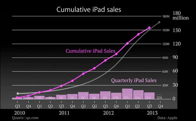
Here’s that same chart with the real data, as released by Apple each quarter, overlaid on top:
What makes the chart even more misleading is that the line appearing to represent a zero-axis is, in fact, not. The distances between all of the axis labels are equal—as they should be— but the distance between 30M and the bottom axis is noticeably smaller. The zero-axis actually falls below the the line shown on the chart. While there is no label claiming the bottom of the chart is zero, the relationship between the line that does exist and the first-ever quarter data is displayed as if that line is zero (it’s hard to understand why Apple would do this since moving the zero-axis up creates the appearance of lower sales).
Finally, charting the data in cumulative—as opposed to net—terms is an exercise in puffery (which, to be fair, is the point of events like these), because it counts incrementally every iPad sold in every previous quarter. The line, in turn, obscures the quarter-to-quarter fluctuations in sales. For Apple, that means that the last two quarters, which were actually declines, look like increases on the company’s chart.
Apple has yet to return email and phone requests for comment.