As soon as Hillary Clinton announced her presidential bid, commentators began dissecting each and every aspect of her communications strategy. Despite a few critics, many noted that the launch video successfully positioned Clinton’s campaign as a collective effort, successfully avoiding the idea that Clinton was “destined” for the presidency.
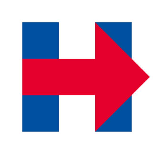
But the reviews of her campaign’s new logo design—a patriotic blue, red and white “H” with an arrow pointing right at the center—were uniformly negative. Why is the arrow red (the Republican color in the US), some asked, and why is it pointing toward the right? Were voters going to interpret it as an imminent shift towards more conservative positions? Others plainly stated that the logo didn’t say anything at all. Quartz’s Anne Quito weighed in with the following:
As unoriginal and clunky as it may appear, Clinton’s logo is perfectly functional. It’s unique enough, with utility that holds up across print, broadcast, and digital platforms. On Twitter, the red arrow is even a nifty, albeit unnecessary, device that directs the eye right to the messenger.
Clinton’s new logo builds upon Obama’s “O,” which was much closer to a corporate brand than a traditional political logo.
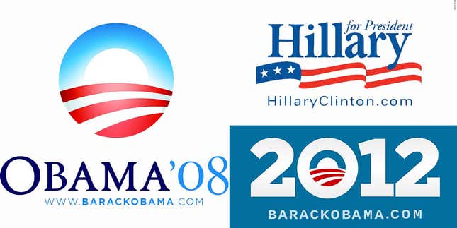
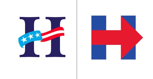
The style informed both of Obama’s campaigns, and forever changed the visual language of American politics, adding modern typography and design to an otherwise trite political visual vocabulary. Learning from that lesson, Clinton’s 2016 one-letter logo is highly recognizable. Like a brand, the “H” is a complete logo, not accompanied by her full name or the year, indicating a timeless commitment, and separating this campaign from Hillary’s bid in 2008.
Besides being bold, the one-letter logo is exceptionally social media friendly—no small thing given how ubiquitous social media channels have become, compared to 2008 (and to an extent even 2012).
“In the past, you got a lot of stars for being on a platform,” Jon Jones, chief digital officer at the Incite Agency who worked as the first digital strategist for Obama’s 2008 campaign, told Quartz. Now, he explained, it’s much less about whether a platform is used and why, and more about how it reflects on the candidate’s image.
In this light, the square design is strategically sound: The strongest attribute of this design—what makes it particularly functional in the time of memes—is its flexibility. Unlike Obama’s “O,” this does not appear to be a lucky accident.
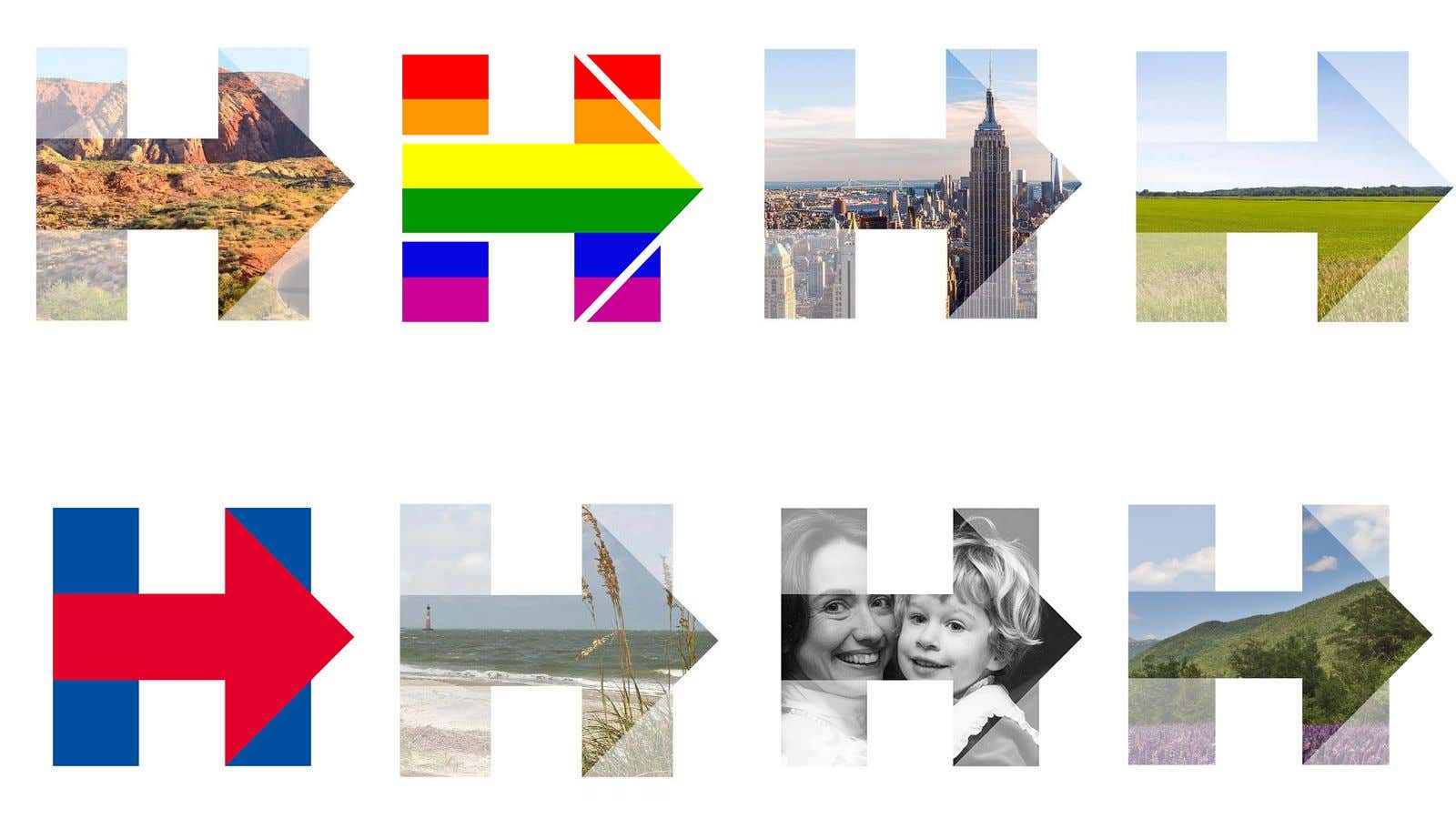
In the past two months the logo has already appeared in a number of avatars both on Twitter and Facebook, including the ones below:
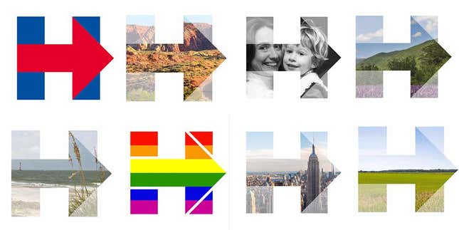
It is through all these iterations that Clinton’s logo fully displays its iconic value: It is highly recognizable despite the changes, and the much-criticized right-facing red arrow is now appears as it was likely meant to: pointing the way forward. The different backgrounds aren’t just an innovative graphic solution—they are the visual embodiment of the values Clinton is building her campaign around. It vehicles a leadership based on collectivity and inclusiveness rather than the elitist individualism Clinton is often accused of.
“The real Hillary is what they are trying to get out there, as opposite to a top-down Clinton force,” Jones explained.
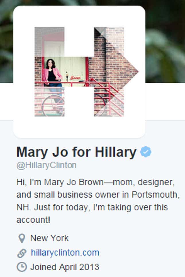
The logo is young, modern, colorful. And the strategy of inclusiveness goes beyond the design, extending to the offline campaign (with campaign workers traveling by bus under the eyes of surprised reporters). Thus far, the best example has been Mary Jo for Hillary: In an unprecedented exercise in relinquishing control, Clinton handed her official campaign Twitter handle to Mary Jo Brown, a small business owner from New Hampshire, who posted tweets about a day in her life (and work) in support of the grassroots initiative of ”small business owners for Hillary.”
This, said Jones, is something 2008 Clinton would have stayed away from but, as other elements of her campaign—such as the pop merchandising, including items such as the pantsuit-printed t-shirt—is “a page of the Obama book.”
Indeed, like Obama’s 2008, Clinton’s 2016 looks like a campaign designed to be remembered—not just to win.


