This post has been updated with details about the logo’s designer.

This post has been updated with details about the logo’s designer.
Blame it on the Sunday brunch cocktails, or on the fact that Hillary Clinton’s much-heralded entrance into the 2016 US presidential race was old news before it finally, and formally, got announced. On April 12, a nation fixated on the debut of Clinton’s campaign logo, and it did not like what it saw.
Join 500,000+ readers who start their day with Quartz.
By subscribing, you agree to our Terms of Service and Privacy Policy.
Created by the revered design legend Michael Bierut, the logo is comprised of a generic-looking, sans-serif H with a red arrow functioning as the letterform’s crossbar. The logo fueled critics who skewered its level of graphic sophistication and lack of originality.

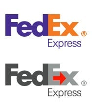
Its designers perhaps aspired to the ne plus ultra when it comes to incorporating arrows in brand marks: the FedEx $FDX logo. With the cleverly embedded white arrow in the negative space between the letters “E” and “x,” it’s considered a triumph of graphic wit and economy. That logo’s designer manage to imbue the straightforward logo mark with an extra layer of semiotic sauce that happens to propel the message about FedEx’s speedy delivery service.
Clinton’s, in comparison, looked like an off-the-shelf stock graphic image, critics charged. Others noted its likeness to a hospital road sign, or Iceland’s flag, while others joked that the right-pointing arrow hints at the political shift she’ll need to win over conservatives.
Wikileaks even accused the campaign of stealing its social media avatar.
Like many comments on social media, Wikileaks’s graphic critique is entertaining yet unsubstantiated—designed to snare impulse retweets and shares on social media. Last we checked, neither the color red nor the arrow is Wikileak’s invention, or innovation for that matter. It’s also highly unlikely that the campaign design team was sitting around brainstorming a logo for the presidential aspirant to match that of the whistleblower’s symbol. (We’ve reached out to the Clinton campaign for a comment on logo-gate, and will update this post as warranted.)
Either way, the fact is that the logo’s design follows such a well-worn graphic formula—from the generic letterforms of the custom-made font and the arrow seemingly lifted from Microsoft $MSFT Office, to the predictable red-white-and-blue color palette—that it’s likely to remind you of one thing or another.
The real issue here is not so much Clinton’s uninspired monogram, but the systemic issues that plague graphic design in American politics, if not design in general.
After a hopeful turn with the 2008 Obama campaign, it seems that campaign graphics is headed back to the doldrums. But Clinton’s H, Rand Paul’s Tinder-like burning flame symbol or Ted Cruz’s emblem that resembles a burning flag, campaign logos usually follow an established convention that’s rooted in literal interpretations of American patriotism.
As writer Steven Heller observed in his 2004 call-to-arms essay, The Dreary Art of Presidential Elections, “The Presidential election year is a special time in American politics when the public sees just how ineffectual graphic design can be. Although typefaces might alternate between serif and sans, the overall message is the same, when it comes to the buttons, posters, banners, and bumper stickers the platform is clear: Don’t rock the vote.”
Logo design is a bloodsport. The nitpicky like/dislike is cheap currency in the age of social media. It is breeding a generation of feckless critical gadflies, and giving them a platform with which they can maim the creative spirit and innovation. Social media is an ad hoc focus group; its aggregate voice will inevitably feed into the next creative brief to delimit future graphic design possibilities.
In the big picture, what role does a candidate’s logo play in the campaign? As unoriginal and clunky as it may appear, Clinton’s logo is perfectly functional. It’s unique enough, with utility that holds up across print, broadcast, and digital platforms. On Twitter $TWTR, the red arrow is even a nifty, albeit unnecessary, device that directs the eye right to the messenger.