This item has been corrected.
The website of Berkshire Hathaway is famously crude. You might even call it ugly. But look at the HTML code of this spartan “WEB page” and you’ll see that the best term for it is simply old school. It is a blast from the internet’s past.
So let’s learn how a WEB page was made in the 1990s by looking at the 2015 website of one of the most successful companies ever.
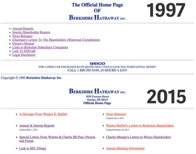
Here is Berkshire’s site today versus the version saved by the Internet Archive on May 30, 1997. It’s basically the same, nearly 20 years on:

Style, lack thereof
There are two things fundamental to the aesthetics of every website: styles and positioning. What elements on the page look like, and how they are placed. Both the ’90s and current Berkshire sites have almost the exact same styles. Perhaps more accurate would be to say that neither has hardly any styles at all.
For example, in 1997, Berkshire Hathaway applied exactly five color rules to its site:
- Make the background white.
- Unvisited links should be this color.
- And visited links this color.
- Links you are actively clicking on, this color.
- All other text should be this color.
There were five colors in 1997. Two decades later, Berkshire has actually simplified the number of colors to four, dropping the one for active links. That’s some extreme minimalism. Even Craigslist, another site renowned for its simplicity, has 40 colors.
The language of web styles today is CSS, or Cascading Style Sheets. Berkshire does not speak this language.
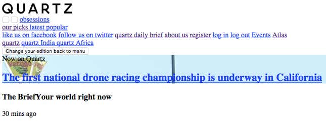
CSS applies style rules to particular elements. So you could apply the rule color: magenta to some element to make it magenta, or set text-align: center for some text. Here’s what Quartz looks like with no CSS—not pretty:

Berkshire didn’t use CSS at all in 1997. That was common at the time. But it still doesn’t today, when CSS is virtually ubiquitous. Quartz has over 1,600 CSS rules; Craigslist, 1,300. Berkshire has zero. The method it uses for style and positioning—HTML attributes—is so obsolete that the documentation explaining how to use it either tells you not to or hasn’t been updated since 2002.
Redesign
The Berkshire site has undergone one dramatic design change: the addition of HTML tables around the beginning of 2000. This is why the links today are fancily positioned side-by-side, whereas in 1997 they were displayed in a vertical list. Even tables, however, are obsolete.
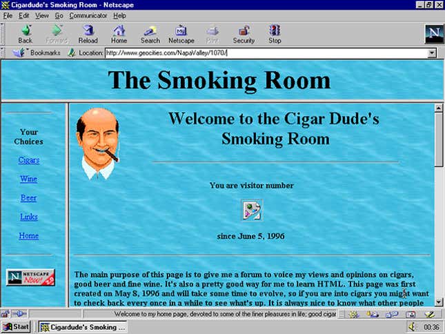
In the ’90s and into the naughts, makers of WEB sites used tables to position things. They even used tables to structure the entire layout of a site, for example to put some hyperlinks on the left side of the main content area. Check out the image below of now-defunct Cigar Dude’s Smoking Room, for the kind of layout that was commonly created by tables in the days of GeoCities, the free service that hosted many people’s first-ever web presence. (Cigar Dude’s site is actually created using frames, not tables, but in terms of positioning the idea is the same):

Like the outdated HTML attributes above, tables are almost never used in this way today, and positioning too is now the job of CSS. One blog post from 2009 called CSS versus tables “the debate that won’t die,” but the debate died years ago, and tables lost.
The main reason tables lost is flexibility. Cigar Dude is trapped by his layout: If he wanted to move the links to the top or right of the page, he would have to change a lot of code. And doing something other than a basic grid might be downright impossible. CSS allows you to do a lot more and change things more easily. Unlike Cigar Dude, Berkshire Hathaway’s tables are still around.
Another thing that the Berkshire site does not have is JavaScript. That’s the language that allows websites to become interactive and dynamic. These days even the simplest sites contain a bit of JavaScript, at the very least to track who is coming to the site or display the current date.
With no CSS and no JavaScript, the Berkshire site is pure HTML. This is the technological equivalent of preparing for a road trip by printing out driving directions and burning a few CDs. It is Times New Roman. It is a Nokia in a belt holster.
So old it’s new
Berkshire Hathaway’s website is built on technologies so outdated that new web developers probably don’t even know they exist. Is that a bad thing?
Sites today will use whatever new technology helps them compete for your eyeballs. They track your movements and interactions. They yell at you to do things you’d rather not. So Berkshire’s folksiness is a relief. People praise its simplicity.
It is to the web what normcore is to fashion: an oasis of unpretentious calm. And because the tech is so old, it is supported by every browser and device going back twenty years. You could read it on a PalmPilot.
Like normcore, it’s unclear whether the folksiness is natural or intentional. Some Berkshire subsidiaries do have modern-looking websites, like Berkshire Home Services, so it’s not as if the company is fundamentally behind the times or unaware of JavaScript and CSS.
Maybe it’s a conscious choice. Berkshire Hathaway and chairman Warren Buffet’s down-home reputation gives shareholders confidence through nostalgia for simpler times, when investors really knew their companies and stuck with them. The website brings us back to a time when people really knew their websites, when they wrote HTML by hand, character-by-character. That is to say, this ’90s site is completely on-brand.
It does have a new competitor for greatest cash-to-simplicity ratio on the web, though: muskfoundation.org.


