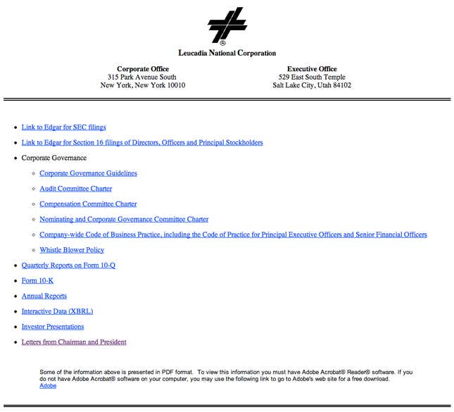
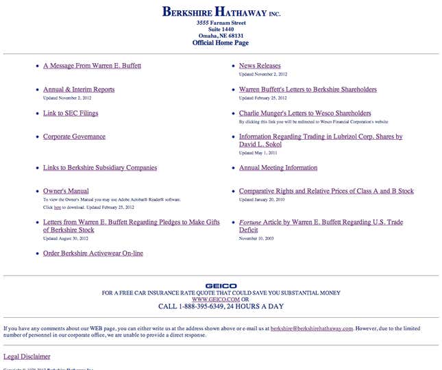
Leucadia National Corporation, a holding company that is often compared to Warren Buffet’s Berkshire Hathaway, just announced that it will buy upstart Wall Street securities firm Jefferies.
But here’s what the financial world’s cognoscenti would really like to know: Why can’t a firm worth more than $5 billion afford a website that looks like it was built after 1995?

So I called up Leucadia. Their official response is, “no comment.” But the impression I got was, if the SEC didn’t require that the company make disclosures available on its website, it wouldn’t have one at all.
Leucadia is hardly alone in its staunch, middle-American commitment to an undesigned corporate web presence. To a naive observer, it looks like an homage to the equally spartan site of Berkshire Hathaway. (Leucadia is fondly known as “Baby Berkshire”.)

In an age in which corporations spend lavishly on websites-as-experiences, it’s hard to imagine that these sites aren’t deliberate. The implicit message is: We are too busy managing your money to bother with what amount to fancy brochures. And, tellingly, Leucadia’s website has barely changed since 2004, which is the earliest record of it in the Internet Archive.
The web is littered with sites sending some variation on this message: “We care much more about our content than about how it looks.” Here’s just a brief list of extremely popular websites with extremely sparse design:
- Craigslist
- Wikipedia
- The Drudge Report
- The Pirate Bay
- Zero Hedge
- Online dating site Plenty of Fish
Far from turning off users, there’s evidence that customers who want to find information quickly love un-designed sites. After all, do we really want to live in a world in which Craigslist is beautiful rather than utilitarian?
When set next to its peers, Leucadia.com’s unimposing facade is the design equivalent of Warren Buffet’s famously modest lifestyle, and the embodiment of a uniquely American conceit: design is for fancy people. Or in other words, liars.