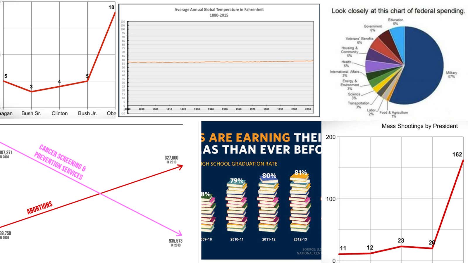
We make a lot of charts here at Quartz. We also spend a lot of time thinking and talking about charts. We have a 6,000-word guide to dealing with bad data and a treatise on properly using the y-axis. So when we see charts in the wild that use fuzzy or bad data, improperly skew axes, or are otherwise misleading, we get sad. We think, “The world is filled with good data! Why can’t everyone just use properly sourced and normalized data and present it in a straightforward way?!” So this year, we rounded up the worst offenders and corrected them.
Skewing the y-axis on Planned Parenthood data
At a hearing on Sept. 29, Republicans in the US Congress grilled the president of Planned Parenthood, Cecile Richards, accusing her of misusing the organization’s $500 million in annual federal funding. To drive home the point, Rep. Jason Chaffetz of Utah pulled out this chart:
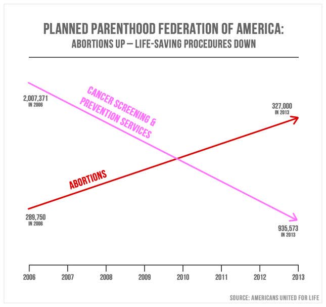
And here’s how the congressman explained the chart: “In pink, that’s the reduction in the breast exams, and the red is the increase in the abortions. That’s what’s going on in your organization.”
At first glance, it may indeed appear that the number of abortions performed by Planned Parenthood has skyrocketed while the number of cancer screenings has plummeted. One might also be left with the impression that the organization has been performing far more abortions than preventative procedures since 2010. But that is not the case. The main issue with this chart is that it has no discernible y-axis, so the placement of the lines is arbitrary. To believe this chart as it’s presented is to believe 327,000 is a larger number than 935,573.
Politifact checked out the numbers, pulling data on abortions and preventative care from Planned Parenthood’s annual reports. Here’s how this information looks on a proper scale:
The number of cancer screenings and preventative services has gone down, that much is true. But there are still far more of those procedures than there are abortions. Here’s another look at the data, using the year-over-year percent change of both services:
(Note that 2008 is missing from these charts; Politifact was unable to find that report, as were we.)
Failing on high school graduation rates
In mid-December, the White House tweeted: “Good news: America’s high school graduation rate has increased to an all-time high.🎓” The tweet included this chart:

This has several problems. First, it’s never a good idea to illustrate elements of a chart. What does it even mean that five books is equal to 75%, or that 16 books is equal to 82%? But ultimately, this is a column chart, and column charts must always start the y-axis at zero. Here’s the same data with an appropriate scale:
Not quite as dramatic there, is it? But that’s not where the issues with this chart end. According to the source line, these graduation rates came from the National Centers for Education Statistics (NCES) at the US Department of Education (DOE). The thing is, neither the NCES or the DOE as a whole* provide a single dataset we could find that includes annual graduation rates from 2008 to 2014. So did the White House pull these graduation rates from multiple datasets? Different data collections can count graduation rates in different ways, so that would be problematic.
Now, we can give the White House the benefit of the doubt and assume it has access to data that isn’t available to the public, but we can’t overlook the fact that a column chart is the worst possible way to show these data, even with a fixed y-axis. In chart-making, choosing the appropriate form to represent the data on hand is of utmost importance. And when you want to show subtle changes in rates over time, you use a line chart. Here’s a dataset from a single source, with the annual graduation rate since 1975:
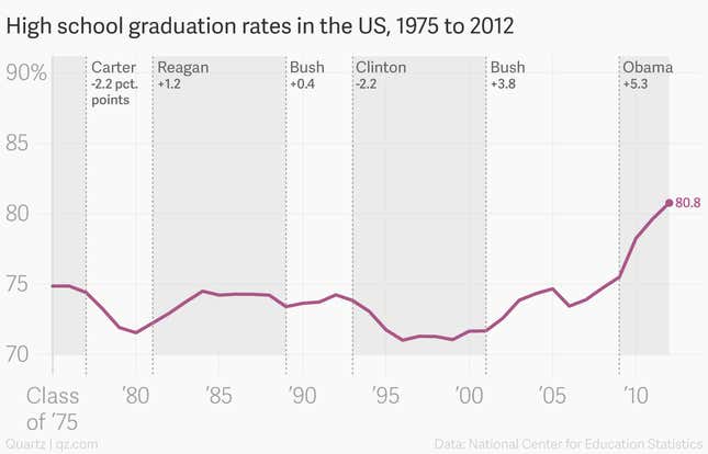
There are a few things we can get out of this larger context. One is that graduation rates were already trending upward when Barack Obama became president. Another is that, as of 2012, the percentage point increase in graduation rates was higher under Obama than any previous president. And if the 2014 graduation rate was 82%, as the White House chart shows, that increase is actually closer to seven points.
(*Update: We previously referred to the NCES and the DOE as “two separate sources.” Several of our readers have pointed out that since the NCES is a department within the DOE, they should be considered one source. The above section has been updated.)
National Review’s cool story on global warming
In 2015, this was the bad chart heard ’round the (graphics) world:
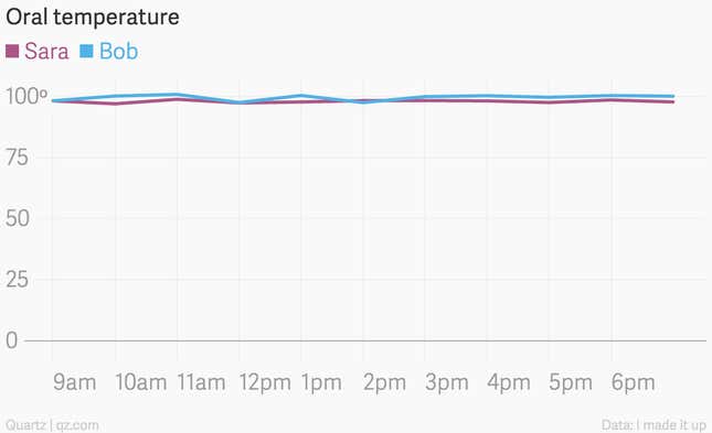
This is the chart we should all think about when someone says line charts should always have a y-axis starting at zero. A change of even one degree in the average global temperature is significant, but starting this chart at zero makes it look miniscule. As David Yanofsky points out in his piece on the appropriate use of the y-axis, look what happens when you chart oral temperatures, starting the y-axis at zero:
And here’s the comparison Businessweek’s graphics desk made:
If we want to accurately represent the change in the global average temperature since 1880, we have to start the y-axis at a higher number:
Government spending, misunderstood
Here’s a pie chart that made the rounds earlier this year:
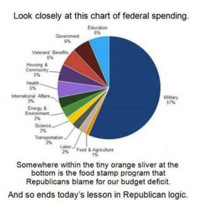
This is, as Politifact found, a fundamental misunderstanding of how government spending actually works. This chart shows only the government’s discretionary spending, and entirely leaves out mandatory spending. Mandatory programs, like Medicare, Medicaid, and Social Security, account for 60% of all government spending. Food stamps, which the pie chart says are included in the discretionary budget for food and agriculture, are actually part of a mandatory program, and are not shown in the chart. Here’s what government spending in 2015 looked like with mandatory spending included:
(* The “remainder” category, according to Politifact, “includes legislative branch, judicial branch, independent agencies and departments of Commerce, Interior, and Treasury, minus offsetting receipts.”)
Lies, damn lies, and cherry-picked data
After the recent shooting in San Bernardino, California, there was much discussion in the data world about how we count mass shootings. There are several data collections available on the topic, but all of them define mass shootings in different ways. Some only count incidents where four or more people were killed, others count any where four or more people were shot (whether they died or survived). The problem is that, depending on the criteria, the number of mass shootings that take place each year can range from dozens to hundreds.
On Dec. 2, a website called Truthstream Media published a story titled, “Why Have There Been More Mass Shootings Under Obama than the Four Previous Presidents Combined?” It included the following chart, which it said was based on several data sources. One was the Mother Jones database on mass shootings, which uses the four-killed-or-more criteria. Two others were from Wikipedia.
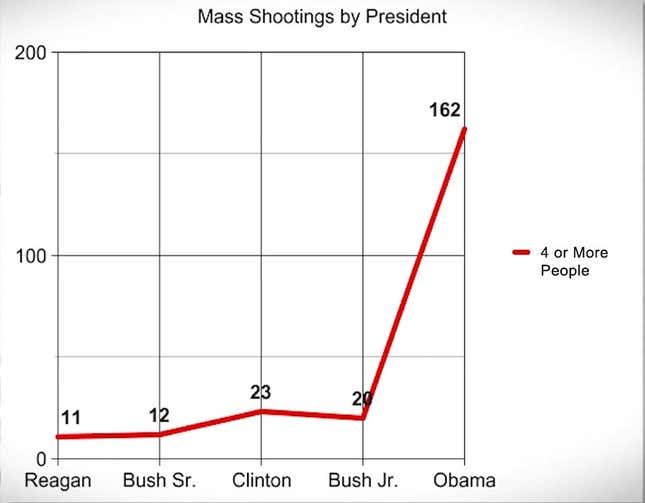
Snopes took a look into the numbers, and found that they were cherry-picked, selectively chosen to skew the numbers in Obama’s term:
TruthStreamMedia.com fudged its numbers by loosening its definition of “mass shootings” to include domestic murders while collecting data for President Obama but exclude similar instances for his predecessors. For example, one entry under President Obama lists “Ervin Lupoe.” Lupoe killed his wife and five kids in 2009 but this incident was not listed by Wikipedia or Mother Jones because it was not classified as a “mass shooting”
Here are the number of shootings by presidential term, using only the Mother Jones data:
