Dieters, diabetics, calorie counters, caffeine avoiders: Beware.
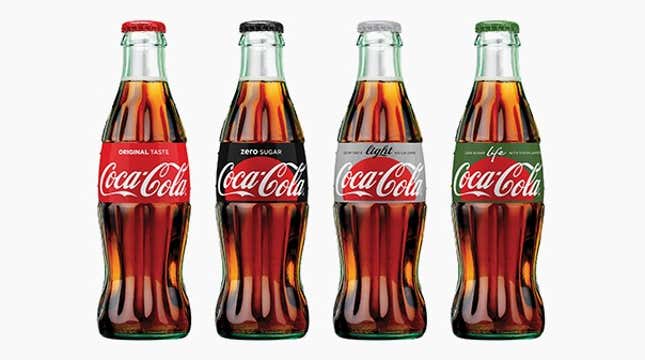
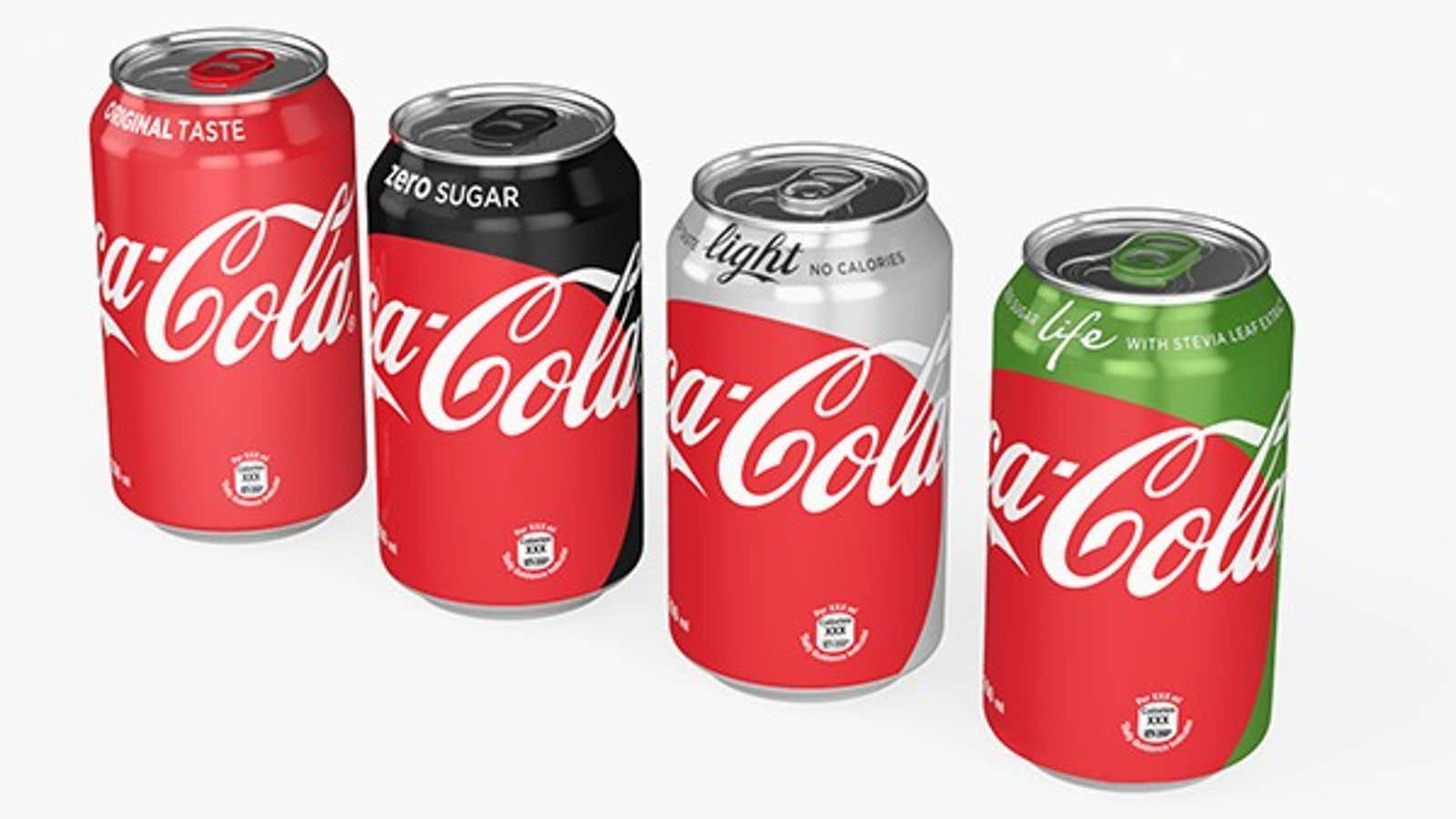
Coca-Cola is launching a new soft drink packaging that essentially obscures the difference between various kinds of Coke. In this new branding scheme, unveiled at an event in Mexico City yesterday (April 19), a Diet Coke can appears predominantly red, as do cans of Coke Zero and Coke Life—with just a sliver of their original colors peeking through one side.
Coke claims that this will make their products easier to distinguish. “We are taking the next step towards full adoption of the “One Brand” strategy, uniting the Coca-Cola family under one visual identity and making it even easier for consumers to choose their Coca-Cola with or without calories, with or without caffeine,” said chief marketing officer Marcos de Quinto in a press release.
Coke’s in-house design team spent 18 months tweaking and testing their package designs in 14 market tests to come up with the new look. Their design solutions echo Coke’s new “One Brand” marketing strategy, where the 130-year-old company plans to stamp all their design assets with the colors, design motifs and nostalgic themes of the bestselling classic Coke.
The new packaging, like their new ads, herald the rise of the “Red Disc”—essentially a flat, red circle paired with the white Coca-Cola Spencerian Script logo—as the brand’s singular unifying graphic element. A Coca-Cola spokesperson tells Quartz that the disc is meant to emphasize the fact that Coke is, well, Coke: “By extending the Red Disc across the variants, we are further uniting the trademark products as one Coca-Cola family.”

Coke’s VP of global design James Sommerville explains in the press release that the Red Disc—which appears like a rising sun in bottle labels—will be applied across “packaging, retail, equipment and experiential [marketing].”
This is a head scratcher. The company’s marketing team is at pains to explain that clarity is the motivating principle of their new strategy. But how can the same color label help busy, inattentive consumers snag the right kind of Coke?
The craft of food packaging and label design began flourishing in the US in the late 1800’s, when consumers started shopping by going to grocery aisles instead of asking for goods over the counter in general stores. Since then, the goal of package design has been to distinguish products with the strategic use of colors, typography, shapes and other design special effects.
Coke, more than any company, knew about the value of a unique package when it invested in its iconic 1915 contour bottle to deter copycats. But with the “One Brand” strategy, Coke is essentially repackaging its products in the generic Pantone “Coke Red.”
It’s a surprise move for a company with a rich history of delightful and profitable branding variations on cans and bottles, from personalized names in their “Share a Coke” campaign to special edition tie-ins with movies and events. This new design twist risks undermining the great work that went into establishing Coke’s distinctive color assignments—including the iconic silver can of Diet Coke.
Coke’s One Brand packaging will be deployed in Mexico by the first week in May and will trickle to markets worldwide by 2017.
