Last week, the US Food and Drug Administration (FDA) put an end to a years-long design debate: Why Helvetica?
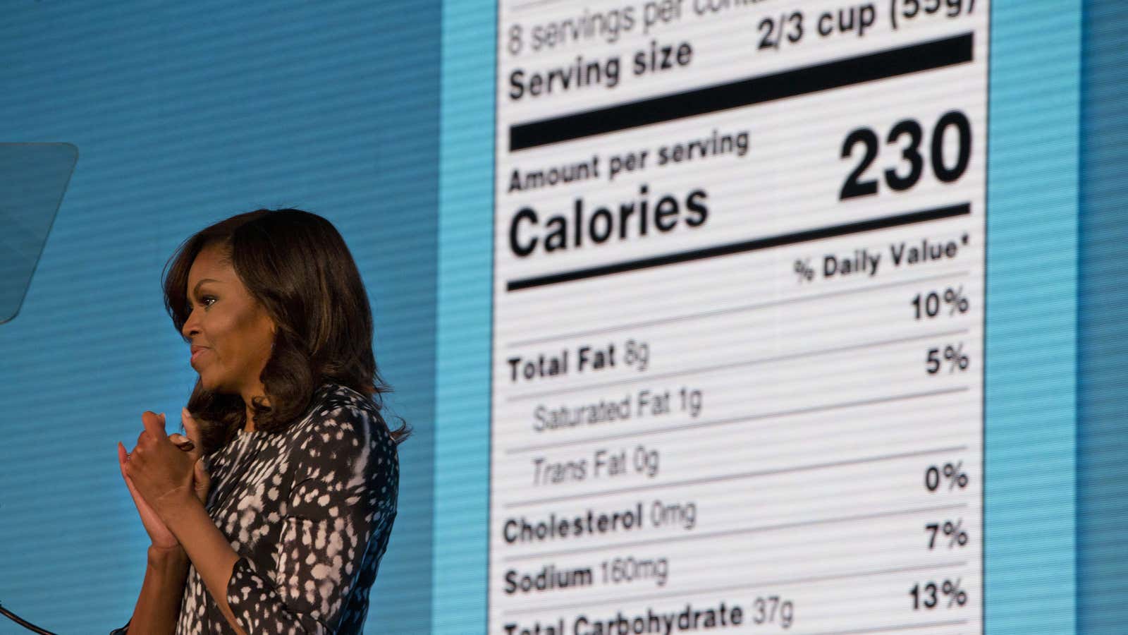
On May 20, the FDA announced that—after much deliberation—it will keep the existing design of its oft-maligned Nutrition Facts label, with just a few typographic adjustments for clarity. ”Very soon you will no longer need a microscope, a calculator or a degree in nutrition to figure out whether the food that you’re buying is actually good for your kids,” proclaimed first lady and health advocate Michelle Obama, unveiling the refreshed design at a health conference summit in Washington, DC, last Friday.
Introduced in 1993, the US Nutritional Facts label appears on nearly 800,000 food products today, and is one of the most reproduced and recognizable pieces of graphic design in recent American history. But with the spread of an alarming obesity epidemic in the US, many have questioned if the straightforward, Helvetica-heavy label is effectively conveying vital nutrition facts to shoppers.

A mandatory label on the side of busy food packaging must not only stand out, but also convey information in the span of a few seconds when we’re deciding whether to purchase a product or leave it on the shelf.
Over the last few years, the US Food and Drug Administration (FDA) has entertained the idea of giving the 20-year old Nutrition Facts label a major design overhaul. Several design proposals have emerged: A stark color-coded box grid; a label crammed with icons, pie charts, and control levers instead of words; a “grading” system that evaluated each nutritional component. Food journalist Mark Bittman even threw his hat in the design debate and proposed a simplified traffic light-inspired label that scores food on its “foodness” (its resemblance to its natural, unadulterated food.)
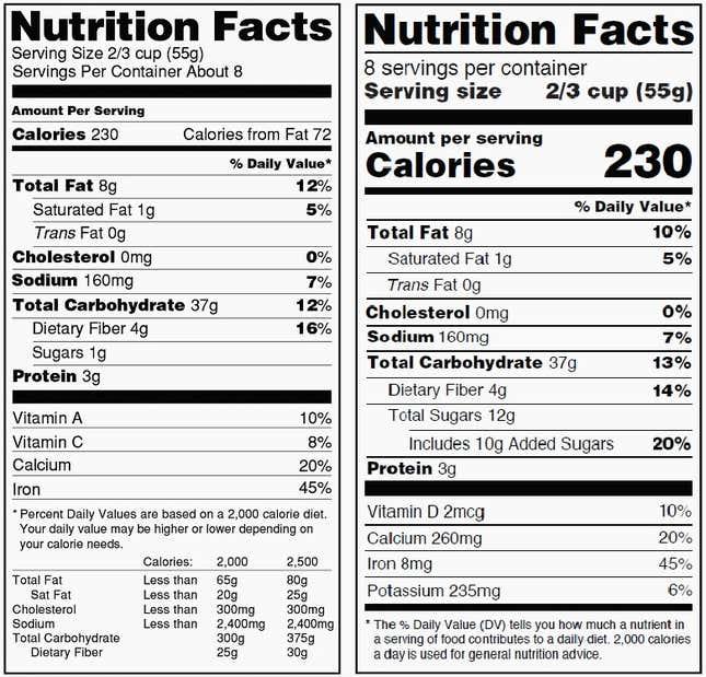
But in the end, after four consumer studies, the FDA is sticking with the familiar. The most obvious updates can be found on top of the label with larger and bolder fonts to denote calories. The most substantial—and controversial—change is the addition of a new line for “added sugars” to declare the amount of sweeteners added during processing.
The 2016 design refresh seeks to distinguish between “serving size” vs. “servings by container.” Inconsistencies in the old label were thought to confuse American consumers, leading them to unwittingly devour multiple servings of snacks and drinks from a single package.
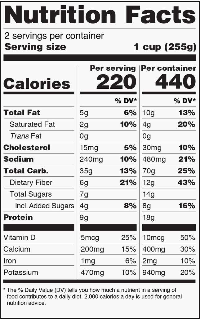
For products that tend to be consumed in one sitting, manufacturers must now print a dual column label to clearly juxtapose the caloric difference between a single portion and the entire container:

“We are keeping the ‘iconic’ look of the label but are making important updates to ensure consumers have the information they need to make food choices that support a healthy diet,” says FDA press officer Lauren Kotwicki to Quartz.
The label’s status as a design icon was affirmed by former president Bill Clinton who bestowed its designer an award of design excellence and by Italian fashion brand Moschino, which capped its fall 2014 runway show with a wedding gown emblazoned with the mandatory food product graphics.
The Nutrition Facts label’s designer Burkey Belser tells Quartz that he’s proud to see his original concept, which he designed pro bono, survive relatively unchanged after so much scrutiny. The 68-year-old Washington, DC-based design veteran (also the creator of Energy Guide labels for appliances) says he was barred from proposing new designs for the label, but gave his input on new proposals. “After 20 years, there is not a single thing I would change from the original design,” says Belser.
Belser credits the design’s enduring universal appeal to its simplicity. “We discovered as we developed our designs (about 35 variations) that charts and graphs, for example, were a second higher level of literacy,” he says. He decided to eliminate infographics, symbols, icons and all types of punctuation marks because they slowed readers down.
Belser’s straightforward solution stripped any extraneous flourishes to the basic elements of a layout: lines and fonts. But of all fonts, why Helvetica? “From the designer’s point of view it’s hard to imagine a better workhorse font than the Helvetica set,” explains Belser. ”It is clear and elegant in both its lightest and its boldest iteration. Gill Sans, for example, becomes awkward in its boldest form.”
It also boils down to money: “We chose Helvetica because it was felt that all manufacturers would already own the font,” says Belser referring to the pragmatism of using pre-installed system fonts in Macintosh computers, when the design was first conceived. ”[It would help in] minimizing at least to a small degree the cost of compliance; that is, they wouldn’t have to buy a new font. Simple as that.”
If a completely new design had been introduced, the FDA would have had to spend more on a massive public education campaign. Manufacturers would have had to replace templates, or even possibly redesign boxes and packages, depending on the shape and size of the mandatory nutrition label. Barely a week since the announcement, food label experts are already convening in Washington, DC to discuss how best to comply with the FDA regulations on the Nutrition Facts label.
All big food manufacturers in the US are required to update their packaging by July 26, 2018. Small factories with annual sales of under $10 million are getting an extra year to make changes. The Nutrition Label updates must also be reflected on all food items imported to the US.
