
At the end of 2012, we brought you our favorite charts of the year—the most significant trends, compelling data, and elegant visualizations, as picked by the Quartz staff. We’re a bit obsessed with charts here, and as 2013 nears its half-way point, we already have a growing list of favorites. Here they are:
Share of the world’s GDP since 1820
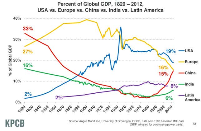
This remarkable chart—from the Kleiner Perkins Caufield Byers “Internet Trends” presentation in late May—shows the shifting shares of global GDP over an unusually long timeframe. Europe’s dive over the past century is made clear, along with China’s sharp rise, and India’s middling progress. Perhaps surprising: China’s and India’s huge shares in 1820. And the American Century looks a lot less impressive in this context. —Kevin J. Delaney
Job growth vs. job quality
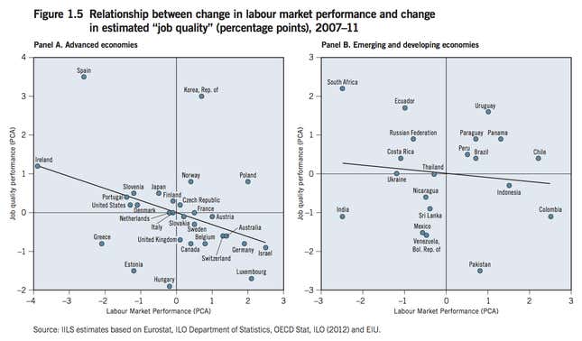
The International Labor Organization made this chart (pdf) to compare “job quality,” measured by average wages, benefits, and hours worked, with job creation, between 2007 and 2011. Essentially, the place to be is in the top right quadrant (where countries are creating more and better jobs) and not the bottom left (where economies are creating fewer, worse jobs).
In most advanced economies, the new jobs being created are of lower quality, like the German “minijob”, with the exceptions of countries like South Korea, Norway, and Poland. The United States has fewer jobs, but is creating better ones—a finding that reflects growing inequality in the US. The emerging markets, on the other hand, are finding it easier to create more and better jobs because they’re starting from a low base. In other words, it’s easy to improve job quality in a country where most people make less than $10 a day; it’s much harder in a country where the median income is $50,000 per year. —Tim Fernholz
The recovering US housing market
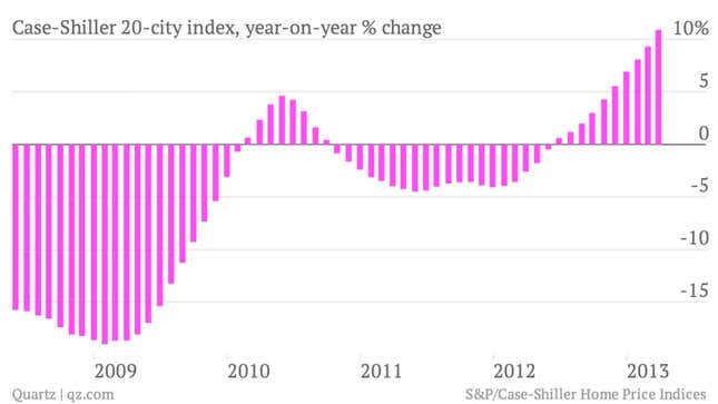
This chart shows how home prices in large US cities have really started gathering steam this year. The closely watched S&P/Case-Shiller 20-city index jumped 10.9% in March, the biggest change in seven years. —Matt Phillips
Android’s fragmented user base
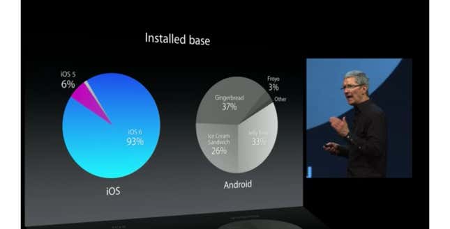
I love this chart because it illustrates a point that can’t be made often enough: Despite its dominant market share, Android remains a highly fragmented ecosystem. Most people with Android smartphones are using a version of the Android operating system (Gingerbread) that came out in 2010 and, frankly, isn’t that great. This is exactly the point Apple CEO Tim Cook was making when he flashed this slide at Apple’s World Wide Developers Conference earlier this month. —Christopher Mims
The NSA’s boundless informant
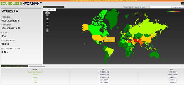
There are many things to love about this screenshot, published by the Guardian, from a US National Security Agency data-mining tool:
- its incredibly corny name, Boundless Informant, which proves that spies lack self-awareness;
- that we are seeing it at all, thanks to whistleblower Edward Snowden;
- and how it captures the vast scope of NSA surveillance, which apparently swept up 97,111,188,358 pieces of information around the world in March 2013—a meaningless figure, yes, but one that speaks volumes in its magnitude.
Like so much of what Snowden has leaked, the screenshot raises more questions than it answers. But there’s something brilliant and ultimately very informative about its rudimentary interface and oversimplified heatmap, teasing the troves of data contained within this thing they call Boundless Informant. At a glance, we see where the American surveillance machine has pointed its ears: Iran, Pakistan, Jordan, Egypt, India—and, with nearly the same intensity, the US itself. —Zachary M. Seward
The cost of everything in the world
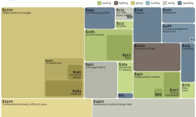
The US has less than one-twentieth of the global population but accounts for over a fifth of world health-care spending. Africa’s entire foreign debt ($200 billion) is just half what the planet spends each year on prostitution. British data journalist David McCandless’s blog, Information is Beautiful, is a repository of simple and elegant data visualizations. He isn’t the first or only person to try to capture what all the money in the world does—if you want to be truly gobsmacked by numbers, look at this stunning giant chart from XKCD— but his Billion-Dollar-O-Gram, updated for 2013 (the above shot is just a part of it), is certainly one of the easiest ways to get a very quick and sudden sense of perspective on how much the big things in this world cost. —Gideon Lichfield
An animated catalog of planets

The discovery of dozens of planets by Kepler, a spacecraft designed specifically for that purpose, is difficult to grasp, let alone visualize. The best most of us can do is recall that sunset from Tatooine. That is why this interactive graphic from the New York Times is my pick for the favorite chart of the first half 2013. Though it doesn’t look like a traditional chart, it fulfills the primary function of one: to communicate a lot of complicated information in an easily understandable visual format. Its sparse design contains a wealth of information: size of stars in relation to our sun, star temperature, relative size of planets, velocity of orbit, and more. And it’s beautiful, too, which is a nice little bonus. —Leo Mirani
The decline of US household wealth
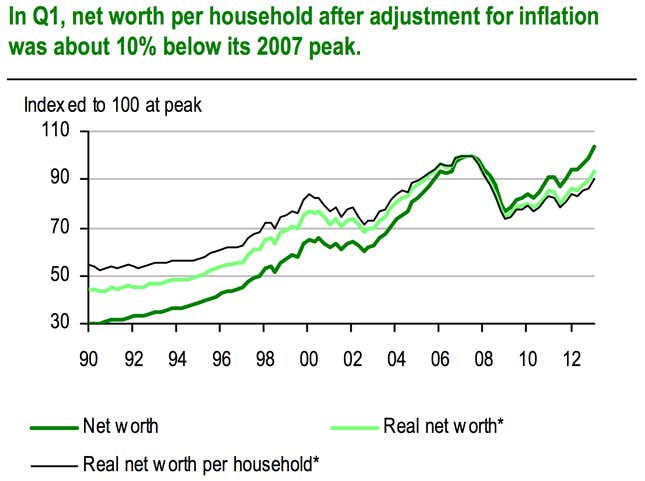
American household balance sheets have healed a lot since the financial crisis hit. The ensuing stock market collapse and housing implosion incinerated some $16 trillion in household wealth. In nominal terms, American households managed to claw all that money back by the first quarter of 2013. But that doesn’t mean households are back where they were before the crisis.
Because of population growth there are now more households, which means aggregate US household wealth is shared by more people. And because of inflation, a US dollar buys less in 2013 than it did in 2008. UBS economists, who created this chart, estimate that after adjusting for inflation and household growth, net worth per household is still down 10% from where it was in 2007. —Matt Phillips
What metadata reveals about us
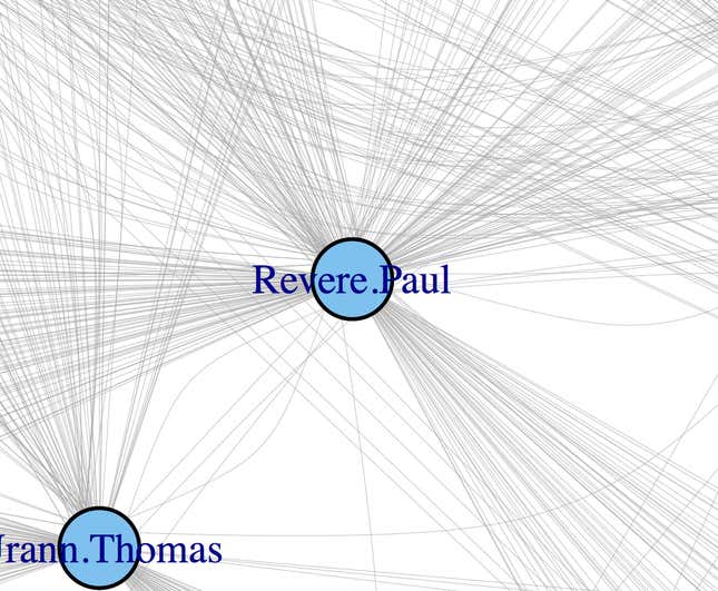
When Edward Snowden leaked information about the existence of a large government surveillance program in the US, it brought the concept of metadata into the national spotlight. The NSA is collecting gobs of it, but a key question in the mind of the public is, what exactly can metadata reveal about you?
To provide a taste of metadata’s power, Kieran Healy, a sociologist at Duke University, used metadata from the past to identify Paul Revere as a central figure in a network of American revolutionaries in 1772. The chart itself (cropped in this screenshot) is nothing to put in a frame; but that Healy used relatively straightfoward math to pinpoint Revere three years before his legendary Midnight Ride is an unforgettable example of what metadata can show. —Ritchie King
Our mobile future
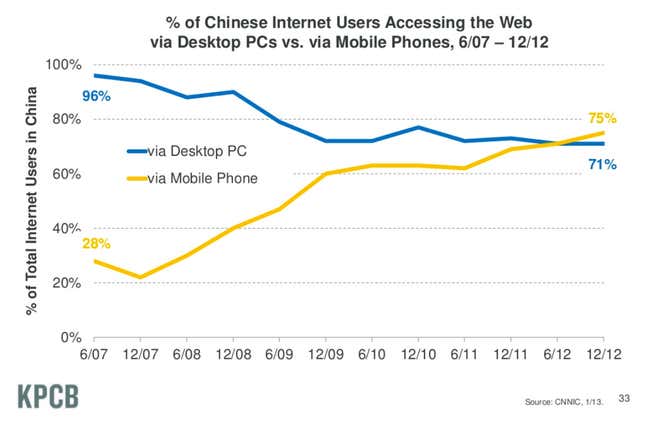
China is the largest internet market in the world, with an estimated 564 million citizens online in 2012. This chart, another from the Kleiner Perkins “Internet Trends” report, shows how smartphones have quickly become the most popular method for connecting to the internet in China. The trend—and similar ones in other countries—helps explain the growth of phone makers like Apple and Samsung and the hard times for traditional PC makers. The chart also points to the continued growth potential for mobile commerce, communications, and services. —Kevin J. Delaney
Violence and investment in Kenya
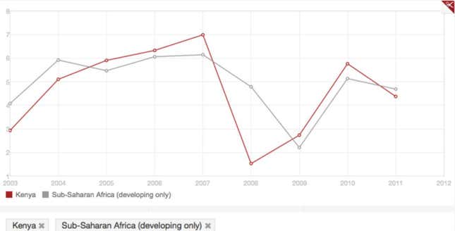
We used a chart from the World Bank to illustrate the dropoff in foreign direct investment after Kenya’s violent and deadly elections in 2007. It’s not much to look at, but this chart speaks volumes about attitudes heading into the country’s elections earlier this year. After that staggering 87% drop in FDI, there was no way the Kenyan government or business would allow this election to be anything but peaceful. And so it was. Or so we were told. —S. Mitra Kalita
The global trade in bull semen
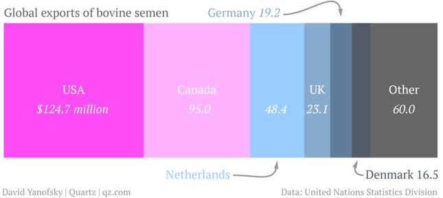
Especially in this era of anemic demand, talk often turns to global trade. Currency wars, the weakening yen, the fate of periphery euro zone economies, the Trans-Pacific Partnership, China’s GDP—all those thing swivel in some way on the concept. But its near-universal relevance also makes it blandly abstract. That’s why my favorite chart of late is David Yanofsky’s two-part exploration of the international bull semen trade for Quartz. And I say that not just because I want the challenge of avoiding raunchy punning for the next two sentences. The US-Iran trade chart neatly unravels all these little filaments of need—the ones that drive people to trade with each other regardless of who’s government is QE-bombing whose. David’s pink dots are an elegant reminder that ”global trade” isn’t just cars, crude and semi-conductors. It’s also cucumber seeds, toothbrushes, lentils and, yes, bull semen. —Gwynn Guilford
At least they’re honest
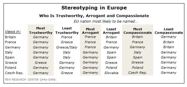
Europeans are quick to stereotype each other, as this survey in May from Pew Research found. Almost everyone agrees that Germans are the most trustworthy, least compassionate and most arrogant nation; in fact, Germans dominate the rankings in general, no doubt a sign of their outsize influence on the continent. Each country pats itself on the back for being the most compassionate, and Greece unsurprisingly gets low marks for trustworthiness. But my favorite finding: Italians consider themselves to be the least trustworthy, and the French reckon that when it comes to arrogance, nobody beats the French. How nice to have a little self-awareness. —Gideon Lichfield
Gold’s big dive
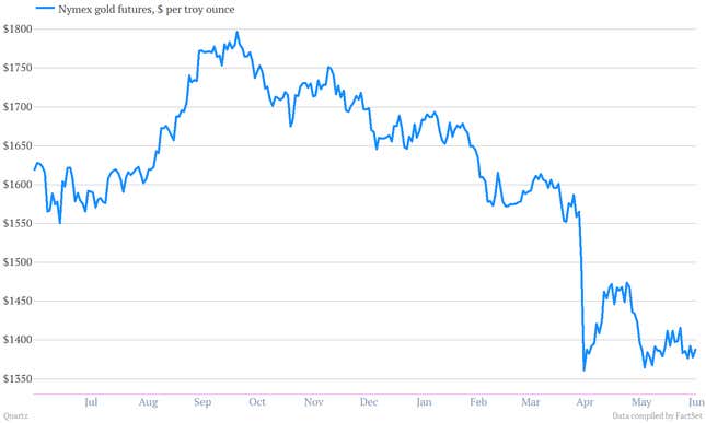
Amid growing confidence in the US economic recovery as well as a sturdy rally in the stock market, gold prices collapsed in April. They’ve tried to get off the mat a couple of times, but no dice. —Matt Phillips
Long-term unemployed in the US struggle to find jobs
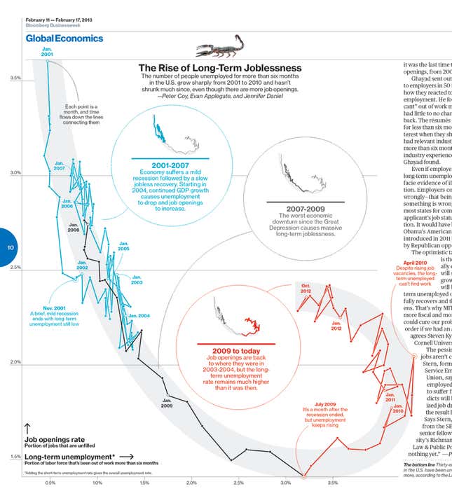
Businessweek showed the relationship between long-term unemployment and job openings. It reveals that the long-term unemployed in the US are still having trouble finding jobs even as the job market has improved to levels last seen in 2004. —David Yanofsky
The high price of wives in China
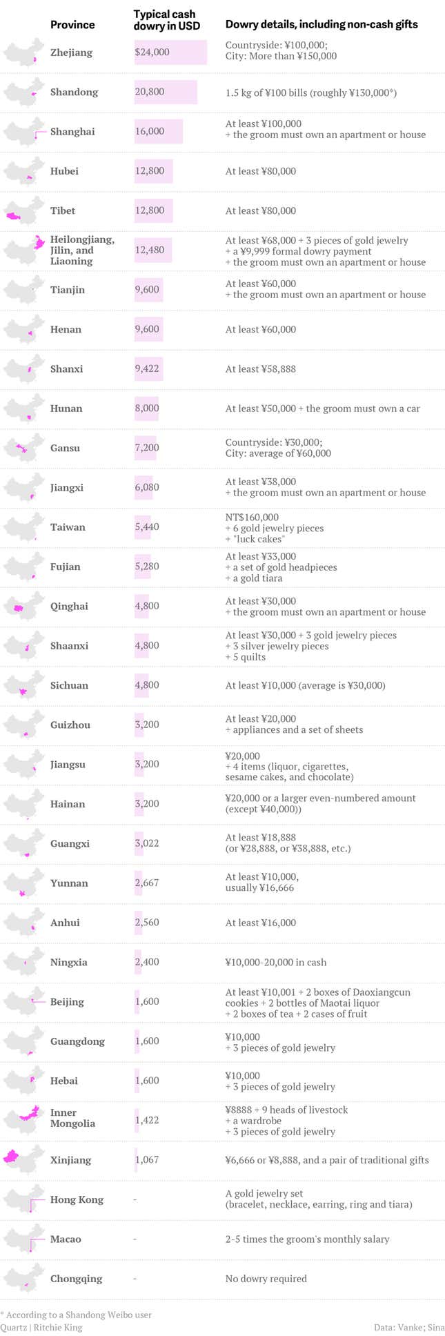
My favorite chart is Quartz’s breakdown of how China’s traditional “bride price” system works today. In this reverse-dowry kind of scenario, men give cash (sometimes measured in weight), appliances, liquor, tea, and other gifts to their fiancees and future in-laws. It also gets at the concern in China that people have become too materialistic. The original version of the chart had gone viral on Chinese social media as people debated whether the bride price system was hurting young couples who have to save for years before they can marry. —Lily Kuo
The many languages of New York tweets
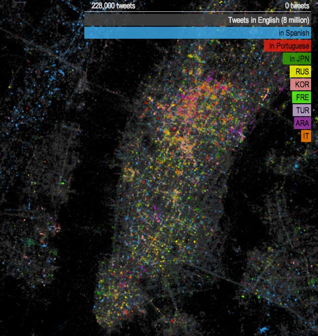
I take the subway every morning, so I’m pretty familiar with how many different languages echo around New York City. But I wouldn’t have guessed that Portuguese and Japanese are two of the city’s predominant languages (at least on Twitter), or that more of its dwellers tweet in Korean than French, and Turkish than Arabic. And even if I had, I couldn’t have documented it as simply and beautifully as this. —Roberto A. Ferdman