If EDM and stencil fonts don’t make border walls seem cool, then Paul Ryan doesn’t know what does
Paul Ryan is trying to give the US-Mexico border wall debate a fresh new look—but he’s going about it all wrong. Today, the US house speaker released a cringeworthy video starring himself on the border, which feels a lot like an ad for a reality show in 2001.


Paul Ryan is trying to give the US-Mexico border wall debate a fresh new look—but he’s going about it all wrong. Today, the US house speaker released a cringeworthy video starring himself on the border, which feels a lot like an ad for a reality show in 2001.
After huge defeats in repealing Obamacare and a thorny tax reform battle, Ryan’s tweet is an attempt to rally new energy behind another Republican party goal: Building the US-Mexico border wall that Donald Trump promised during his 2016 candidacy. The House passed the $1.6 billion bill funding Trump’s “tall, impenetrable, beautiful” dream wall last month, but is facing opposition in the Senate.
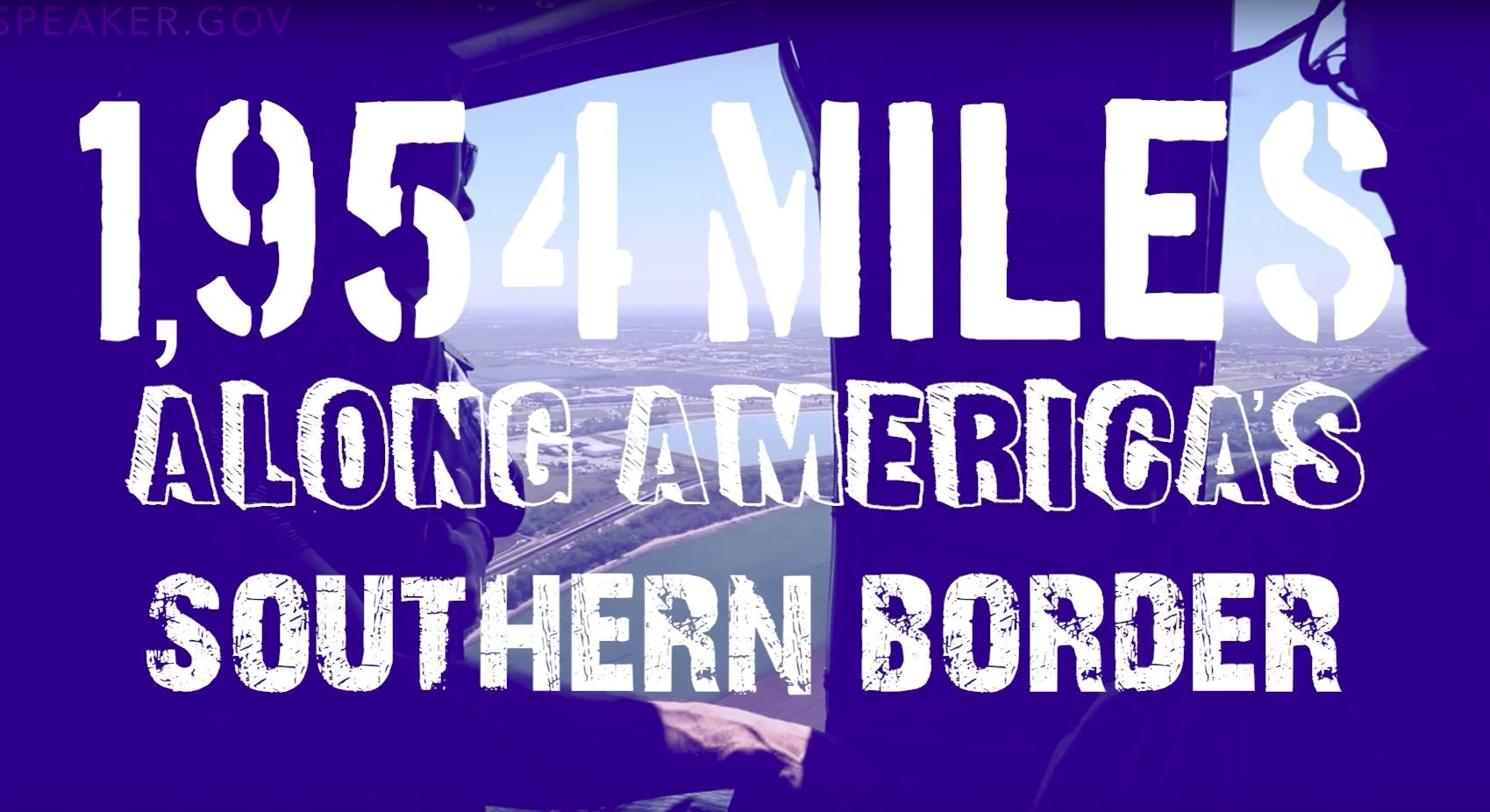
Set to grating electronic dance music, the 30-second video follows Ryan’s tour of the Rio Grande Valley border in Texas last February. Wearing cool dad sunglasses, the self-described fitness fanatic is shown traipsing from an airfield, to a border patrol boat, and finally galloping on horseback like a immigration-quashing action hero.
But stealing the spotlight from Ryan is a mess of cheesy fonts, added to punctuate his message.
Stencil fonts, grunge type, doodle ballpoint scrawl, and doily fancy script, the video’s editors seem to have thrown in all the free fonts they could download. His call to action—”let’s get it done”—is rendered in three typefaces: A sloppily-kerned calligraphic script, followed by distressed grunge font (for “let’s get our hands dirty”), and for a brief second, military stencil font (for “power”).

The video’s graphics are reminiscent of onscreen type antics in tween-oriented TV shows. But of course, everything is relative. Ryan’s amateur production is still a lot better than the famously low production-value videos coming out of the White House these days.
This is not Ryan’s first controversial graphic design choice. In January, many critics mistook his office’s emblem for the Grossdeutschland eagle of the Nazis. The icon of an eagle atop a sphere, in fact, has been part of the US Speaker’s seal since the 1960’s, but Ryan’s clip-arty version evoked the bold shapes of the fascist emblem.