America’s opioid epidemic is way worse than we realized
It’s hard to solve a problem if you don’t understand its magnitude. And thanks to faulty data collection, America seems to have been greatly underestimating the severity of its opioid epidemic. According to a new study that corrected the rates, opioid mortality rates in 2014 were 24% higher than the official statistics. Heroin mortality rates were 22% higher.


It’s hard to solve a problem if you don’t understand its magnitude. And thanks to faulty data collection, America seems to have been greatly underestimating the severity of its opioid epidemic. According to a new study that corrected the rates, opioid mortality rates in 2014 were 24% higher than the official statistics. Heroin mortality rates were 22% higher.
Why might the official data be so horribly off? Drug overdoses that kill people often involve more than one type of drug. However, when entering information on the person’s death certificate, hospitals don’t necessarily record all—or even any—of the drugs taken. In fact, around one fifth to one quarter of drug overdose fatalities—depending on the year—indicate “unspecified drugs” as the cause of death. The share of these that involve opioids or heroin aren’t making it into the official mortality rate tally.
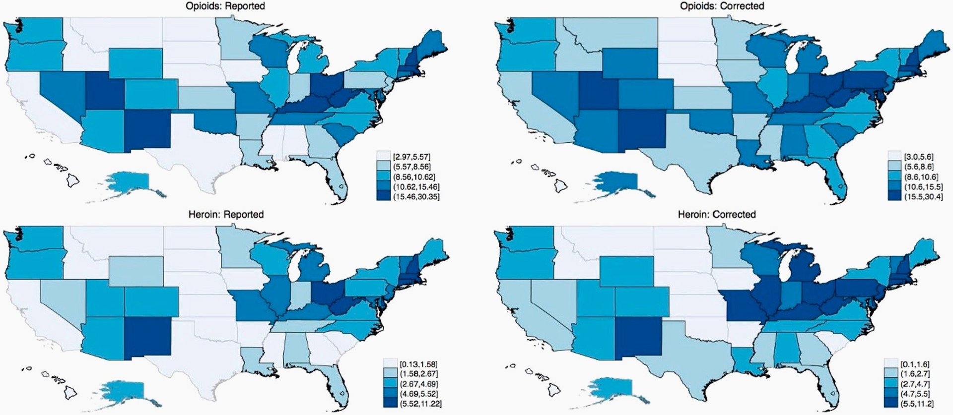
To correct for that oversight, Christopher Ruhm, an economist at the University of Virginia, estimated the probable percentage of “unspecified drug” deaths involving opioids and heroin based on the distribution of drug involvement for death certificates on which at least one specific drug category was recorded. He also adjusted for demographic factors and controlled for socioeconomic variation at the county level. This calculation implies the rate of mortality in which opioids were involved rose to 11.2 per 100,000 people in 2014, the last year for which complete data were available. That compares with the official rate of only 9 per 100,000. The heroin rate, meanwhile, leapt from 3.3 per 100,000 to 4.
Applying Ruhm’s model dramatically changes the state rankings for opioid- and heroin-related mortality. For instance, Pennsylvania, Indiana, and Louisiana clearly haven’t been meticulous data-recorders: their adjusted opioid and heroin mortality rates were markedly higher.
The corrected rates reveal a clearer geographic mortality pattern than the reported data, argues Ruhm. Opioid-related overdoses were clustered in the Mountain States, the Rust Belt, and the Industrial North (creeping on up into New England), and parts of the South. Heroin deaths, however, were concentrated in the Northeast and the Rust Belt, more so than the South or the Mountain States.

Since Ruhm’s analysis extends back to 2008, it also offers a sharper picture of how mortality rates have changed—a trend that might be obscured by changes in how states record drug overdose death data. For the US as a whole, the increase in heroin mortality from 2008 to 2014 was underestimated by about 18%; opioid-related drug fatalities changed little, though.
Pennsylvania and Indiana topped the charts for biggest increases in the frequency of both opioid- and heroin-related deaths, based on Ruhm’s estimates. Meanwhile, the official mortality data for about half of US states overstates the rise in mortality rates between 2008 and 2014—in particular, Connecticut, Ohio, New Mexico, and South Carolina.
Of course, there are some caveats to Ruhm’s approach. For one, he’s assigning the probability of a drug’s involvement based on a necessarily limited range of demographic characteristics. Plus, he only looked at one type of inaccuracy, the “unspecified drugs” oversight. Distortions may arise due to other flaws in death certificate bureaucracy. For example, heroin deaths are sometimes mistakenly attributed to morphine or codeine overdoses, notes Ruhm. And that means more grim surprises may yet await us.