Hurricane Irma: Many Floridians are now in danger because they didn’t know how to read a hurricane map
Hurricanes put weather forecasters in the middle of an impossible problem: They can’t know for sure where a storm will travel, but people need to know whether they’ll be hit.


Hurricanes put weather forecasters in the middle of an impossible problem: They can’t know for sure where a storm will travel, but people need to know whether they’ll be hit.
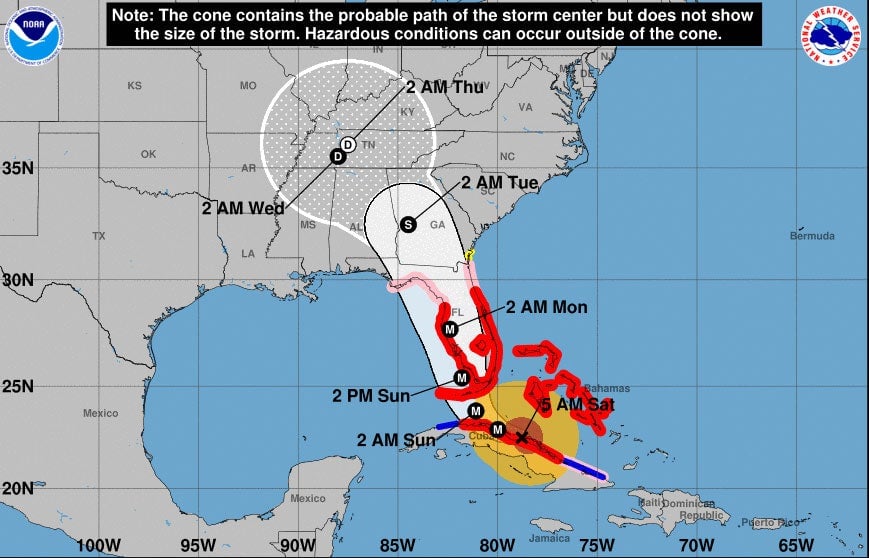
Their visual solution has always been the “cone of uncertainty,” a chart that shows the spectrum of possible paths for the center of the hurricane over the next 3-5 days. But the design of that chart still leaves people with questions, and can be misleading to the point of giving some people false hope that they won’t feel any of the storms effects—until its too late.
Meteorologists explaining the charts over the internet, from the National Weather Service to local weather forecasters, have seen two major issues with the way people read these maps.
The cone doesn’t represent storm size
At a quick glance, it’s easy to think that cone indicates which locations are going to be impacted by the storm. But this isn’t the case. The cone of uncertainty only shows where the eye of the storm (or central point) could travel, meaning those even slightly outside the cone could feel the full force of a hurricane.
Confusion around what the cone means is seen even in the direct path of the Hurricane Irma.
Miami chief meteorologist John Morales tweeted this morning that the cone would miss the southern tip of Florida and the Upper Keys. Some following the forecaster responded asking if Miami, already feeling gusts of wind up to 60 mph as the storm lingers near Cuba, whether they would feel wind or any other effects. Much of coastal Miami has been ordered to evacuate due to the storm.
Those hundreds of miles outside of the cone will feel some impact from Hurricane Irma, which has measured up to 400 miles in width, with hurricane-force winds extending a total diameter of 126 miles. Looking at another kind of projection, wind gusts, helps understand what impact would look like spread over the southern tip of Florida.
For scale, German geographer Simon Kuestenmacher superimposed the size of Hurricane Irma onto a map of Europe.
Marco Rubio has chimed in this morning to also help explain:
Center isn’t certain
Many also mistake the center of the cone to the be the most certain path; this also isn’t true, as we’ve seen from Irma. The center of the cone shot straight through the center of Florida, overlapping into either the Gulf of Mexico or Atlantic Ocean. Irma instead turned west.
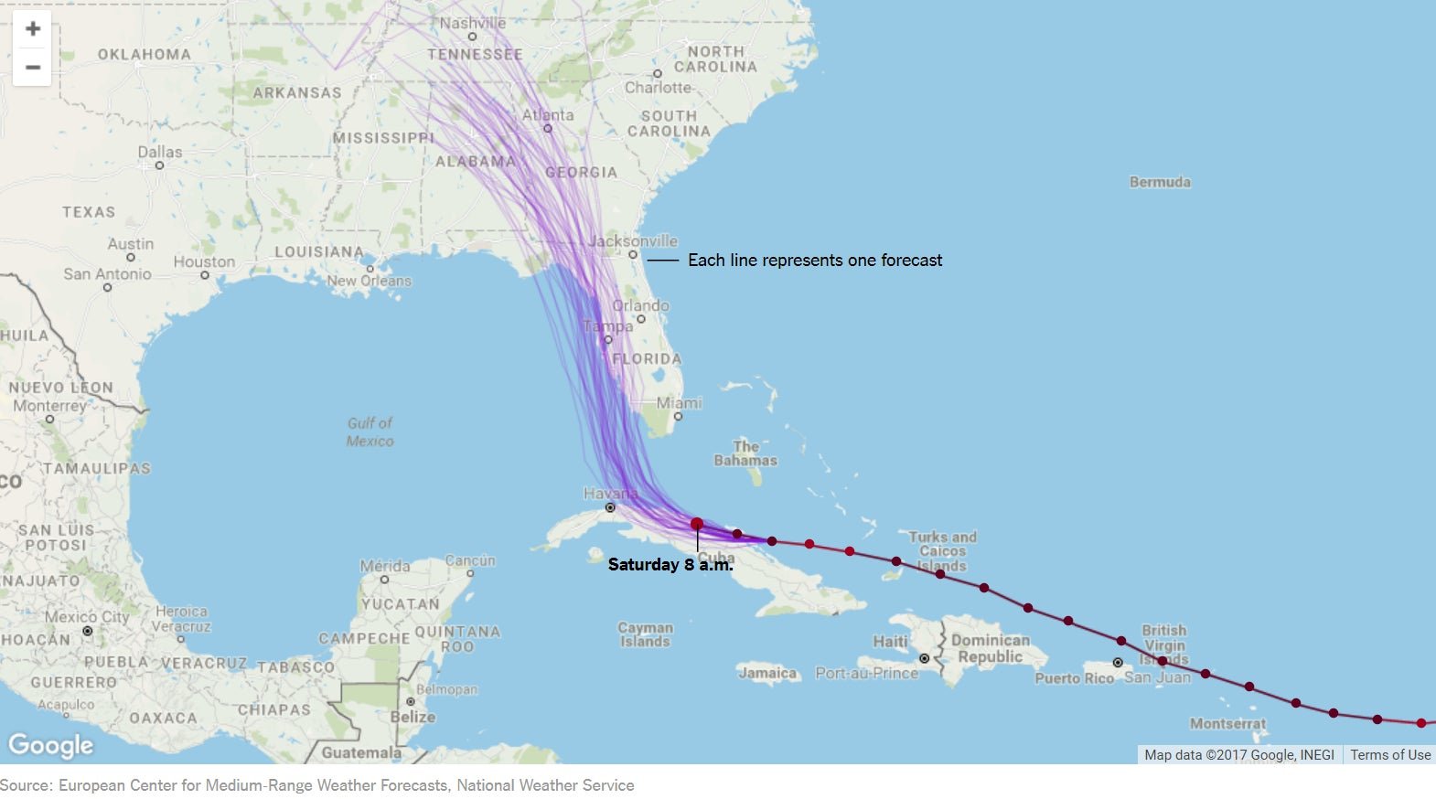
The cone is actually an amalgamation of many projections of where the Hurricane may go, all summed into one blob. The New York Times has a better visualization, which shows the track for each individual projection.

When looking at these lines, it’s a lot easier to understand that how each projection is separate. The cone isn’t weighted, but each side still represents a valid projected path for the center of the storm.
Weather forecasters also sometimes use small hurricane icons in the center of the cone to designate the strength of the storm. This makes it even easier to confuse the center for the most likely track of the hurricane; it’s just a visual aid, though a confusing one. The entire cone still has the potential to be the eye of the storm.
So even if projections say that the cone just misses you, don’t take it as a sign you’re in the clear. Stay prepared.