American Express is the newest member of the minimalist logo club
Windows did it in 2012. Apple, Google, Pepsi, Facebook, and countless other brands have followed. More and more companies today are simplifying their logos in the interest of screen legibility.

Windows did it in 2012. Apple, Google, Pepsi, Facebook, and countless other brands have followed. More and more companies today are simplifying their logos in the interest of screen legibility.
American Express is the latest corporation to expunge gradients and graphic flourishes from its corporate emblem. In its first brand refresh in 37 years, the financial services giant unveiled a new flatter, bolder logo this week that might escape the casual observer.
The changes are subtle but purposeful.
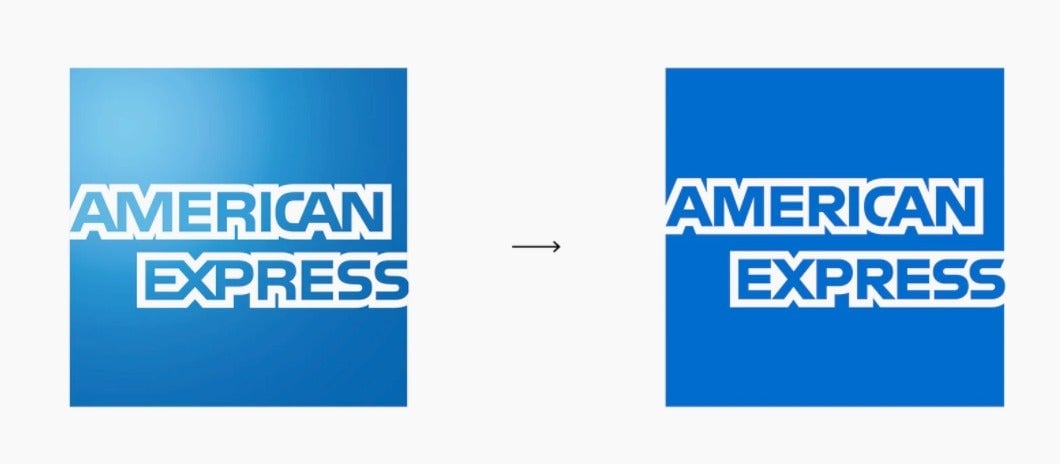
The color gradient is gone, and the logo’s letterforms have been cleaned up in the interest of making it more legible and consistent across digital platforms. A new cropped version, featuring an off-center “Amex,” has been designed for small screens of mobile devices.
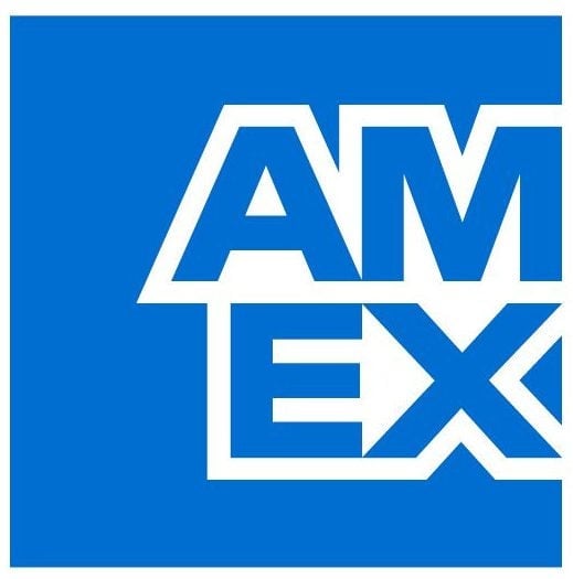
“Its the haiku version of the original blue box logo,” says Pentagram partner Abbott Miller, whose team worked on the logo update. “We loved that this version works the same way a good crop of a photograph can snap things into focus and put your eye directly on what matters, delivering a stronger punch than the original image.”
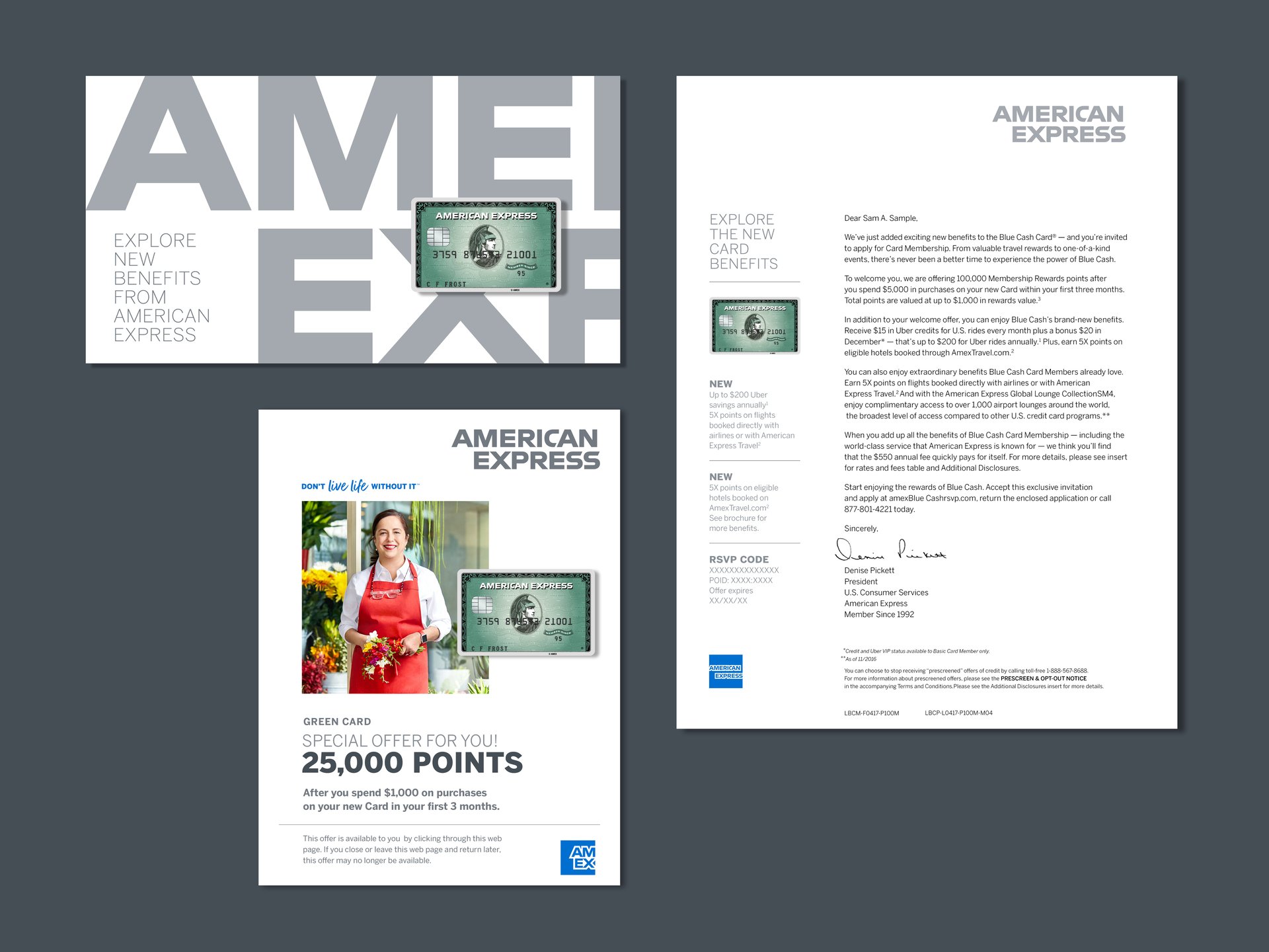
Pentagram also cleaned some of Amex’s iconic visual assets such as the centurion, the “member since” badge, and the World Service pattern.
The branding update preserves these elements while representing them in a modern way.
Founded as an express delivery company, Amex’s first logos featured a guard dog perched on top of a crate, with the company name spray painted on its coat in 1890. The globe element comes from Amex’s 1915 tourism venture, when it began selling tickets for rail and steamship travel. The Roman gladiator was a design element in its money orders, foreign currency exchange, and traveler’s checks.

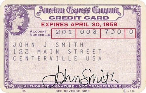
“American Express should never walk away from this incredible heritage,” says Miller, who dug through archives to study the mark’s 168-year history. “The research shows that there is incredible respect for the brand, and affection for its imagery.”
Simplifying logos results in fewer pixels and faster uploads, but Miller says the prevailing reductionist impulse is also a rejection of the skeuomorphic fad of the 1990s. Skeuomorphism is a user interface trend when designers rendered 2D elements as if they were 3D objects. This was evident in the subtle shine of the old Amex blue box logo.
Flatter logos convey authenticity, suggests Miller. “There is almost ‘truthiness’ aspect to it: the illusionism of gradients and shadows is sort of fake-looking and flatness looks more authentically digital.”