We may have reached the close of the era of uber-sleek, soulless, sans serif-based logos. According to the latest LogoLounge trends report, graphic designers are bringing back luscious serifs in an effort to infuse brands with personality and charm.
We may have reached the close of the era of uber-sleek, soulless, sans serif-based logos. According to the latest LogoLounge trends report, graphic designers are bringing back luscious serifs in an effort to infuse brands with personality and charm.
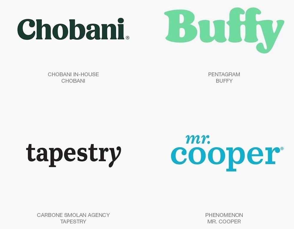
The “serif-redux” trend, as LogoLounge founder Bill Gardner calls it, is a welcome development during a time when most corporations have chopped off distinguishing flourishes and quirky elements from logo marks in the name of screen legibility across their digital platforms. Many corporations have gone sans serif, including Google $GOOGL, Yahoo, Lenovo, and Ebay.
Join 500,000+ readers who start their day with Quartz.
By subscribing, you agree to our Terms of Service and Privacy Policy.
In drafting the 16th edition of the LogoLounge trends report, Gardner and his team surveyed some 250,000 entries uploaded to LogoLounge, a subscription-based inspiration gallery where graphic designers and companies share implemented or speculative logo designs. Gardner says the glut of lean, minimalist typography has created a counter-movement characterized by ornament and decoration. “I look at the resurgence of detail as a rush to fill the void created by the push to anonymity that was a result of stripping brands to their visual bone,” he explains to Quartz. “You are starting to see the near rebellion of a group of designers that have been on a fat-free diet too long. Mouths are whetted for an opportunity to binge.”
Gardner says the title sequence of the Netflix $NFLX show Stranger Things, featuring the decorative serif ITC Benguiat, has, in particular, demonstrated the rich graphic possibilities we’ve been missing. “A throwback for sure, but the cultural impact of this show can’t be denied. It may well have led to the largest mass migration of designers in history, as they scrolled through their font files and were reunited with long-lost serifs,” he writes in the latest LogoLounge trends report. Indeed, type fanatics and graphic designers have obsessed over the retro graphics of Stranger Things designed by Imaginary Forces, in adulatory essays, Photoshop tutorials, and explainer videos.
Type designer Jonathan Hoefler says the reign of sans serif fonts can be explained by the traditional notion that sans serifs connote progress and modernity while serifs evoke nostalgia. “[This] is why for 60 years the sans serif has been the standard costume of industries like aerospace, information systems, medicine, and biotech,” argues Hoefler, whose type foundry designed (by former business partner Tobias Frere-Jones) and licenses Gotham, one of the most popular and over-used sans serifs of late.
“For this reason alone we’re probably ripe for a change,” he says. “It could be wonderful to see what happens if people rediscover just how much more expressive, evocative, and distinctive serif letterforms can be.”
The return to serif-based logos goes beyond nostalgia, adds Gardner. “I think it is more of a reboot…. The more humanist quality of some serif fonts are playing directly to a generation looking to find personal value and worth, or a warm place to feel comfort.”
If serifs are so great, how did we end up in the wasteland of sans serif logos in the first place?
The traditional excuse for stripping away ornament has been about improving legibility, especially for small screens. This is a fallacy, says Hoefler. “Whenever a tech company rebrands and drops the serifs from its logo, we always hear the argument that sans serifs somehow perform better on screen,” he explains. “They really don’t. You can render a serif letter in seven pixels, and it’s been ages since any of us were confronted with screens so coarse.”