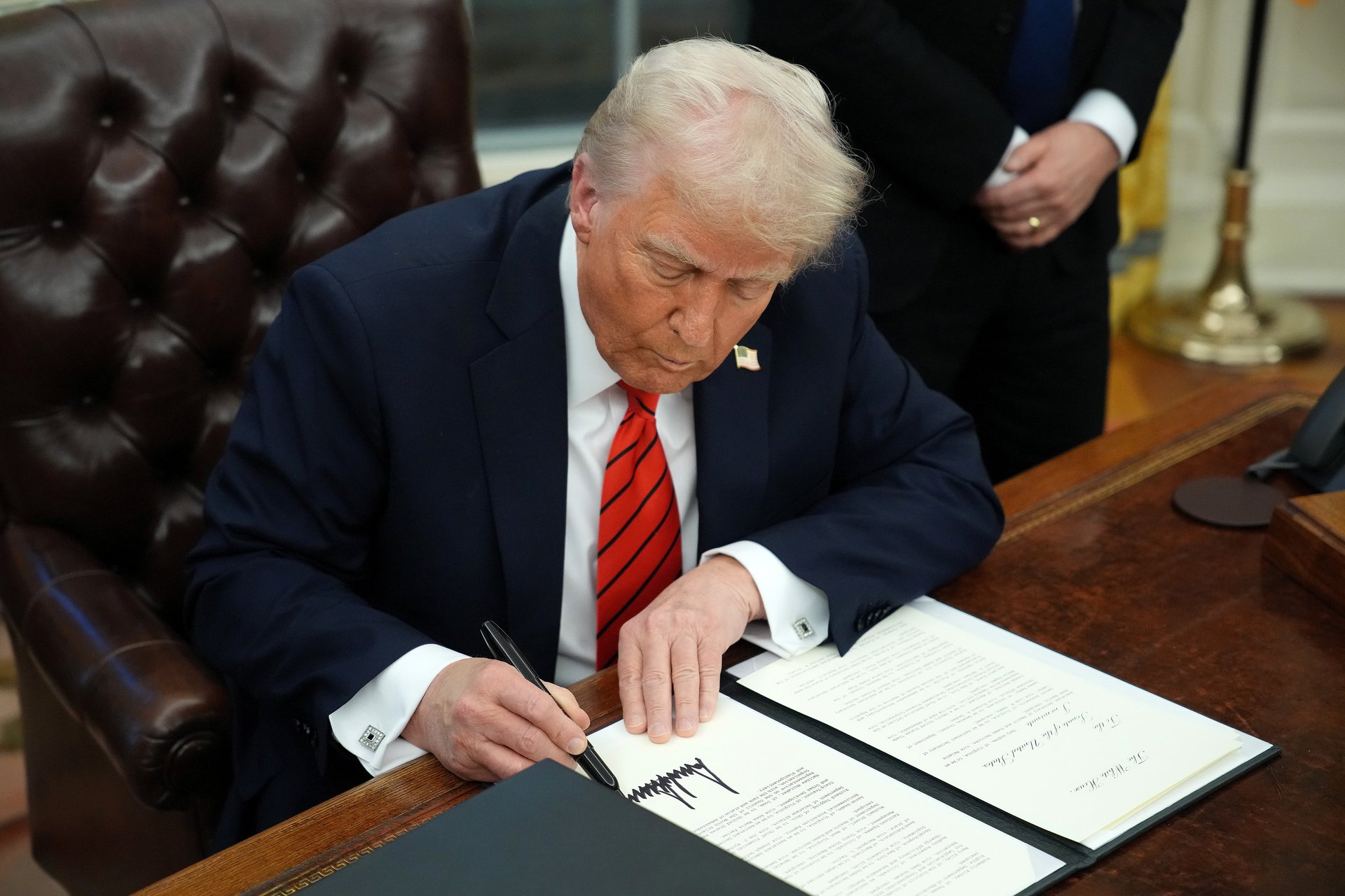
02:03Donald Trump wants a sovereign wealth fund. Here are the risks and rewards, according to a strategist
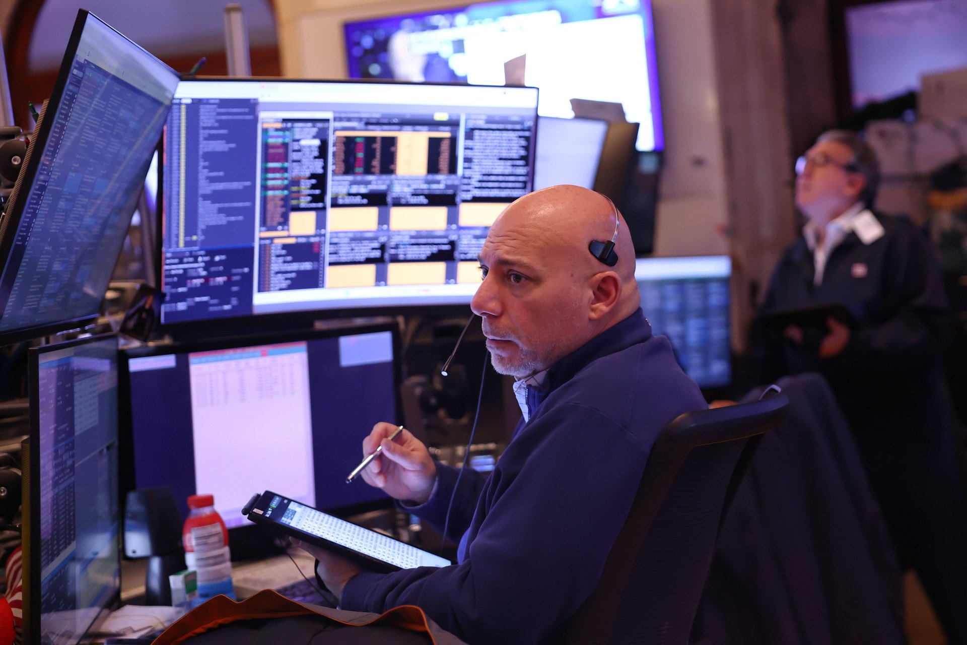
06:09Tariffs, interest rates, and market volatility: What they mean for your investments in 2025, according to a strategist
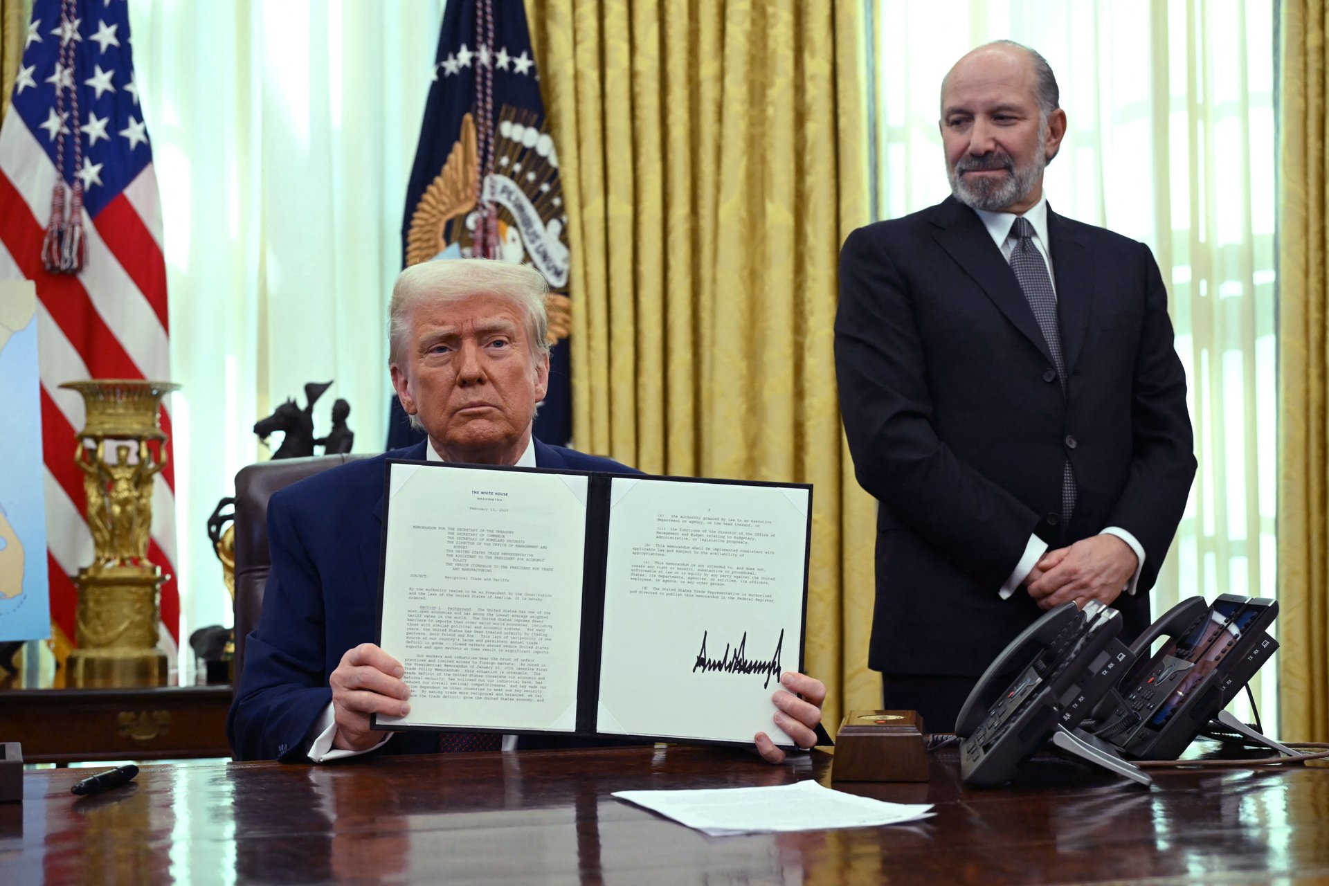
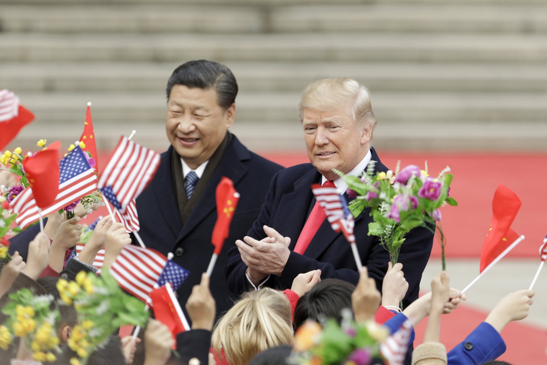
03:45How Donald Trump’s tariff rhetoric could reshape investment strategies, according to a strategist
06:13Nvidia's dominance in AI will continue, but be cautious with quantum computing stocks, strategist says