Since the UK narrowly voted in June 2016 to depart the EU, many Britons have sought to make sense of all the convoluted ways Brexit could unfold.
Since the UK narrowly voted in June 2016 to depart the EU, many Britons have sought to make sense of all the convoluted ways Brexit could unfold.
Enter the flow charts. A cottage industry of them has cropped up in recent months and even years, to describe the dizzying array of Brexit outcome possibilities—spanning everything from votes on Theresa May’s withdrawal agreement in early 2019, repeated Brexit delays thereafter, another referendum, a general election, and much, much more.
Join 500,000+ readers who start their day with Quartz.
By subscribing, you agree to our Terms of Service and Privacy Policy.
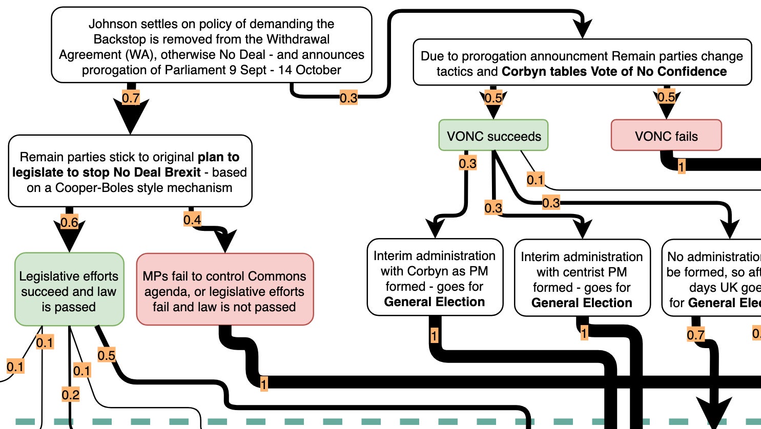
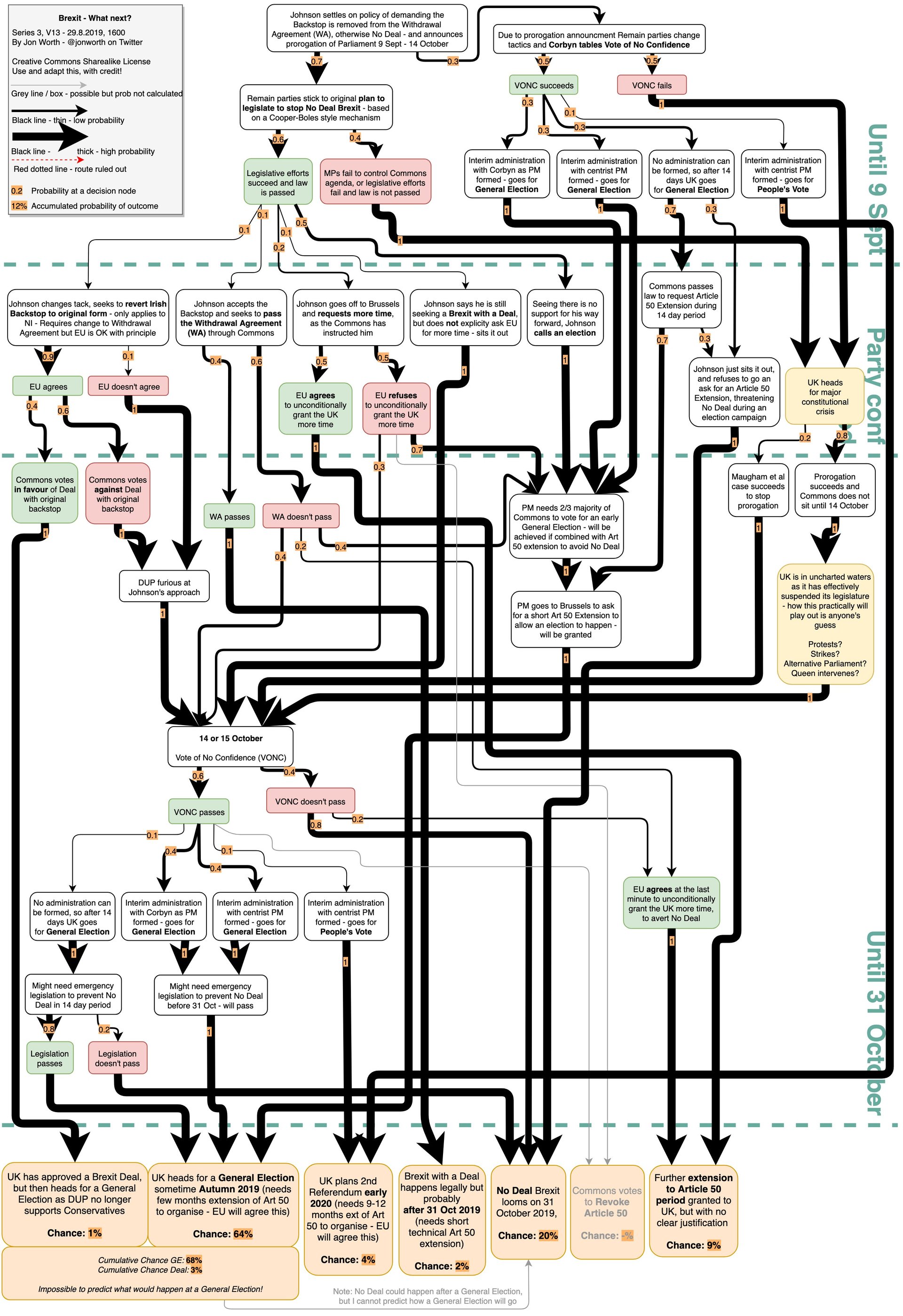
One of the most well-known—and most comprehensive—Brexit diagram artists is Jon Worth, who publishes them on his personal blog. The latest, created after Boris Johnson became UK prime minister in July, features seven possible outcomes that can be reached after getting through a 10-plus-level decision tree.
Overall, these Brexit charts range from professional-looking diagrams by media outlets and commentators, to, in some cases, non-linear cosmoses that move in a mystifying range of directions.
Other charts eschew the digital route altogether. John Rentoul, chief political commentator for The Independent, has drafted hand-scrawled diagrams—featuring an understated “Complicated Bit.” A glue stick and Wite-Out have already been deployed for updates.
The sheer complexity of Brexit, and the need to distill it to readers via flow charts, has also spawned many satirical charts to illustrate the messiness of it all.
It’s also inspired tongue-in-cheek diagrams that make light of potentially very dire consequences, like the increasingly probable departure from the EU without a deal in place. On a pocketbook level alone, studies expect the average income for Britons would decline by up to nearly 9% over 10 years under such a scenario.
The European Commission itself has jumped into the fray. Instead of a traditional flow chart, a descending staircase diagram (pdf) shows how the UK’s red lines lead not to a Norway-plus arrangement with the EU, but something more akin to Canada’s relationship with the bloc.

Most of these diagrams chart all the mechanisms that lead to one of a handful of outcomes—Boris Johnson negotiating a new withdrawal agreement with the EU (unlikely), a no-deal departure, another delay, a general election, or a second referendum.
It’s a decisive week in the UK—parliament has resumed, and opposition MPs are expected to propose a bill to prevent a no-deal Brexit. There could be clarity about whether any of that materializes before parliament breaks next week until Oct. 14, otherwise there’s always flowcharters to rely on to show what could lie ahead.