Is your cool new app ADA-compliant?
Is your cool new app ADA-compliant?
As the Department of Justice has started cracking down more on websites and apps that fail to meet requirements for the Americans with Disabilities Act, more companies—notably, healthcare companies—are having to ask themselves this very question.
Sadly, the answer is pretty bleak, especially when you consider healthcare consumers who are blind and visually impaired. From drugstore to insurance companies to hospitals, websites that are supposed to share healthcare information tend to hide it from those who need visual assistance.
One of the most common ways this happens is when a company clutters its webpages with so much information that it makes it difficult for someone using a screen reader (a software application that detects text on a computer screen and converts it into synthesized speech) or a screen magnifier (a third-party software program that provides powerful magnification of text on a screen) to decipher the information.
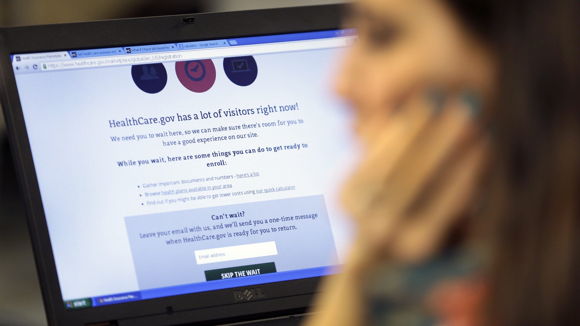
For example, sites that use the ubiquitous Adobe $ADBE Flash Player are inaccessible to screen reader users, and the use of text images for navigation links hinders accessibility for someone using a screen magnification software.
So far the trend in healthcare, an industry whose central purpose is helping people, has been to respond to this most recent call for inclusivity by hastily throwing together websites that are technically suitable for the screen-readers.
Of course, ticking boxes and meeting compliance standards is not the same as creating a seamless and full user experience.
And if a fear of legal repercussions for failing to meet ADA guidelines is what drives design, that will be evident in the product itself.
Instead of scrambling for something that will help keep lawyers at bay, healthcare companies must strive for something more: Intentional design rooted in empathy.
When accessibility drives the design of a product, technology can become an organic tool of empathy and empowerment.
For example, as many as 80% of people who are visually impaired develop their condition after the age of 50. For those who experience a disability later in life, the challenges are often compounded by loss, and the frustration of learning new skillsets with different resources.
If website designers take into account the fact that many users are navigating a new reality, it’s more likely that they’ll put the appropriate user experience design front and center in creating a product.
The best place to start is for designers and engineers ask what information blind and visually impaired users are looking for. And how they can best and most efficiently provide it. Designers know that done well, technology is unnoticeable.
This is true for any tech designed for optimal inclusivity.
Importantly, empathy in tech is teachable. Empathy can be a powerful tool, and it should inform the learning and creative experience for anyone involved in a user experience.
As humans, we are hardwired to make new information fit our own understanding of the world, and a lack of empathy usually indicates a narrow framing or limited understanding of a situation.
At its core, it’s all about understanding another person’s experience of the world.
In my own work I’ve found that just the act of interacting with a context outside of my normal frame helps to increase empathy by exposing me to new thoughts and realities.
When we talk about bringing empathy into accessibility, it is not sufficient to just understand how to implement a set of accessibility protocols. You have to talk with the folks who use your platform, observe them, and listen to what they have to say. You have to see and understand the pain points and the opportunities to make an experience more useful—and more delightful.
While every inclusively designed site and app may be different, designing with empathy follows the same basic principles, whether in healthcare or any other industry.
Designers need to remember that the standard regulations and requirements for online accessibility are meant as a bare minimum, not a comprehensive to-do list. Meeting all the requirement may help keep companies out of hot water, but that by no means ensures a user gets an experience that makes sense for what they want and need.
For example, some blind users listen to text readers at an impressive 600 words-per-minute, speeding through an extraordinary amount of redundant information until they find what they are looking for.
They have to sift through copious amounts of data because in many cases these pages are technically accessible—meaning they meet ADA requirements—but are functionally abhorrent when it comes to efficiency, clarity and labor.
If the pages were designed to be delightful for the visually impaired just as they are for the everyday consumer, redundant information would disappear, pertinent information would be easy to find, and the experience would be much better.
If you have a tech company, and you’ve never witnessed a blind person interact with your product, do it now. The results will change you and your product forever.
To start, sign yourself and your teams up to participate in events that are organized and led by members of the disabled community. The Blind Institute of Technology in Denver, for example, organizes symposiums with blind lecturers who speak about what it is like for non-sighted people to navigate information online—with stories that undoubtedly would make any self-respecting web designer cringe.
To help companies avoid creating inaccessible experiences for the visually impaired, the institute provides companies with non-sighted testers who navigate companies’ online experiences and provide them with their invaluable insight.
Seeking this input can help healthcare companies create authentically accessible—and positive—online experiences.
Automatic testing tools can theoretically tell developers whether their sites and apps are accessible to people who are blind. But as at least one developer discovered via Google $GOOGL’s testing criteria, a high score along can actually be pretty meaningless.
In order to break down barriers, healthcare companies must first understand what those barriers are. For example, it’s not enough to hide redundant information from text readers. Understanding what information is needed, how it can best be accessed and what will most efficiently and easily empower users will make the difference between an app that works on a technical level, and an experience that works on a human one.
Once programmers and designers look beyond regulations to the people who are affected by them, creating good experiences within those rules becomes fun.
Building a compelling hierarchy of design and adjustable color harmony, for example, can become an intellectually thrilling challenge. Allowing users to adjust font size on the fly, rather than having to toggle out to their settings first, is an added bit of design magic that a product team might not consider.
Asking creative people to think creatively is rarely met with groans. When the results notably improve a user’s quality of life, the process is that much more rewarding.
As I’ve argued, empathy lies at the heart of any successful inclusive design effort. But the mere intention of being accessible does not necessarily make your site more accessible.
Technically good accessibility layered on top of a bad user experience, for example, will not improve anyone’s overall experience. For instance, if a doctor needs to see a visual of an issue while texting with a blind or visually impaired patient, that situation will be difficult to work through no matter what the design is.
Even the best design can’t solve for issues that go beyond technology. A person who recently became blind may feel frustrated with the first few forays with screen readers and other software, which can feel ineffective to the user by virtue of their own inexperience.
Importantly, no amount of empathy or attention to accessibility can solve for a cultural or industry lack of education and awareness. The first challenge is to change the attitude and thinking around access and inclusion, before we start to design products.
So, hire developers and designers who have knowledge and/or the desire to learn about this space. Hire blind and visually impaired engineers to design accessibility products. Know the difference between an app that works on a technical level, and an experience that works on a human one.
Then, when you’re asked, if your cool new app ADA compliant, it will be an easy one to answer.
Join 500,000+ readers who start their day with Quartz.
By subscribing, you agree to our Terms of Service and Privacy Policy.