Why we geek out over sleek interface designs
In everyday life we are surrounded by a dizzying array of technological gizmos. The ones we love and use the most are often the ones that have been designed with humans firmly in mind.
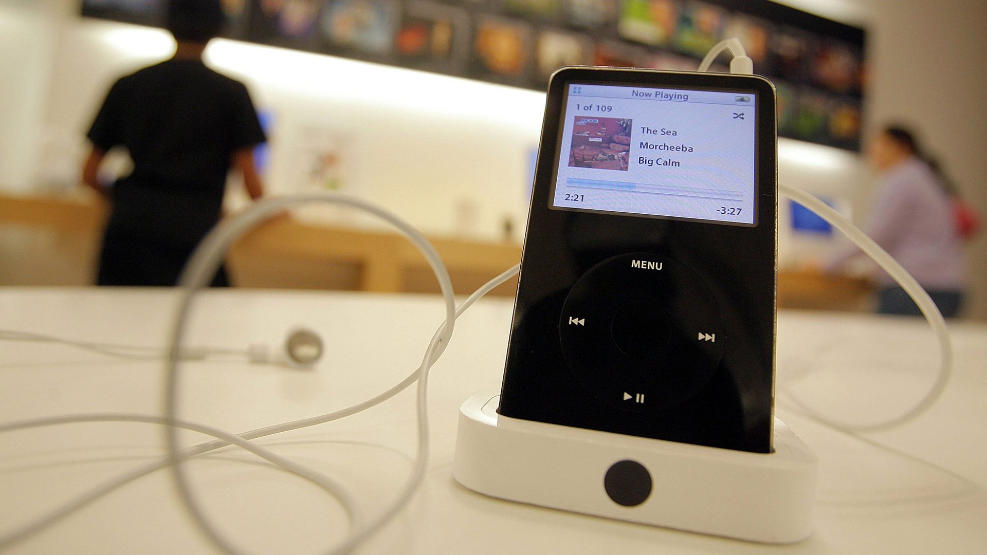

In everyday life we are surrounded by a dizzying array of technological gizmos. The ones we love and use the most are often the ones that have been designed with humans firmly in mind.
Those that aren’t so fun or easy to use usually end up unloved in the cupboard. Or worse, in landfill.
Interface: people, machines, design, an exhibition produced by the Museum of Applied Arts and Sciences and currently showing at Sydney’s Powerhouse Museum, has gathered some great examples. It illustrates just how long designers, manufacturers, and consumers have been in this cat-and-mouse game.
People love machines if the designer and manufacturer get it right.
Spanning the last century or so, the exhibition assembles an instructive array of products. Together they show how the “interface” has become one of the central principles of contemporary design.
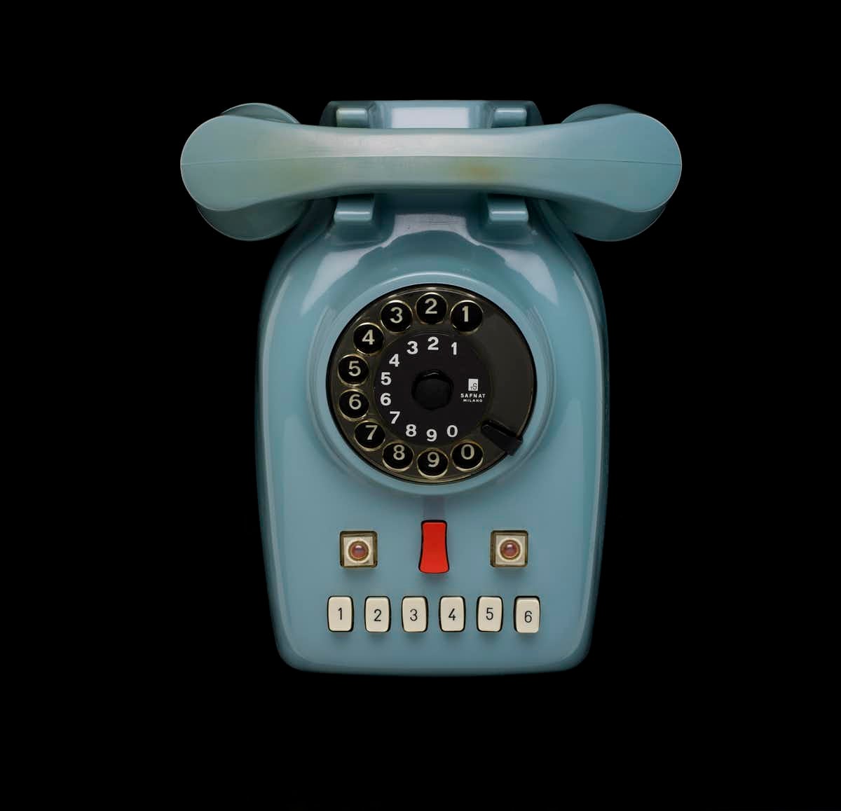
While we nowadays associate interfaces with digital computing, this show suggests we should think otherwise. Tactile buttons, knobs, dials, and machined surfaces abound.
The mouse, keyboard, and touch screen are certainly present in this show. But we’re also reminded that a simple handle or lever can qualify as an interface.
Featuring the work of well-known designers such as Dieter Rams, Jonathan Ive, Ettore Sottsass, Susan Kare, and Peter Behrens, the show does more than acknowledge the genius of the “superstar.” It also presents an “archaeology” of how material, function, and form morph across time.
More than this, Interface underscores the importance and continuity of what we now call “user-centered design.” It shows this across a range of practices—and not just modern information design.
A well-conceived interface distinguishes more than just the pretty looks of a product.
Take the Safnat telephone (pictured above), designed by the Italian Marcello Nizzoli in 1958.
The anthropomorphic layout of the dial and push buttons provide the show with its main publicity image. Beyond the retro value, the phone reminds us of the complex aesthetics of touch and play at work in any interface.
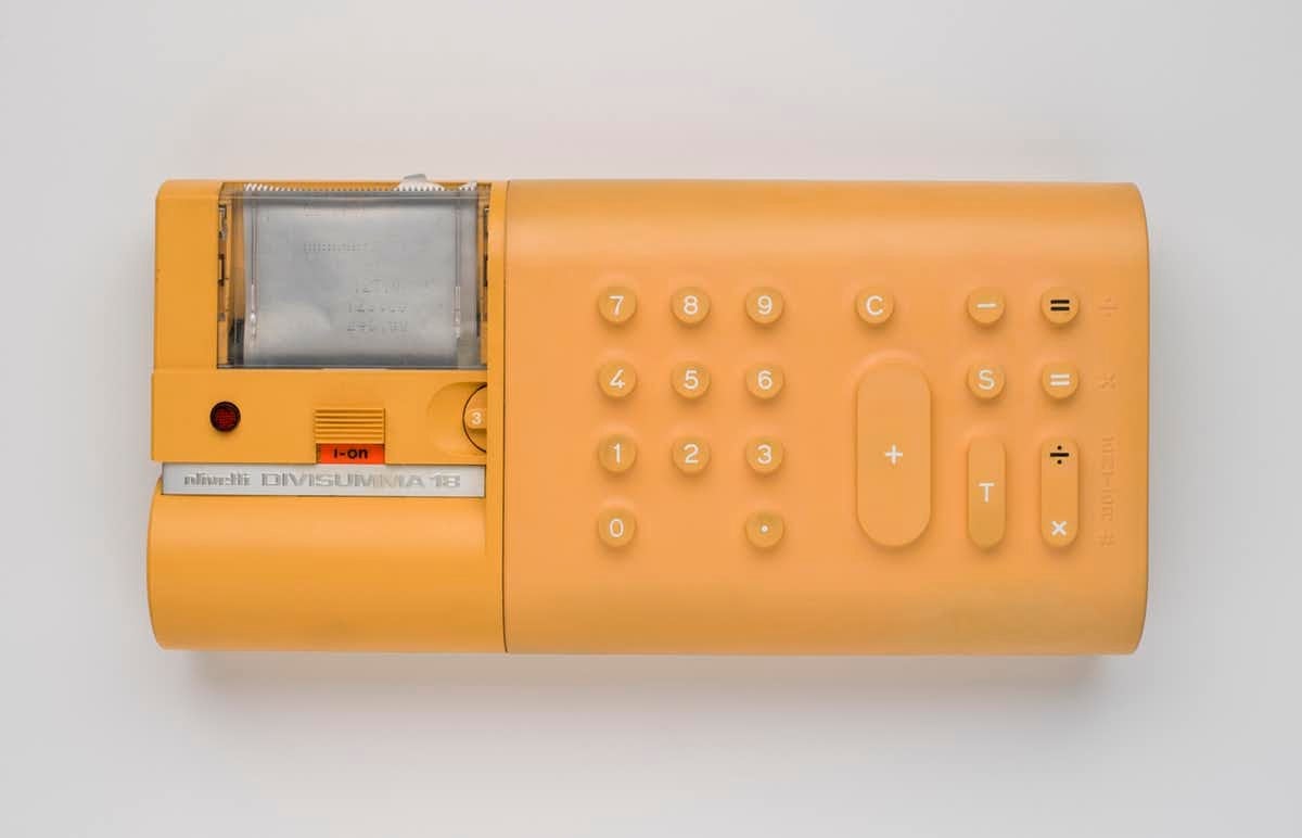
It also prompts us to ask whether contemporary interface design is always as good as it can be.
The exhibition sets up multiple chains of resemblance between familiar and now unfamiliar everyday objects. My favorite is at the entrance.
A school slate (used by Australian students until the middle of the 20th century) sits next to an iPad tablet. The uncanny resemblance between the lo- and hi-tech products is instructive. Lightweight read/write devices have a long history that precedes the information age.
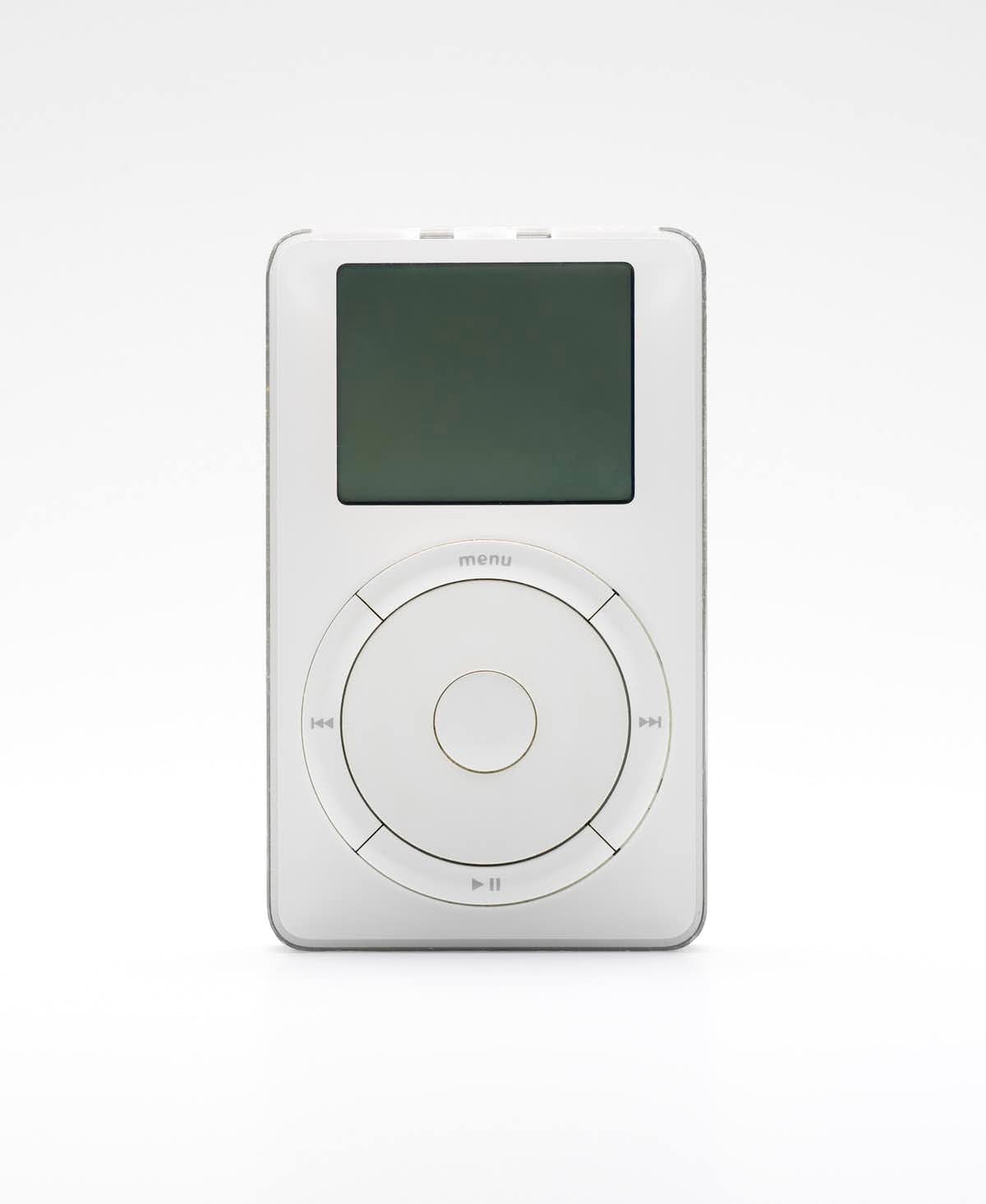
While it could be argued that this further fetishizes these consumer products, something else is at play here. The curatorial framework is evident throughout the exhibition. Suggesting that there are “three phases of adoption”—from enthusiast, to professional to consumer—the careful sequencing and arrangement of objects initiates an engaging dialogue of objects.Throughout the exhibition the careful arrangement of products reinforces these types of echoes. Safe and sound behind perspex boxes, everyday objects like MP3 players, game consoles, and personal computers are “reframed” by the museum.
The steampunk-looking Blickensderfer 6 portable typewriter from 1906 (pictured) is light years from Eliot Noyes’ sleek Selectric typewriter developed for IBM’s business market in the early 1960s.
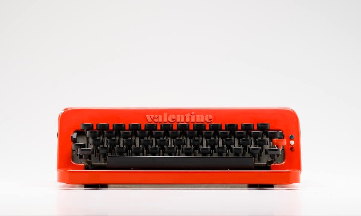
Compared with Olivetti’s bright red plastic Valentine portable typewriter for the late ’60s consumer, it is easy to see the progression from unrefined technological monster to consumer object of desire.
There are many examples throughout the show. A replica of Doug Engelbart’s mid-1960s plywood mouse prototype sits near other “gestural” devices, such as the Mattel Powerglove from the late 1980s.
Rather than demonstrating how far we’ve come, the exhibition hints at how central the body’s fit with the machine remains. What does the interface feel like? How does it respond when we touch it?
With tablet and mobile computing literally flattening everything out onto the smooth surface of a screen, there are many lessons to be learned from these things that delight so much in their “object-hood.”
Conceiving information technology as a subset of industrial design, Interface is a timely exhibition. It reminds us how manufacturers and designers have negotiated the sometimes delicate, sometime clunky borders and controls that connect consumers to machines.
To my mind, the exhibition prompts us to question the very idea of the interface, to consider what it has been, what it is now, and what it could become.
This article is republished from The Conversation under a Creative Commons license. Read the original article.