The shrewd political craft behind Andrew Cuomo’s folksy pandemic poster
“I love poster art.”


“I love poster art.”
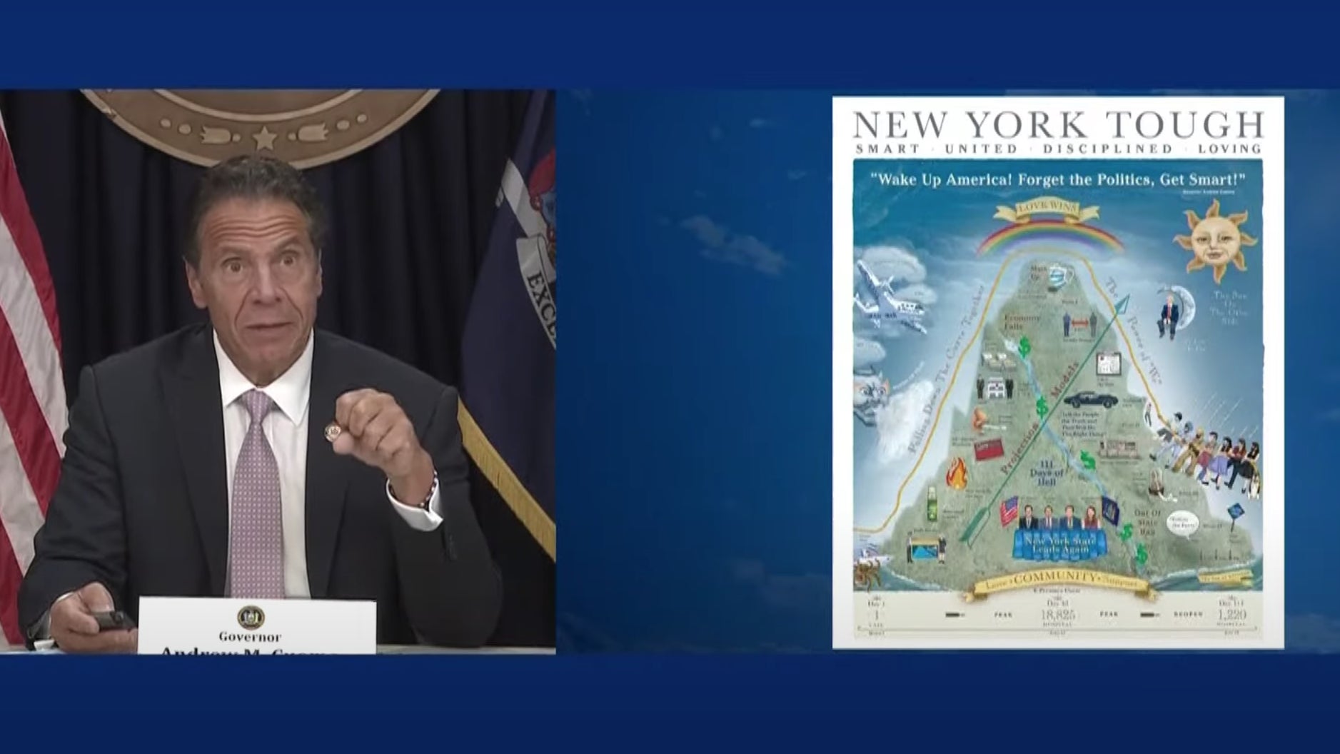
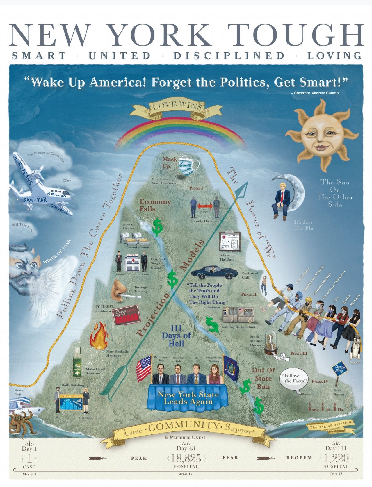
With these words, New York governor Andrew Cuomo unveiled a coronavirus-themed poster he designed himself, titled “New York Tough”. The 22 x 28 inch poster (priced at $11.50) is a visual summary of the state’s dramatic, uphill battle to contain Covid-19.
In stark contrast to the rest of the US, where the number of positive coronavirus cases are spiking, reports indicate that New York is effectively containing the coronavirus, at least for the time being. At its peak, more than 600 people a day were dying of the virus. This week, the state reported several days without any Covid-19 deaths.
For Cuomo, the occasion called for a victory banner. During one of his recent, regular press briefings, he described graphic design as a “release valve” from the pressures of his job.
“I could go and just use a different side of my brain,” he said at his July 13 briefing.
In an interview later that day with NBC late-night talk show host Jimmy Fallon, Cuomo elaborated: “For me, these posters allow a different form of expression,” he said. “They’re basically a relief for me, just to design it, make it visual, sketch it, [to] make it graphic, what am I trying to say, what am I feeling.”
His handiwork is essentially a belated movie poster for his widely-watched daily Covid-19 press updates. It recalls Cuomo’s rallying points, barbs, gags, dad jokes, and personal anecdotes.
The central motif is a mountain, which represents the bell curve reflecting the number of Covid-19 cases and deaths in New York.

Among the amusing graphic details: a lanky man perilously dangling off the side of a mountain called the “boyfriend cliff.” It’s a friendly jab at Norwegian athlete Tellef Lundevall, who is dating Cuomo’s daughter Mariah. Like other graphic tropes in the poster, the gag evokes the 62-year-old politician’s folksy, no-nonsense political persona.
“New York Tough” is Cuomo’s second pandemic-themed poster. In March, he worked with his portrait painter, Rusty Zimmerman, to produce a self-aggrandizing allegorical painting, depicting New York as a ship plowing through “the sea of division,” the “reefs of greed,” and “the squalls of hate.”
How the current poster was produced remains a mystery. Cuomo suggests that he worked with an artist to realize his sketch. Zimmerman tells Quartz he didn’t work on “New York Tough.” The governor’s office didn’t respond to any of our queries.
Critics everywhere have spoken
Love it or hate it, Cuomo’s pandemic poster proved to be irresistible to critics of all mettle. Like the familiar ritual of logo-bashing on Twitter, everyone seemed to have an opinion on the governor’s art project—drawing references to Dante’s Divine Comedy, post-medieval allegories in the Atlas of Fantasy, or even cheesy subway ads for dermatologist Dr. Jonathan Zizmor.
Some critics say calling victory over the deadly virus is premature, if not callous, given the rising number of new cases elsewhere in the United States. Others argue the poster is propaganda, or “a cover-up” for the errors Cuomo’s administration made in its early handling of the crisis.

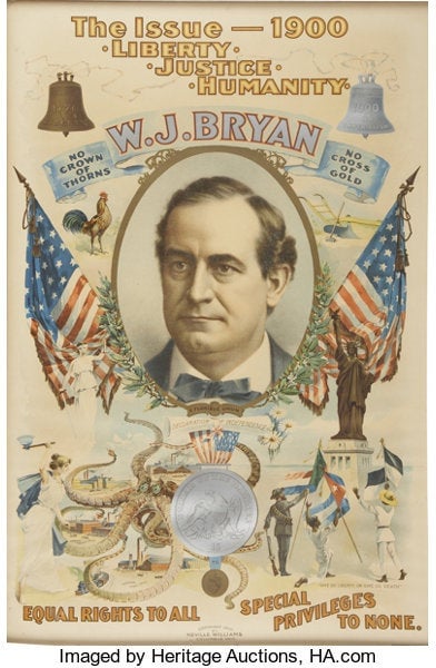
Cuomo’s says he was inspired by political campaign posters from more than a century ago. “Poster art is something they did in the early 1900s, late 1800s, when they had to communicate their whole platform on one piece of paper,” he explained at his press conference, flashing an image of the famous “octopus poster” created for William Jennings Bryan’s second (losing) presidential bid.
Scholars are divided on Cuomo’s graphic design calls.
Angelina Lippert, chief curator at New York City’s Poster House museum, is a fan. “This is an homage to what was a very sophisticated style of American printing, and that sort of visual cacophony was considered fancy and effective at that time,” says Lippert, who oversees what’s billed as the “first American museum dedicated exclusively to posters” and has already acquired Cuomo’s posters for its collection.
“If we look at through the rules of modern advertising, it’s too convoluted, too dense and non-linear,” Lippert says. “However, his point is to look back at what was considered not just effective but necessary and celebrated within political advertising 150 years ago.”
Meanwhile, D.B. Dowd, professor of art and American culture at Washington University in St. Louis, suggests that the poster’s reliance on graphic software has a damaging effect. “The comprehensive fuzziness of the entire thing, attributable to the worst of Photoshop ‘painting,’ works against its authority,” he argues. “The ‘naïve’ style [aka outsider art] is not as effective as it would be if it had been painted, drawn with a crayon, or gouged.”
Dowd, the author of Stick Figures: Drawing As a Human Practice, says it’s “so easy to move things around in a digital environment that spacing relationships are often haphazard.” In this case, “[t]ype and color are also used without much reflection on hierarchy. It’s a mishmash.”
As the symbolism and style of “New York Tough” gets debated, Spectrum Designs, the nonprofit selected by the governor’s office to handle orders of the poster, reports brisk sales. A representative from Spectrum, which employs people with autism, tells Quartz the group has been flooded with requests for the poster—about 20 orders per minute.
Brooklyn-based art collector Ryan Farrell, for one, is excited to add Cuomo’s poster to his collection. He says the bizarre circumstances that led to its creation compensates for any aesthetic shortcomings. “It’s impossible not to love the image of the governor of the worst-hit state, in the worst-hit country in the world, managing the crisis down and then busting out the crayons in a politically on-message manic episode,” he said. “For me, the weirdness and the dumbness forgives how self-serving it is.”
A MAGA cap for Cuomo fans
Beyond style, Terry Brown, former director of the NY Society of Illustrators, characterizes the poster as a savvy political tool. “This is a MAGA cap for Cuomo fans,” he says, referring to US president Donald Trump’s now iconic campaign swag. “Displaying the poster is a way of saying, I believe in this guy.”
To Brown’s point, Cuomo portrays Trump as the anti-hero of the poster. He’s the figure perched on the crescent moon, dawdling in denial of Covid-19.
Brown says the poster, though busy and technically flawed, speaks to today’s visually oriented audiences, in the same way that religious paintings reached illiterate masses in the Middle Ages. “Art has served a purpose for those who can’t read. Just look at illustrated bibles,” he says. “That’s what illustration is—explaining text. [It’s] his PowerPoint turned into imagery.” One part of this poster that remains unresolved is: What happens next?”