The Air Quality Index is in need of an update
Every day, the Air Quality Index (AQI) gives millions of people an idea of whether it’s safe to breathe the air. Formulated by the US Environmental Protection Agency (EPA) in the 1970s, it has become the most popular way cities and countries around the world assess air pollution’s effect on their citizens’ health.


Every day, the Air Quality Index (AQI) gives millions of people an idea of whether it’s safe to breathe the air. Formulated by the US Environmental Protection Agency (EPA) in the 1970s, it has become the most popular way cities and countries around the world assess air pollution’s effect on their citizens’ health.
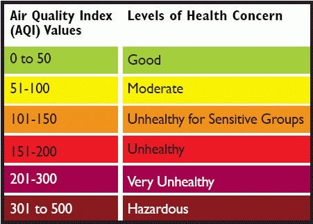
AQI makes measuring air quality simple by placing it on a scale of 0-500 (though in very rare circumstances it can get above 500, as it has in China and India on multiple occasions). The EPA succeeded in turning complex scientific formulas into something almost everyone can understand. But it was not particularly scientific.
This is how the US government presents the AQI ranges:

You might think that the index’s labels are based on a formula accounting for levels of many different pollutants in the air at a given time. You’d be wrong. In fact, each pollutant has its own AQI scale, and the overall AQI—the one a citizen is most likely to see—simply reports the pollutant with the highest AQI.
Although it’s still useful, that’s a bit like doing an annual health checkup by only taking your temperature and pulse.
That might have made sense at the time the index was created, when the EPA had little data about how multiple pollutants interact. But researchers in the journal Nature in 2015 said the rate of hospital admittance after pollution events suggests “a single-pollutant index may inadequately communicate the adverse health risks associated with air pollution.”
In an era punctuated by multiple sources of air pollution, from debilitating wildfires to industrial smog to chemical manufacturing, it might be time for an update.
The Big Five
AQI is based on the levels of five major pollutants regulated by the EPA: ground-level ozone, particulate matter (PM2.5), carbon monoxide, sulfur dioxide, and nitrogen dioxide. (PM2.5, inhalable particles that are 2.5 micrometers or smaller, cause the vast majority of deaths from pollution.)
Imagine a day where the PM2.5 AQI was 70 and the other four AQI pollutants scored a 10. The AQI for that data would be 70, in the yellow moderate range. Now imagine the same situation, but the ozone AQI was 60. That extra pollution would not impact the AQI. It would still be 70. Peculiar, eh? The system’s simplicity obscures the additive effects of pollution levels (for which hard data on long time scales is still hard to come by).
Over time, the government has added some nuance to the index. When the AQI was given its current name in 1999, new thresholds were added for sensitive populations, and the “criteria pollutants” monitored were expanded to include fine particulate matter (PM2.5), known to infiltrate deep inside the lungs and affect the rest of the body.
But a second strange fact about AQI is that the scales for each pollutant are non-linear, meaning an AQI of 100 does not represent twice as much of a pollutant as an AQI of 50. Rather, the EPA decided that the first 50 micrograms of PM2.5 per cubic meter are more important than the next 100.
Josh Apte, a University of California, Berkeley professor studying air pollution, says the way AQI treats PM2.5 means high pollution days appear less harmful than they actually are. Pollution’s health impacts don’t necessarily diminish as concentrations rise, but the AQI treats PM2.5 as less harmful as its levels in the air increase. The chart below shows this quirky relationship.
A new AQI?
One final thing can complicate citizens’ understanding of AQI: The ranges that reflect different levels of health concern vary dramatically over time and space.
A single AQI value means different things in different countries. The same PM2.5 gets an AQI score of 75 in India, but 124 in the US. This is because India’s air pollution regulations are a bit laxer than in the US. What is “unhealthy” in the US is merely “moderate” in India.
As the EPA changes its pollution standards over time, the scales shift as well. A PM2.5 concentration of 15 micrograms per cubic meter used to be equal to an AQI of 50, but in 1997 the EPA changed it to 12.5 micrograms. It’s good the EPA updates standards to reflect the science, but it changes how citizens interpret and compare AQI scores across time.

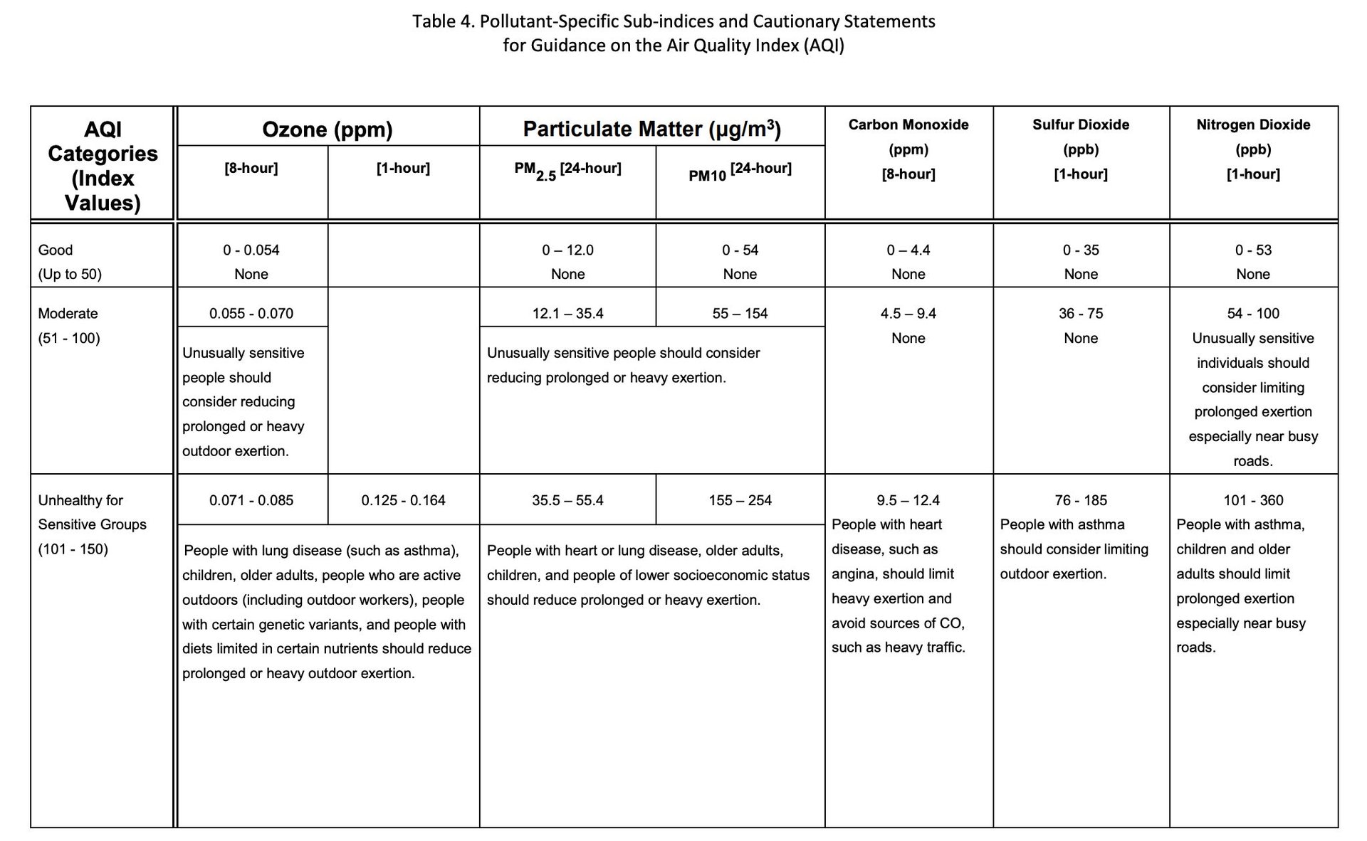
Some air pollution experts suggest we simply look directly at the air pollution concentration numbers themselves, rather than creating an index. Specifically, Apte thinks we would be better off promoting an understanding of PM2.5 concentration numbers, the most deadly pollutant and the sixth leading cause of death in the world. A snapshot from the AQI technical guidance below shows hazardous concentrations of various criteria pollutants as scientists measure them in μg/m3, parts per million, and parts per billion over one, eight, and 24-hour periods.
That might be too much for some. Another solution will be to update AQI based on a better understanding of just how multiple air pollutants affect our health. Breeze Technologies, an air quality sensor and analytics company, proposes evaluating 10 pollutants and evaluating them across all relevant time scales, to give a better picture of the risk of air pollution.
It may be time for the EPA to update the AQI once again.