This jobs report might be worse than we realize
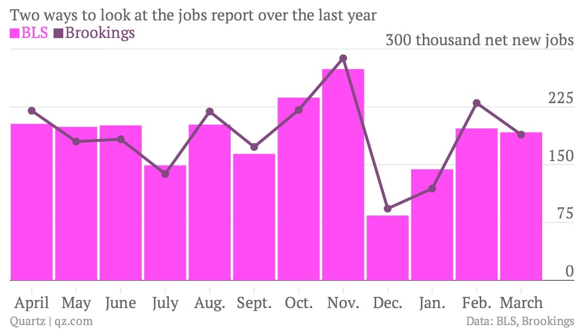
The chart above shows two ways to look at the number of jobs created in the United States, month by month. You’ll notice the purple line, based on data from the Brookings Institution, shows a slightly different job creation pattern in the last two months than the pink columns, which represent the widely followed results disseminated by the US Bureau of Labor Statistics. Which is correct?

The chart above shows two ways to look at the number of jobs created in the United States, month by month. You’ll notice the purple line, based on data from the Brookings Institution, shows a slightly different job creation pattern in the last two months than the pink columns, which represent the widely followed results disseminated by the US Bureau of Labor Statistics. Which is correct?
The thing to keep in mind about the widely quoted jobs numbers, besides a margin of error in the range of 100,000, is that they don’t represent “jobs” per se but are instead adjusted to account for the fact that there’s lots more hiring in certain parts of the year than others, which can mask the longer-term trends that policy-makers and politicians are looking for.
But the methods used to adjust for seasonal factors are in dispute, and the Brookings Institution has adopted an approach developed by Jonathan Wright to come up with a different adjustment—that’s the purple line. You can read this story on Wright’s research for the whole skinny on this debate—and I recommend you do. Basically, Wright says we should base our adjustment of the numbers on seasonal patterns from the past six years—rather than the past three, as the BLS does—to avoid problems created by, say, a recent financial crisis or other shock to the labor market.
Obviously, the differences in the last year have’t been huge, largely because the problems of the financial crisis are fading out of the BLS adjustment; they were more pronounced in the years following the crash. But you can see how last spring, from April to July, the Brookings adjustment provided more warning of the downward trend for job creation. And this spring, it also appears to show a more pronounced downward trend than the BLS numbers. Either way, it’s a story of lagging job creation.