If you’re planning to travel to the UK anytime soon, make sure to tack two hours to your pre-trip preparations. That’s around how long it takes to figure out the utterly discombobulating passenger locator form required of all travelers to England, Wales, Scotland, or Northern Ireland.
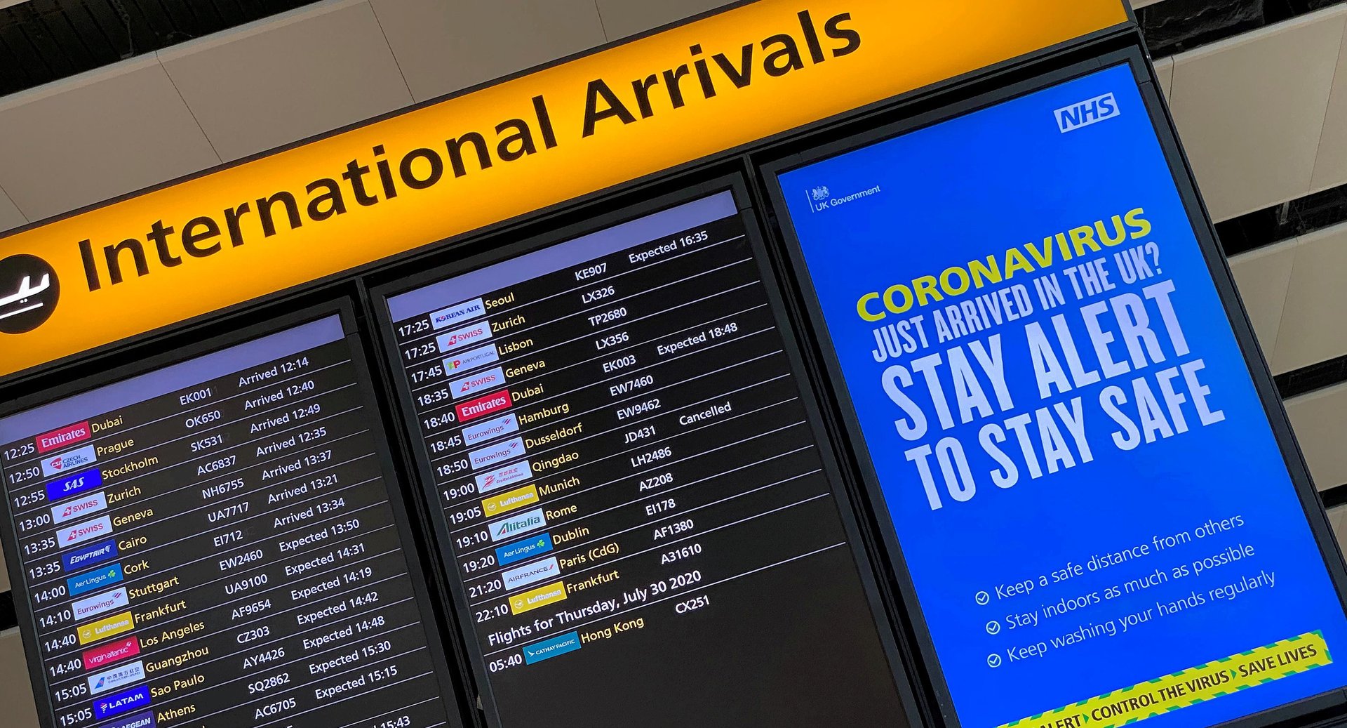
If you’re planning to travel to the UK anytime soon, make sure to tack two hours to your pre-trip preparations. That’s around how long it takes to figure out the utterly discombobulating passenger locator form required of all travelers to England, Wales, Scotland, or Northern Ireland.
Introduced in June 2020, as the UK began to open its borders after a period of lockdown that decimated its tourism sector, the questionnaire inquires about a passenger’s biographic details, trip itinerary, seat numbers, accommodation, Covid testing, and vaccine information, all couched in a jumble of legal language that stymies even native English speakers. For contact tracing, collecting granular data about a traveler’s whereabouts is understandable during a global pandemic, but publishing a questionnaire this poorly-conceived is inexcusable—especially for a country like the UK that has for the most part prioritized good design in the public sector.
Join 500,000+ readers who start their day with Quartz.
By subscribing, you agree to our Terms of Service and Privacy Policy.
Most countries that have opened their borders to international travelers have their own versions of a passenger locator form. Introduced by the World Health Organization, it’s a mechanism meant to assist public health officials in contacting individuals in case a breakout of a communicable disease, like Covid-19, occurs during their journey. Many European countries have adopted a digital passenger locator form developed by the European Union Aviation Safety Agency.
Apart from government-issued locator forms, airlines and cruise lines also require travelers to manually fill out a one-page form and hand them in before they arrive at their destination.
Complaints about the UK’s locator form are mounting on social media. Frustrated travelers point out flaws ranging from the form’s length, its graphic design, and the vagueness of its language, to maddening tech glitches that complicate the already onerous process of filling it out.
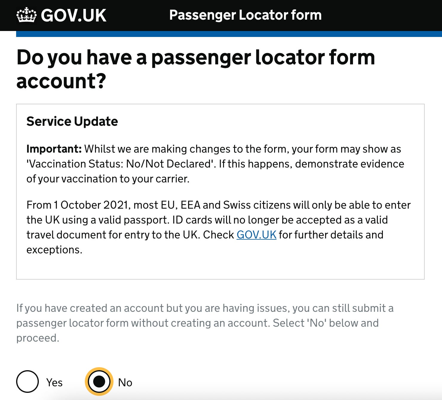
“It is a bit surprising to me that this form that is not that usable,” says Zoltan Kollin, a user experience designer who teaches a course on how to create good forms. “I’m a huge fan of the Gov.UK site, and I usually cite them on my lectures.” Kollin evaluated the form upon Quartz’s request and explained how it ignores some pretty basic tenets of good UX design.
The problems arise from the very first screen. The instructions page takes 900 words to detail requirements, exceptions, and a stern warning about legal penalties for submitting any misleading data. “This is very overwhelming,” observes Kollin, explaining that such a long list could be broken up in a series of simple yes or no prompts. “I would even consider breaking this into different screens because it’s really painful to go through all of this information.”
The shock of filling out such a tedious form is heightened when we’ve become accustomed to tech-enabled shortcuts like paying for transactions with digital wallets or unlocking our mobile phones with our eyes.
One of the issues is the “Service Update” box that interrupts the flow of reading and remains on several screens. Kollin suggests that one solution is perhaps placing this as a sidebar, or including a button that readers can check after they’ve read the information.
Apart from the length, the instructions also contain verbiage that violates the plain language principle of UX, which requires that written information be simple enough so non-native speakers can understand it.
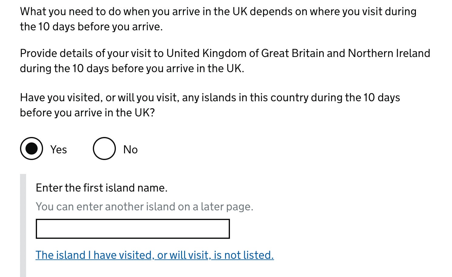
Consider the head scratcher that quizzes foreigners on their knowledge of British geopolitical map:
Have you visited or will you visit, any islands in this country during the 10 days before you arrive in the UK?
The mind reels: What island? What nation is “this country” referring to? The Great Britain is made up of England, Scotland, Wales, and Northern Ireland, and the British Isles have over 6,000 islands in the North Atlantic sea.
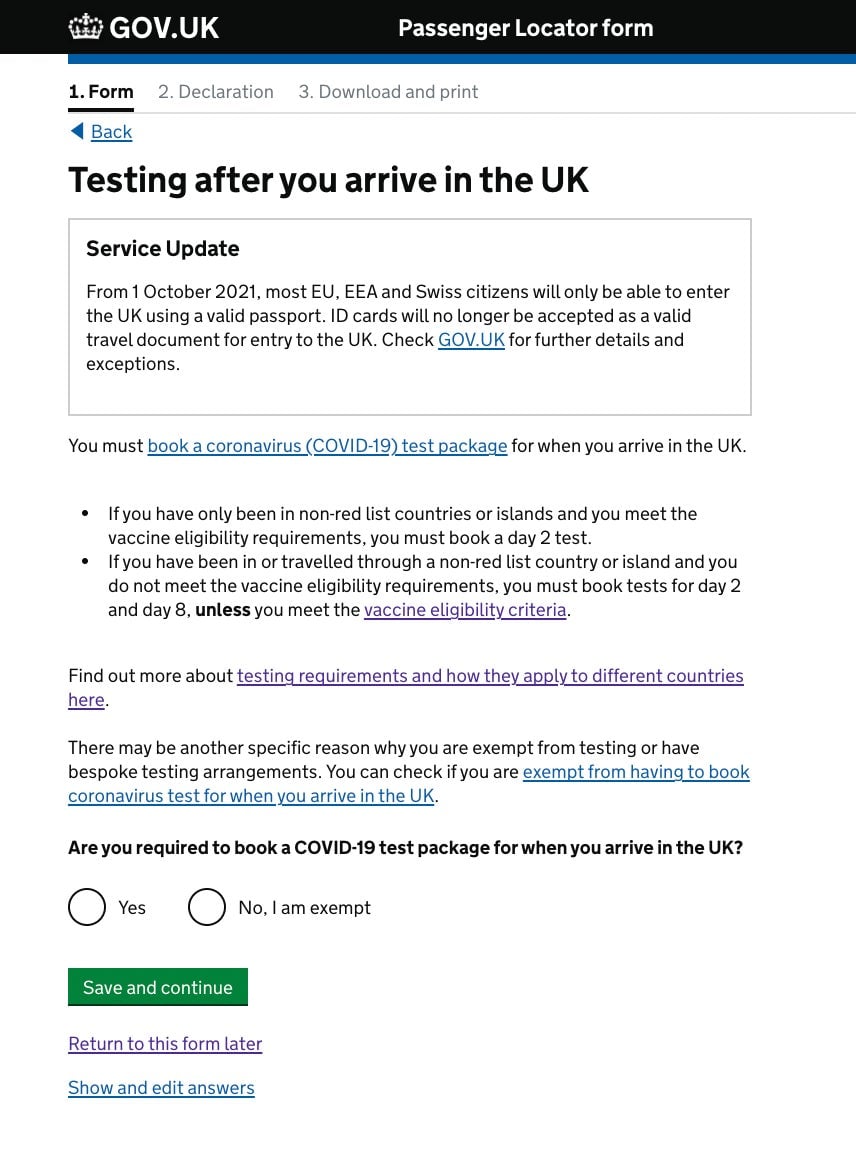
Another vexing page is one about booking Covid tests while in the UK. Foreign travelers are required to get tested on or before their second and eighth days in the country, and the locator asks for a reference number for the day 2 test.
The Gov.UK interface links out to a list of private test providers, which asks users to fill out another set of forms. After scheduling and paying for tests, the provider is supposed to generate an alphanumeric reference that must be indicated in the passenger locator form. The problem is that many users get error messages because the code isn’t in the right format.
Kollin explains that humans generally hate forms because they function as a speed bump that delays us from what we really want to do. “It’s usually just in our way,” he says. “In interaction design, a user’s intent is never to fill out a form. Say, you want to order a book, you don’t really want to fill out your billing details to get that book. In this case, people just want to travel but they’re saddled with the tedious locator form.”
That bureaucratic torture can be lessened if writers of the questionnaire considered how to make the experience as simple and easy for user, which is the goal of UX design in a nutshell. Infusing play in the process is one idea, says Kollin. For instance, Duolingo, which in essence is a form in the guise of a quiz makes answering questions engaging. “Usually 99.9% of forms aren’t designed like that,” he says.
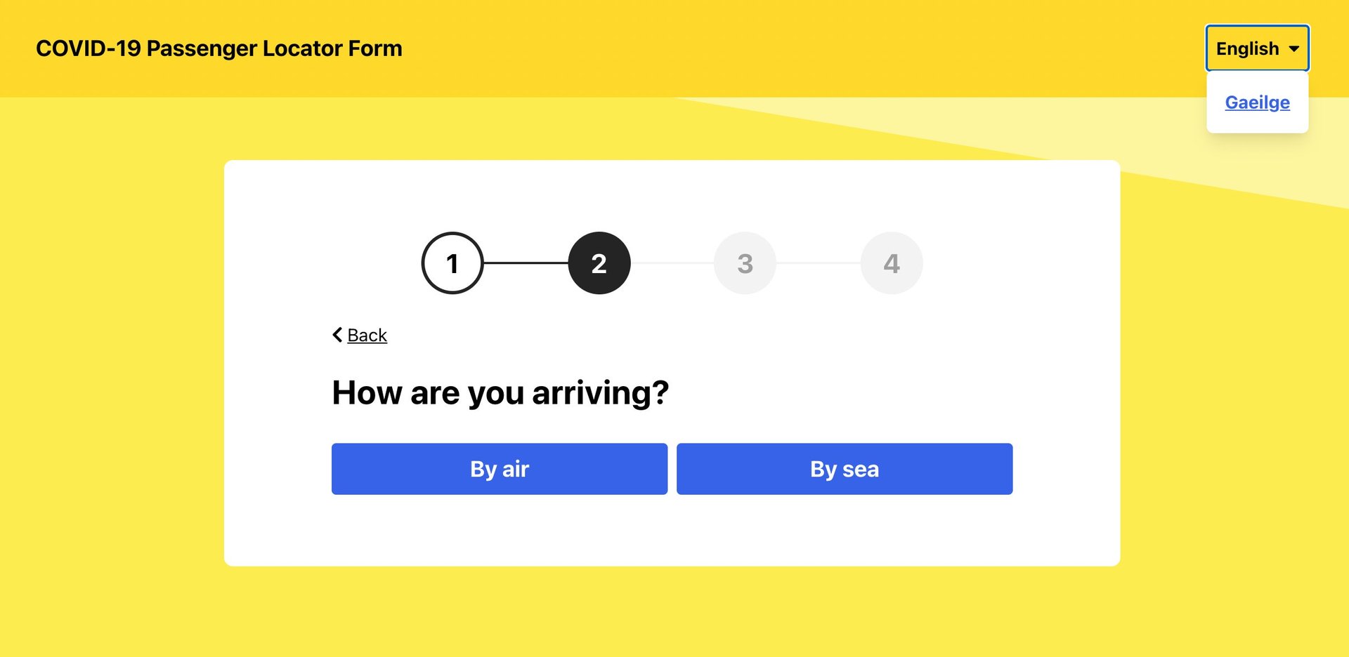
Though filling out a government forms may never be described as fun, they can at least be efficient. The Irish passenger locator form, in comparison to the UK one, takes mere minutes to complete.
Quartz sent several queries to the UK department of transport to inquire about the challenges of the passenger locator form and any improvements they plan on making. We never heard back from them.
Kollin thinks this blind spot may attributed to bad or incomplete data. “If a form is so hard to use, people will usually just abandon it [and the transaction], but that’s hard to do if if you’ve committed to fly,” he points out. “When the designers take a look at their analytics, they’ll say ‘well, we have 100% completion rate, so everybody can finish it.”
“I’d be surprised if they [the UK] didn’t do qualitative testing on this form before they launched it—this is a professional operation,” he says. “But just looking at the completion numbers wouldn’t show you the problems.”