So much Arctic ice has melted that we need a new atlas
It used to be wars, Communism and colonialism that kept atlas illustrators on their toes. These days, though, their biggest headache is global warming.

It used to be wars, Communism and colonialism that kept atlas illustrators on their toes. These days, though, their biggest headache is global warming.
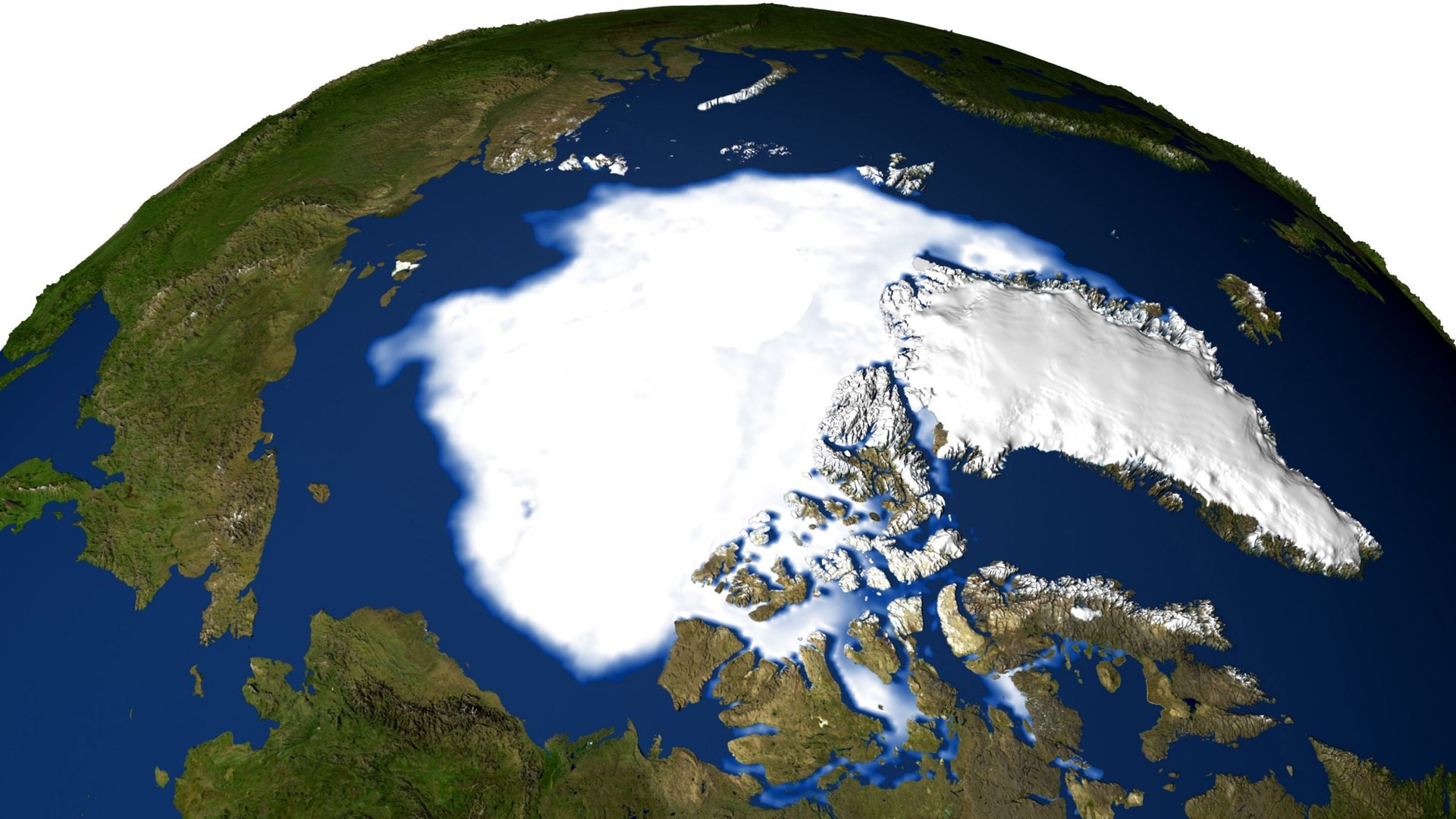
For instance, when the National Geographic Atlas of the World is published this coming September, its renderings of the ice that caps the Arctic will be starkly different from those in the last edition, published in 2010, reports National Geographic. That reflects a disquieting long-term trend of around 12% Arctic ice loss per decade since the late 1970s—a pace that’s picked up since 2007. This comparison from the US National Snow and Ice Data Center, although not the one used by National Geographic, should give a sense of how much skimpier that Arctic ice cover has gotten:
But drawing Arctic ice isn’t as uncontroversial as you might think. A few years ago, the Times Atlas mistakenly suggested that the Greenland ice sheet had shrunk by 15% since 1999, which it later retracted. Even choices made by the National Geographic atlas geographers have elicited criticism.
First is the issue of which years to compare. Arctic ice trends vary wildly by year. The atlas geographers’ use of data from 2012—a freakishly low year—risks misleading readers, as Walt Meier, a scientists at NASA’s Cryospheric Sciences Lab, told NatGeo.
Then there’s the matter of which ice to illustrate.
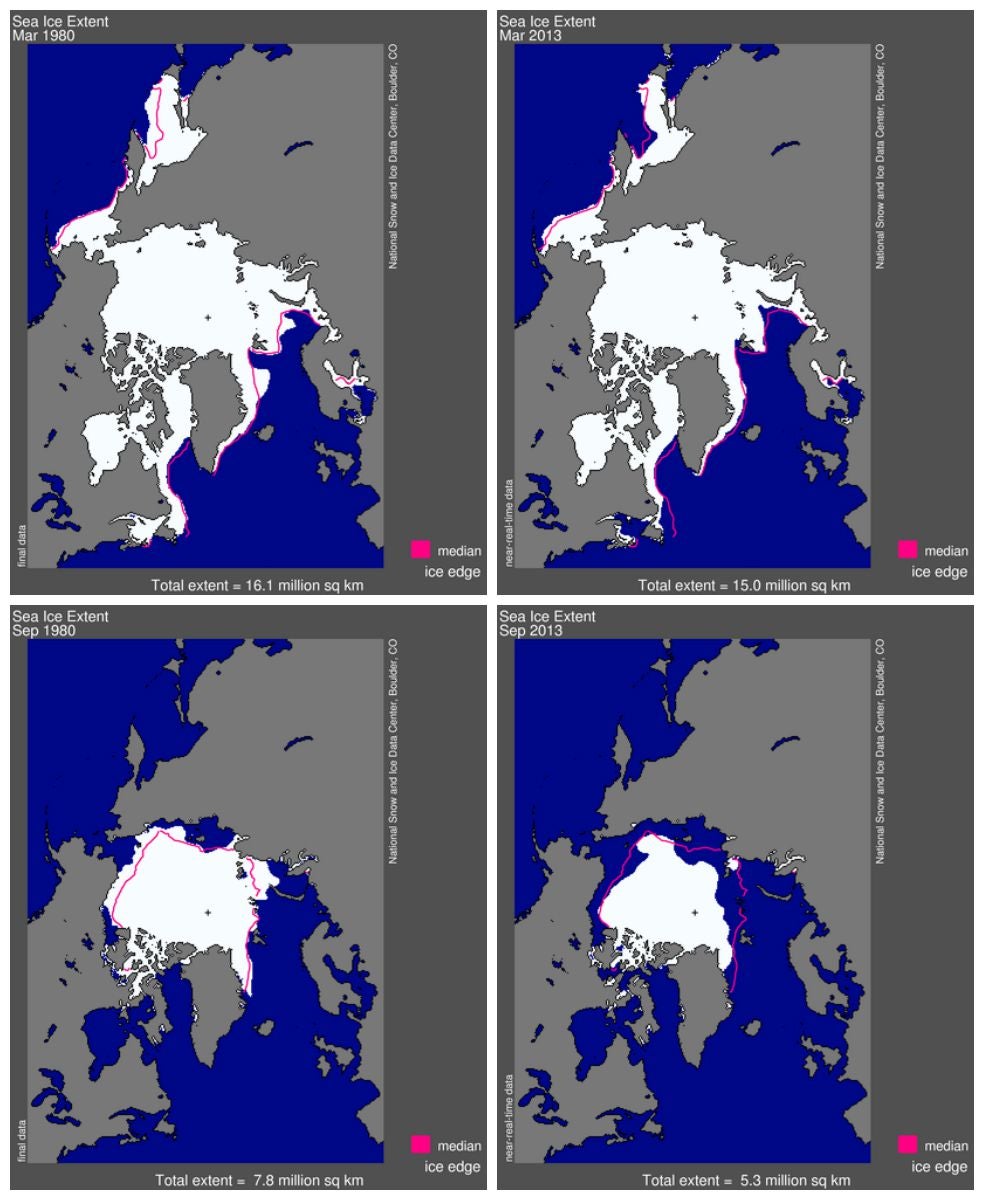
Every winter, cold temperatures seal the Arctic under a sheet of ice. By late summer, though, the sun’s warmth has melted millions of square kilometers of that ice. Scientists refer to these two seasonal extremes as “total maximum sea ice cover,” measured in March, and “total minimum sea ice cover,” taken in September (that’s what’s in the YouTube above). Here’s how both measures in 2013 compared with those of 1980:
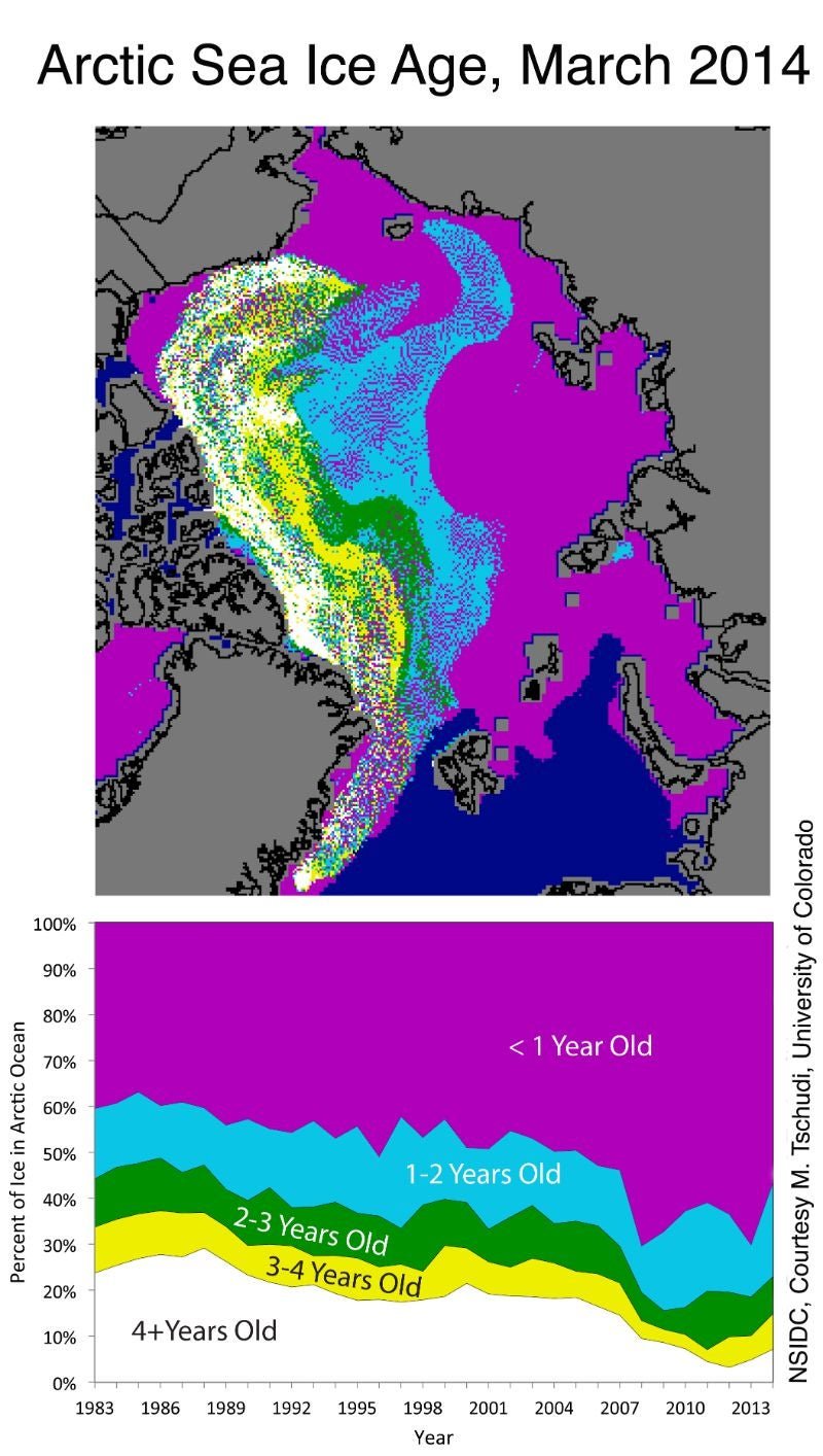
There’s also a third crucial metric: “multiyear ice,” which is ice that has survived at least two summers without melting. This older ice is a vital buttress against faster melting and the rising sea levels that would result. Typically three to four meters (10 to 13 feet) thick, multiyear ice is harder to melt and reflects more sunlight than new ice does, keeping solar heat from warming surrounding seas, which would accelerate melting all the more.
Not long ago, multiyear blanketed the Arctic. But that older ice has receded at a much brisker clip than the young, thinner ice. Now just 7% of Arctic ice is at least five years old, half of what it was in 2007, and a quarter of what it was in the late 1980s.
In order to become older ice, of course, younger ice has to stay firm right through the year. The ”total minimum sea ice cover” is a measure of how much ice makes it through summer without melting. But the National Geographic atlas depicts the ice as it stands in March (“total maximum sea ice cover”), before a lot of it has melted, which NASA’s Meier says might mislead the public.
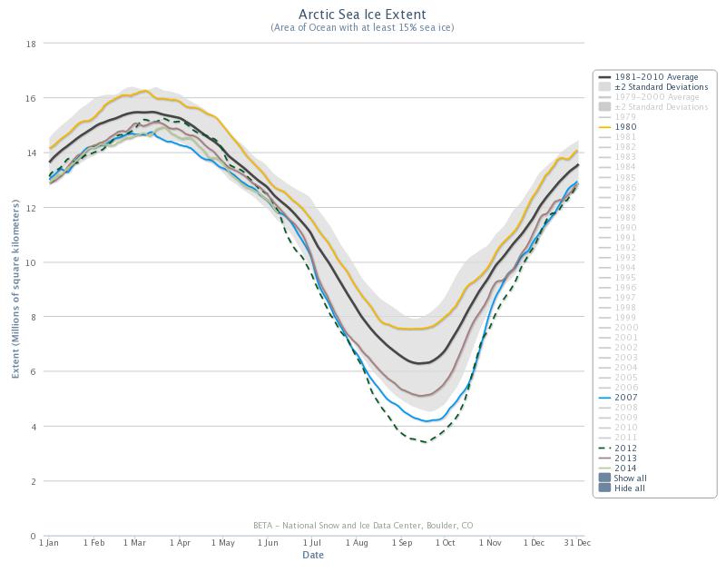
The atlas’s geographers, however, say that there’s only so much they can include before they confuse the reader. And they have a point; keeping the three metrics straight is tough. They also vary so widely that looking at one or two data points alone risks exaggerating the overall trend. And seen in aggregate, the long-term trend doesn’t need exaggeration: The yellow line below shows the sea ice extent in 1980, the black is the 1981-2010 average, and the brown is 2013. Even if you treat 2007 (blue line) and 2012 (dotted line) as outliers, that’s an alarming decrease.
