The James Webb Space Telescope images aren’t what your eyes would see. But that makes them science, not faked
The James Webb Space Telescope delivered astounding images of the universe. But what are we looking at, exactly?
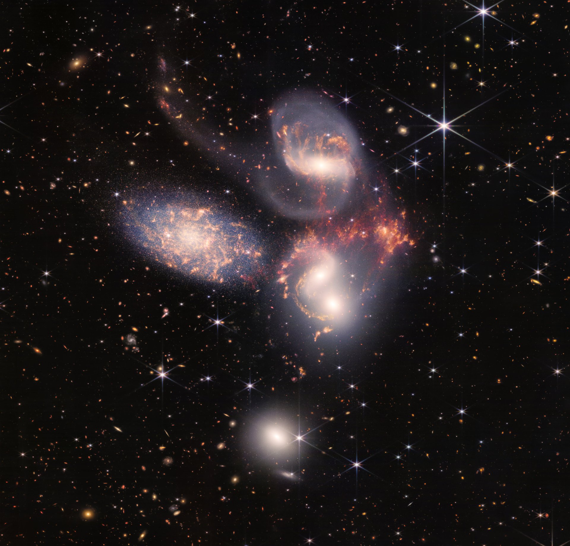

The James Webb Space Telescope delivered astounding images of the universe. But what are we looking at, exactly?
It may go without saying, but these aren’t photographs. They are data visualizations! And that data is the impact of photons—light energy—on very sensitive circuits a million miles away from us. The various sensors on the Webb Telescope measure that energy and send that data back to earth, where it can be rendered into something human eyes can see.
That rendering process can make people suspicious of these images—that we aren’t seeing what’s really there, but something artificial or manipulated. The truth is more interesting: Just like any data set, measurements of light in the universe can be manipulated. But scientists have standards and techniques to ensure that their visualizations convey useful information about the world, just like economists trying to put their finger on rising inflation.
Turning James Webb Space Telescope data into charts
For scientists, much of the interesting data will be in spreadsheets or in spectrographs, charts that show the presence of specific elements based on the frequency of light reflected, absorbed, or emitted by an object in space. Jonathan McDowell, an astronomer at the Harvard-Smithsonian Center for Astrophysics, compares the visualizations to crime-scene photos and spectrograms to DNA analysis—one gives you the lay of the land, but the other offers far more detail.
One of the first five images we saw was actually a spectrograph of the atmosphere on a planet 1,150 light years away from Earth. The new telescope was able to spot the chemical signature of water:
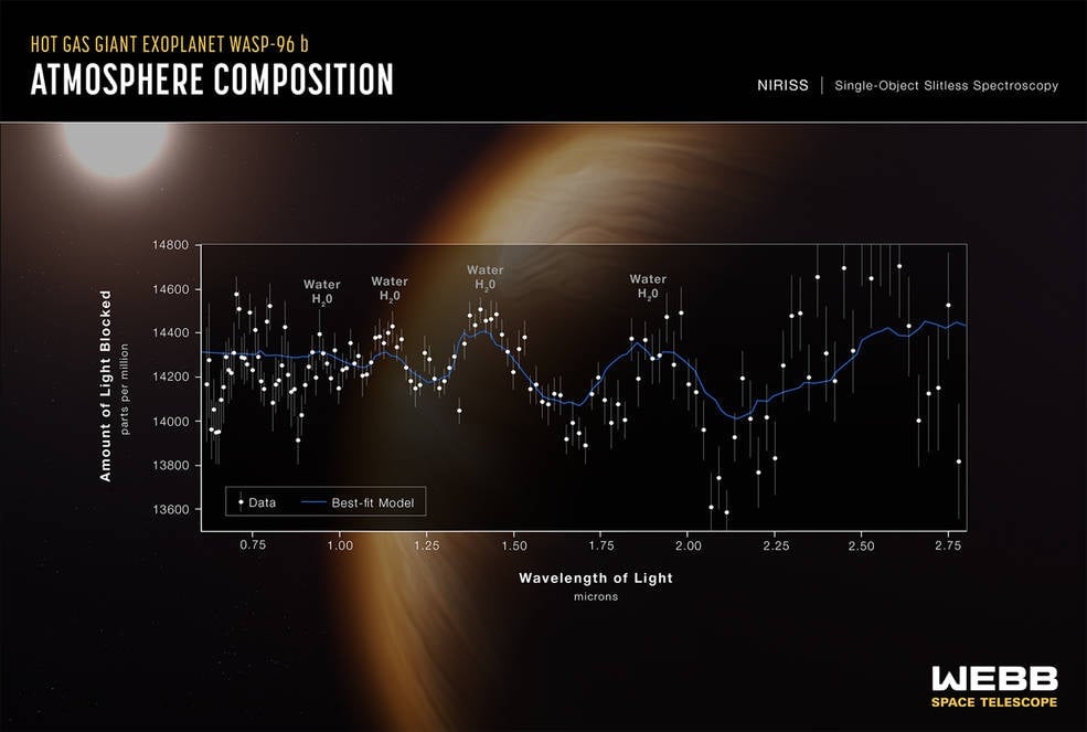
This is what will drive the science: Precise measurements of distant things. Given half a moment’s thought, it’s absolutely insane that we can say with some certainty that there is water vapor on a planet so far away. The bulk of Webb’s scientific impact will come from those analyses.
And if that’s what’s important, why are we gawking at images like these?
James Webb Space Telescope images are data visualizations
It’s a powerful method of communication, explains Rob Simmon, a data visualization expert at the remote-sensing company Planet and formerly at NASA. While his work is pointing space sensors back at Earth, he faces the same challenges as astronomers looking at more distant targets.
“That transformation from numbers to visual, especially a visual that has immediate impact, is super important,” he says. “Even other astronomers outside a particular discipline are going to need that type of bridge.”
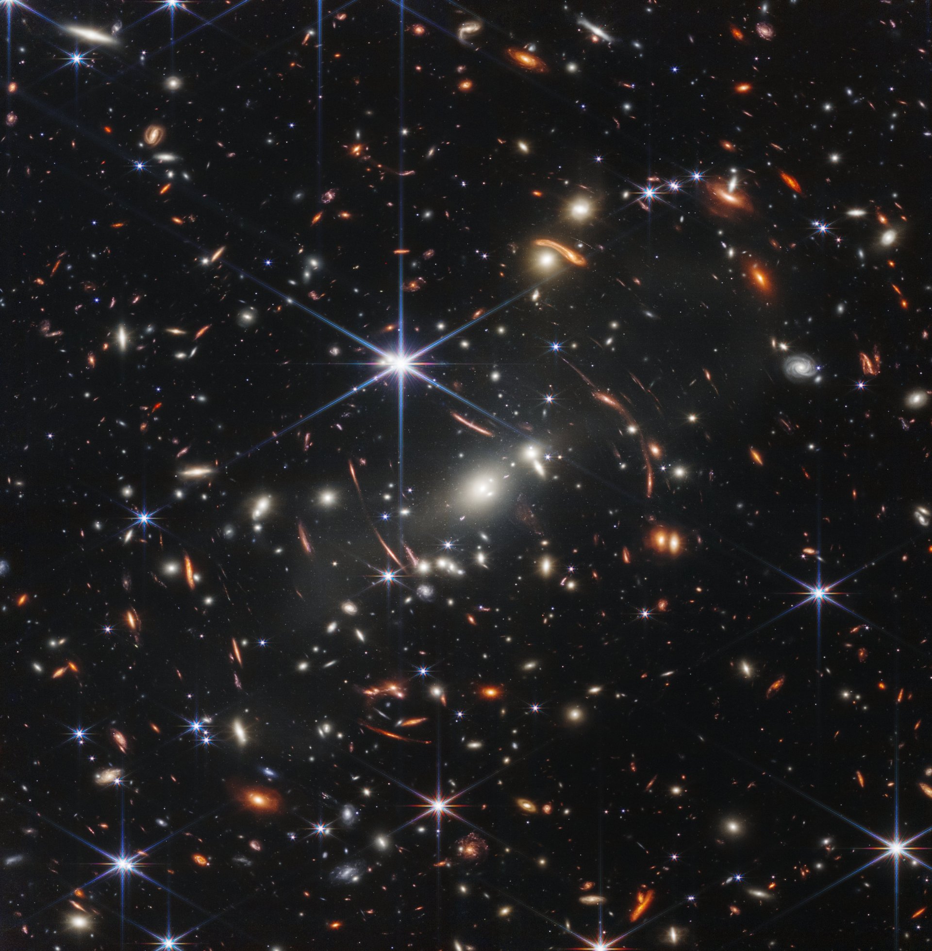
For one, images have scientific value. The JWST “deep field” image above may look like a world of stars, but the key context is that thirty years ago, we thought there was nothing there. Then, in 1995, the Hubble Space Telescope’s director used his discretionary time to look what was then registered as a blank spot in the sky. The resulting image showed thousands of galaxies at various ages, definitively upending the idea of a changeless universe. Now, JWST has confirmed that, and more, by looking even further.
And at a different wavelength. Hubble’s sensors were primarily designed to look at the visual spectrum of light: the frequencies which the human eye can see. JWST, though, also captures infrared light that human eyes cannot detect. This is important for astronomers because the universe is expanding, which causes light from the most distant objects shift toward a longer or “redder” wavelength. JWST can see some of the oldest objects in the universe because it can detect this “red-shifted” light.
Making invisible light visible
To turn these into something we can see, scientists must choose how to represent each frequency that humans cannot see, but they rely on the same physical properties that humans are familiar with.
“Infrared colors are just as real as visible colors—what we do with Webb is not making up colors,” Klaus Pontoppidan, a JWST researcher, said last week. “We always maintain that order: Blue color means shorter wavelength, red color means longer wavelength…you can think of it as a translation of a language you don’t understand. If you had infrared eyes, this is what you may see.”
Consider two Webb images. This one, relying on the telescope’s near-infrared camera, shows never-before seen galaxies and stars in the Carina Nebulae:
That same part of the sky was also imaged with the telescope’s mid-infrared camera, which better captures clouds of space dust. Here’s an image that emphasizes the data from that instrument:
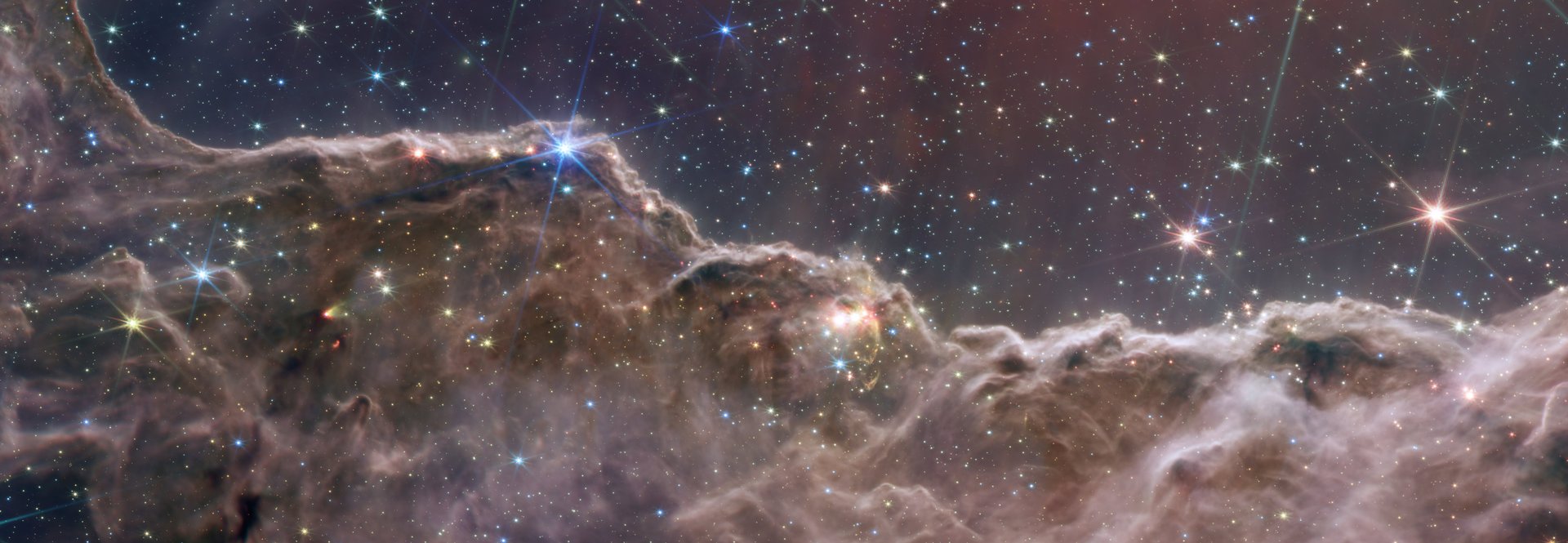
Neither of these visualizations is “wrong” or “fake.” What makes them different is what their creators are trying to communicate. On a clear day, I can see the Golden Gate bridge from my window, but often it is obscured by fog. If I had the right infrared camera, it could peer through the fog, and I could produce similar images—of the fog, or the bridge behind it. Those choices are even more important when taking pictures of something light years away versus miles—there’s just more in between.
For scientists, it’s the one that is most useful to furthering their understanding. They are acting as designers, trying to communicate specific findings to their audiences.
The responsible way of communicating scientific data
“My rule of thumb is I try to do things that are global to an image,” Simmon says, to avoid presenting a misleading picture by selectively changing one small part. That means consistency in color choices. But it can become more difficult, for example, when trying to depict the 3D environment of space in a 2D image: Astronomers will make choices about what is in the foreground or background of an image.
Debates about the veracity of scientific imagery are hardly new—Simmon points out that cartographers are the original remote-sensing visualizers. Before digital technology, the chemistry used to make film presented similar choices to photographers. One brand might have brighter reds, another might have more detail in shadows. It’s what many Instagram filters are trying to simulate.
Indeed, during the exploration of the American west, when painters and eventually photographers attempted to capture the otherworldly landscapes of the Grand Canyon, similar questions of veracity came up. Thomas Moran was a painter who worked for popular magazines, his stunning images are credited with inspiring the National Parks movement.
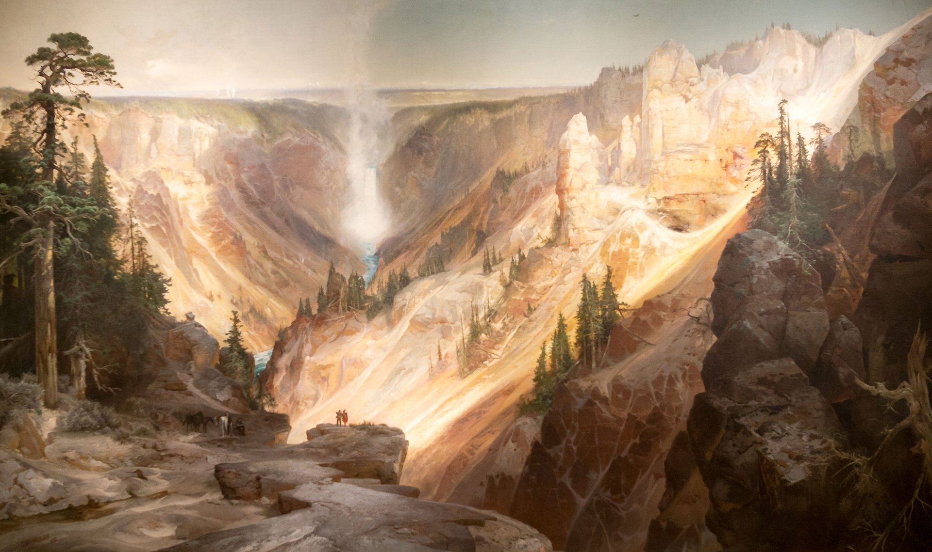
William Henry Holmes, on the other hand, was a geologist focused on recording what he saw scientifically. Moran gained more fame, but Holmes earned the respect of scientists.
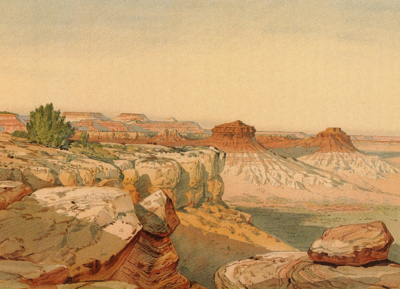
Art historian Elizabeth Kessler argues that the visual language of imagery from space telescopes can be credited to this era landscape artistry. It’s worth mentioning that while glorious pictures of deep space won’t lead to settlement on the space frontier (until we invent some kind of faster-than-light travel) they do serve a propaganda role in promoting the results of government spending to a wider audience that might not care about spectroscopic analysis but would like to get a sense of their place in the universe.
And while navigating the boundary between the literal depiction of something and the way it makes you feel can be a gray area, the JWST images bring to mind what the author Wallace Stegner wrote about Holmes: “At least once, when there was no cause for improving on nature because nature was superlative, once when pure geology was art, he made such pictures as no one has made since…art without falsification.”