Designers are racing to digitize Hong Kong’s disappearing street typography
Prior to 1997, nearly all road signs in Hong Kong were made by prison inmates. The job entailed cutting Chinese characters by hand, in the absence of an available font for the approximately 13,000 glyphs in the Chinese language.


Prior to 1997, nearly all road signs in Hong Kong were made by prison inmates. The job entailed cutting Chinese characters by hand, in the absence of an available font for the approximately 13,000 glyphs in the Chinese language.
That all changed when the highway authority began adopting commercially available Chinese fonts, in the mid-1990s, thus closing the era on Hong Kong’s vernacular street typography. Now a group called Road Research Society is racing to preserve the handiwork of inmates, calling it important artifact of Hong Kong’s history.
Why the signs are worth saving
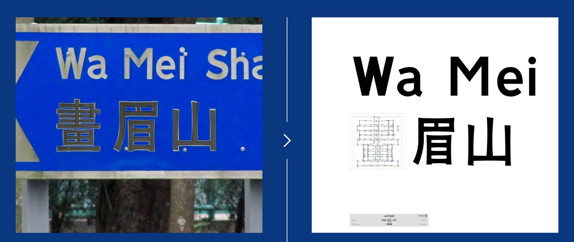
Over the years, the manual sign-making process at the Pak Sha Wan Correctional Institution has resulted in an array of imperfect characters—and this is precisely their charm, aficionados argue. “Chinese characters are the epitome of balance and proportion, but the Chinese writing on these street signs was often lop-sided or slightly awkward,” explains Chris Gaul, a University of Technology Sydney design lecturer who wrote about the Hong Kong’s idiosyncratic signs on Medium. “They may not be graceful, but these characters certainly have character. Their flaws and quirks have an energy and charm that calls attention to the work of the sign-writer.”
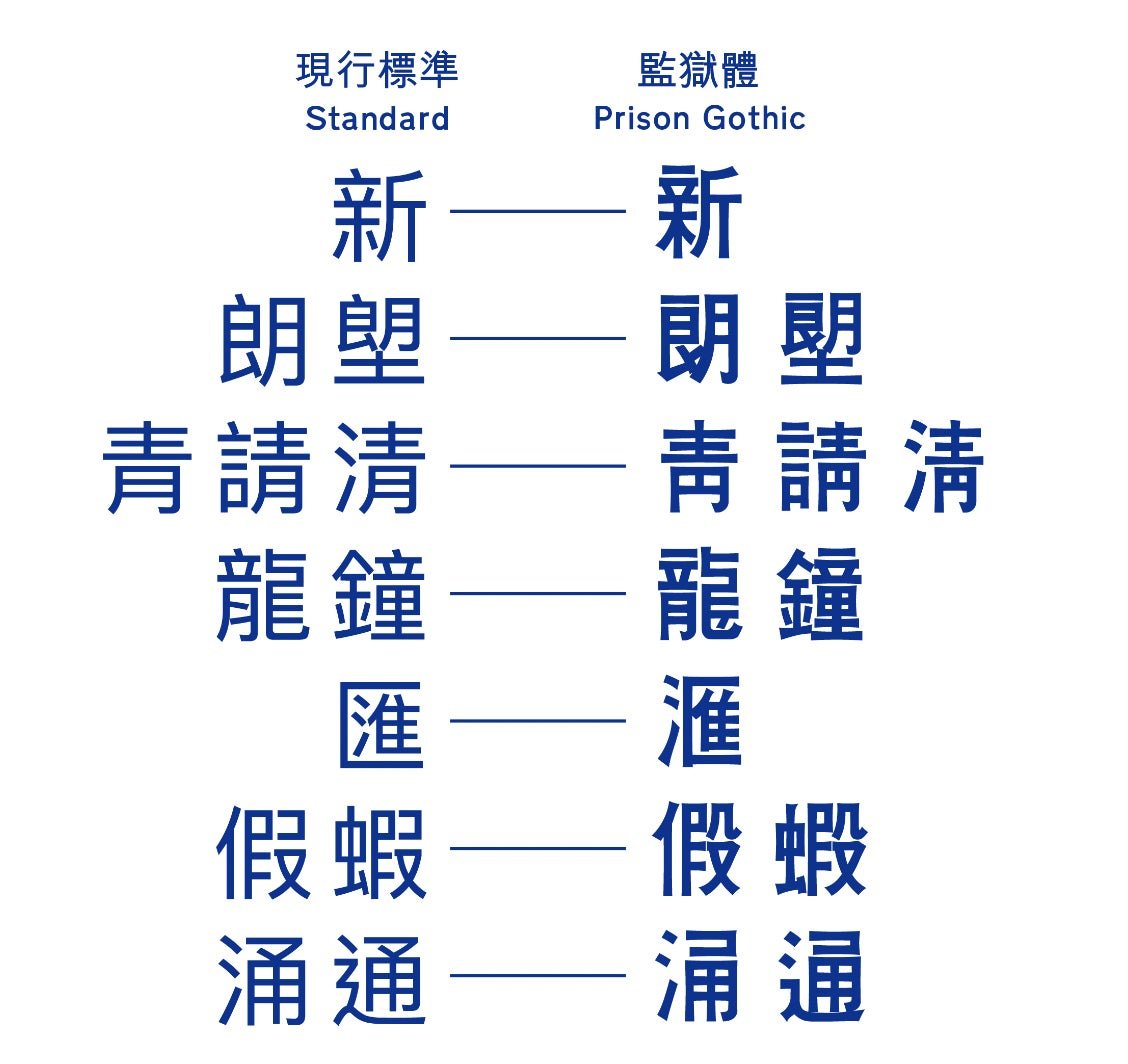
The Hong Kongers who comprise Road Research Society—mostly transport history buffs and information designers—have dubbed the lettering style “Prison Gothic,” celebrating it as foil to the legible but comparatively generic serif used for the English text on the dual language signs.
Members of the Road Research Society have been photographing signs throughout Hong Kong’s highway system, and now have made a typeface out of it.
“Prison Gothic mixes old and new styles of writing characters,” explains Gary Yau, a type designer who founded Road Research Society while he was in university. “The manufacturing process of Prison Gothic signs had to go through many different people, and there were no computers back then so characters had to be cut by hand. The fact that they could create a unified style is pretty fascinating,” he said in the local culture blog, We Are HKers.
Though Yau has been documenting the evolution of Hong Kong’s public signage for several years—chronicling it in his 2019 book Hong Kong Road Study: Signage & Highway Design—he hasn’t been able to meet an inmate who actually worked on the signs. Hong Kong’s correctional services authority have rejected Yau’s requests because of security concerns.
What it takes to make a Chinese font
Making a quality font is hard work, and that’s even more true of Chinese fonts. The job requires designers to research traditional writing systems and translate them into pleasing and legible digital typefaces. “The cost and time of developing a font with Chinese characters are much more than a font with only the Latin alphabet,” Yau explains, echoing a familiar lament of independent type designers.
After nearly six years in development, Road Research Society will launch Prison Gothic Medium in November. The font has 8,000 glyphs including Cantonese characters, Mandarin phonetic symbols, the Latin alphabet, numerals, emoji, and punctuation marks.

Road Research Society is now raising funds to further develop the typeface. If they can meet the $90,000 goal on their Indiegogo campaign, Yau tells Quartz they’ll develop another weight for Prison Gothic and expand the character set.

Yau says he’d like to see Prison Gothic font used in documents, book covers, board games, and even video game graphics, though he’s says that it’s unlikely that it’ll be used in new road signs. ” I don’t think the Highway or Transport Department would likely adopt it in new road signage,” he says. “Some of them did not like the old traditional writing style of Prison Gothic.”